July 18, 2017 | carly stewart
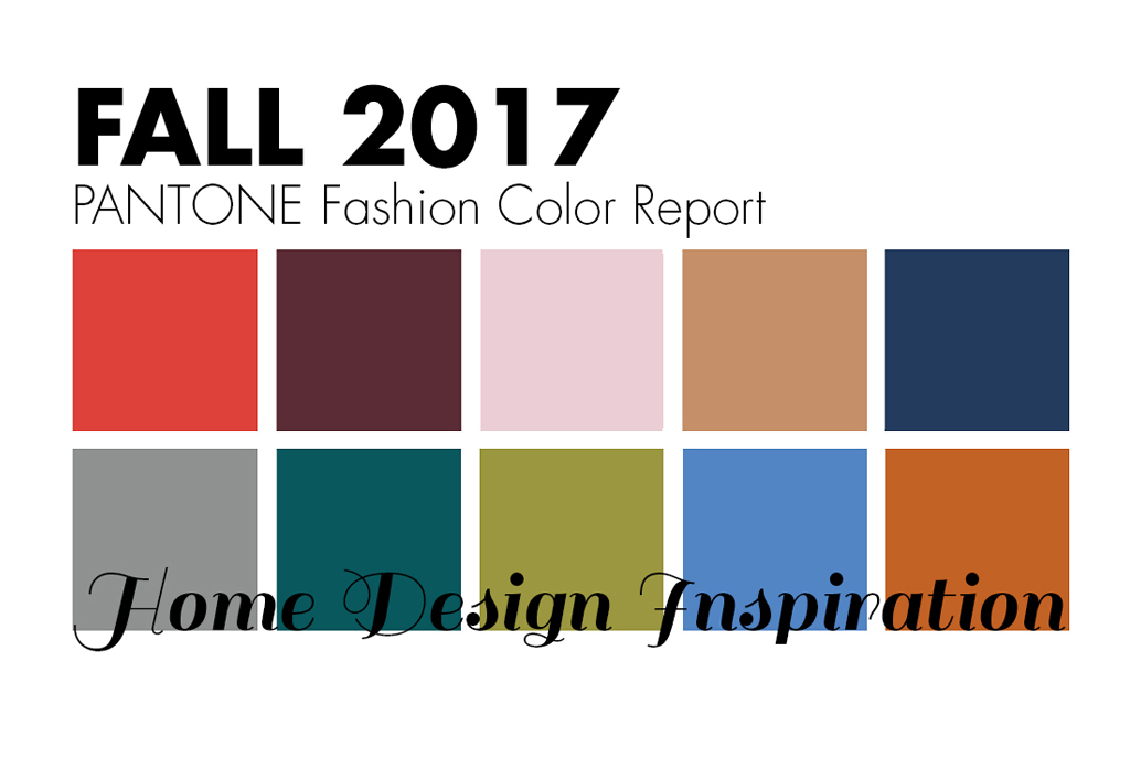
PANTONE's Fashion Color Report for Fall 2017 represents a color palette for New York that incorporates a sense of warmth with hues that are comforting and crucial to the seasonal feeling. We've collected inspiration from the professionals on a number of ways that these trending pops of color produce the perfect touch within the home for the upcoming season.
1

Grenadine – PANTONE 17-1558
The ultimate attention-getter; Grenadine expresses confidence when using hints of its powerful, evocative red tone in a space.
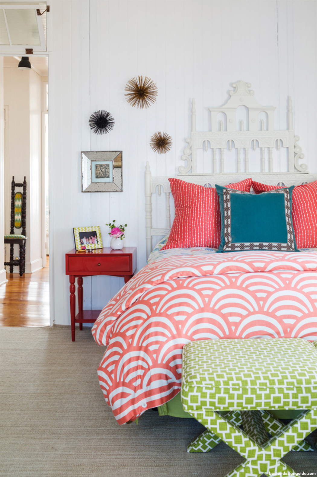
Interior Design by Heather Vaughan; Photo by Greg Premru
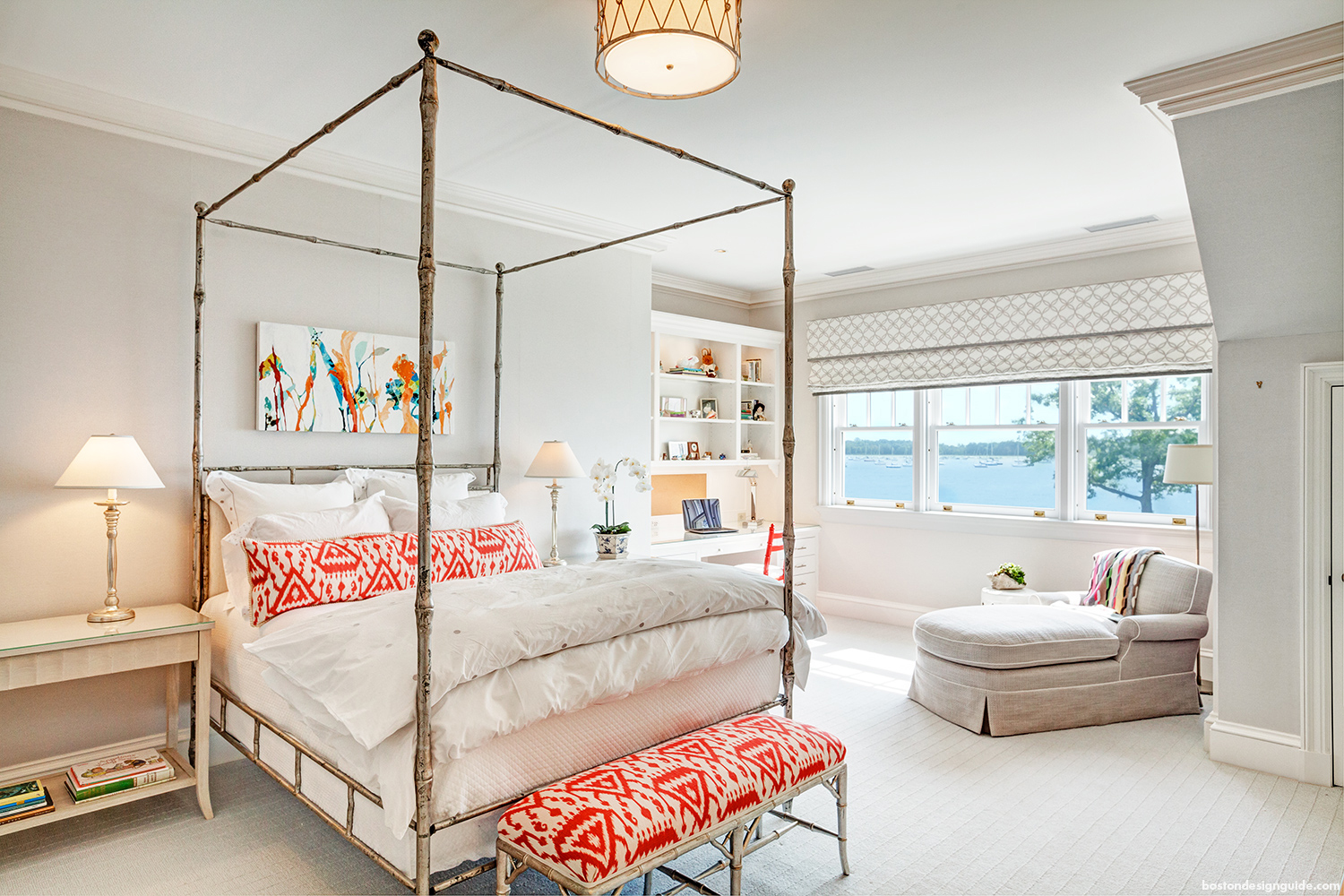
Architecture by Charles Hilton Architects
2

Tawny Port – PANTONE 19-1725
The elegance of Tawny Port brings a taste of sophistication.
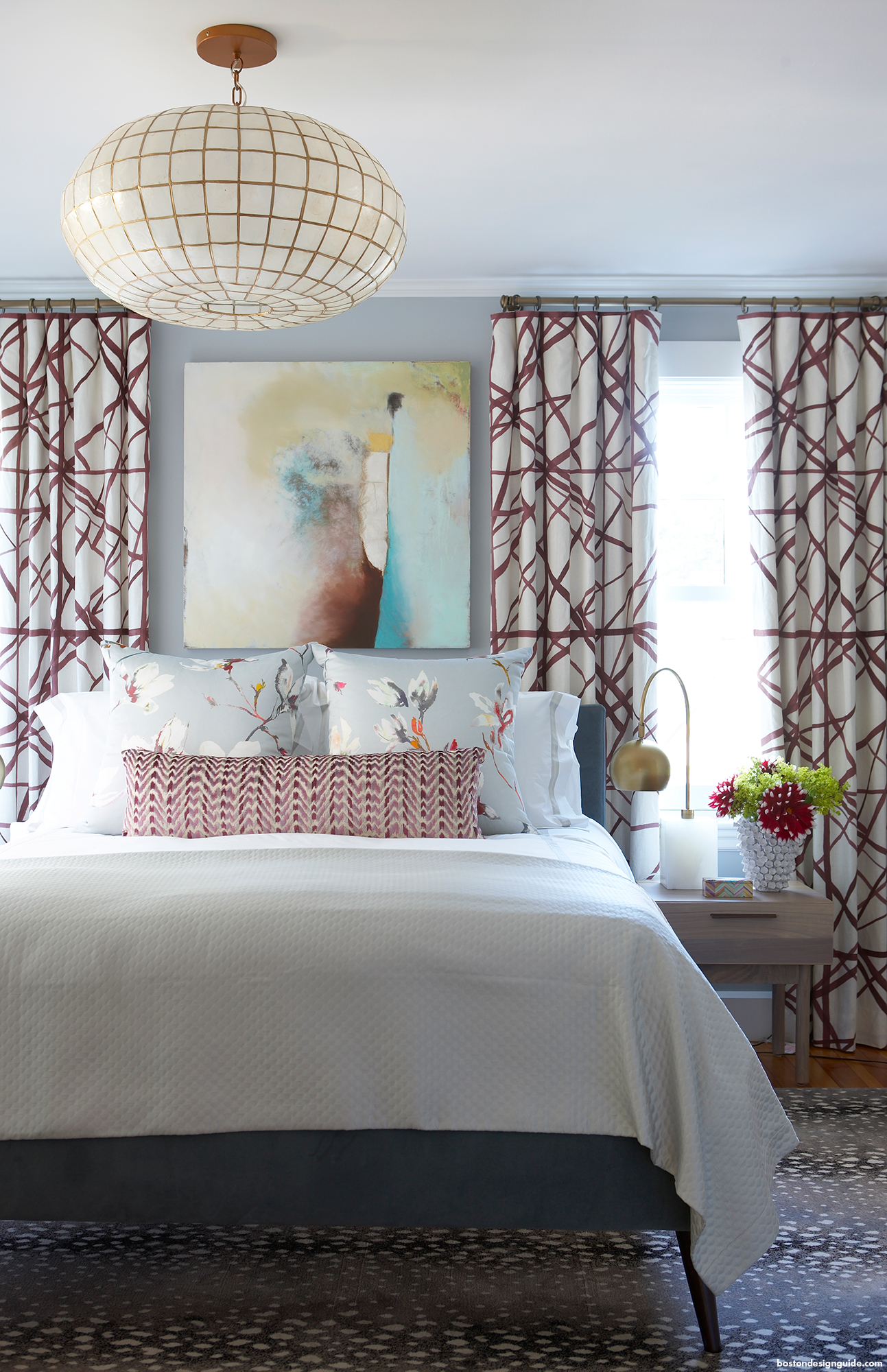
Interior Design by Rachel Reider Interiors
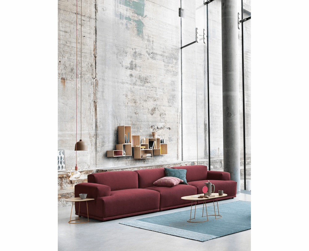
Photo by Muuto
3

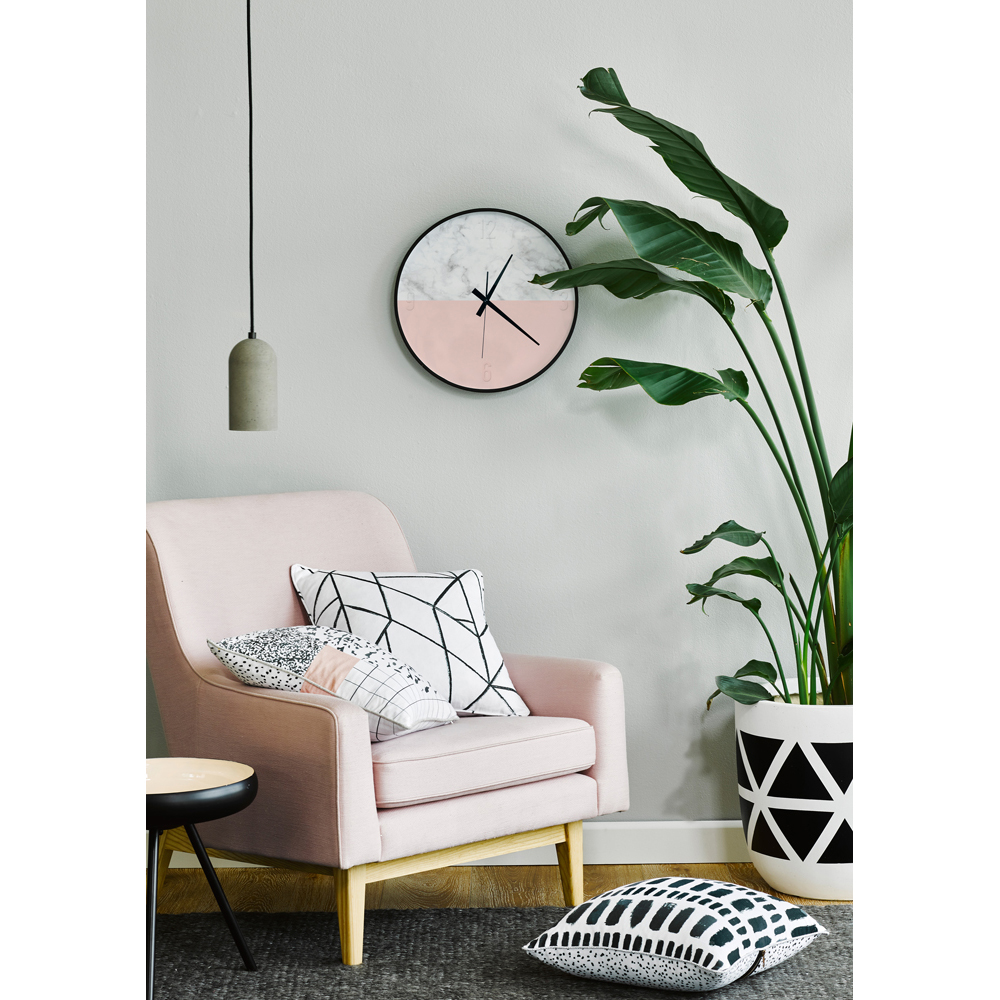
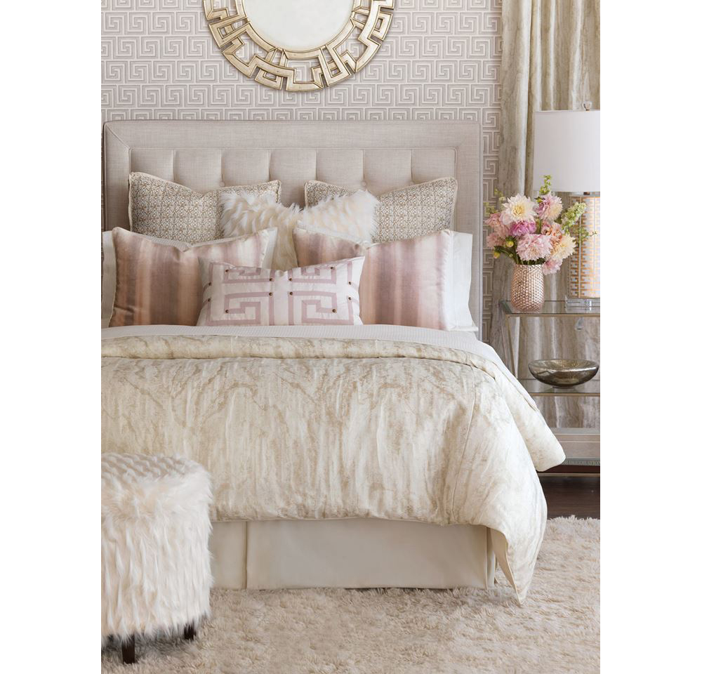
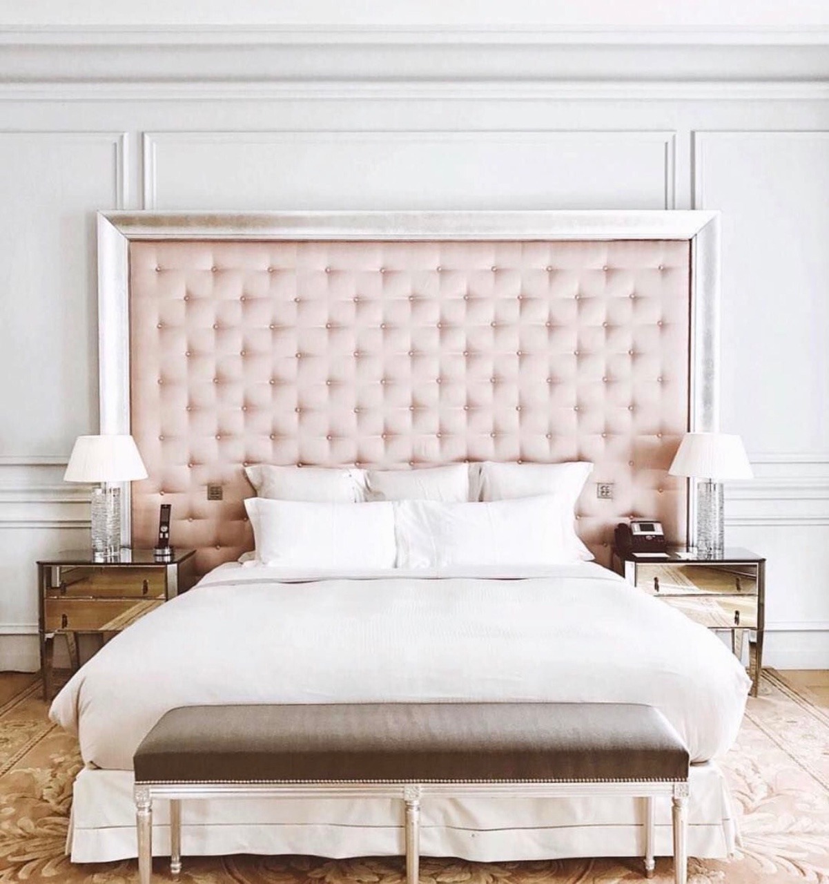
Ballet Slipper – PANTONE 13-2808
Staying within the red family, Ballet Slipper holds a soft touch to flatter the room with a rosy glow.
4

Butterum – PANTONE 16-1341
An autumn evening is filled with warmth with a shade as evocative as drinking a glass of Butterrum.
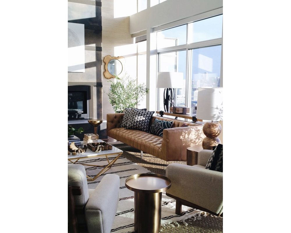
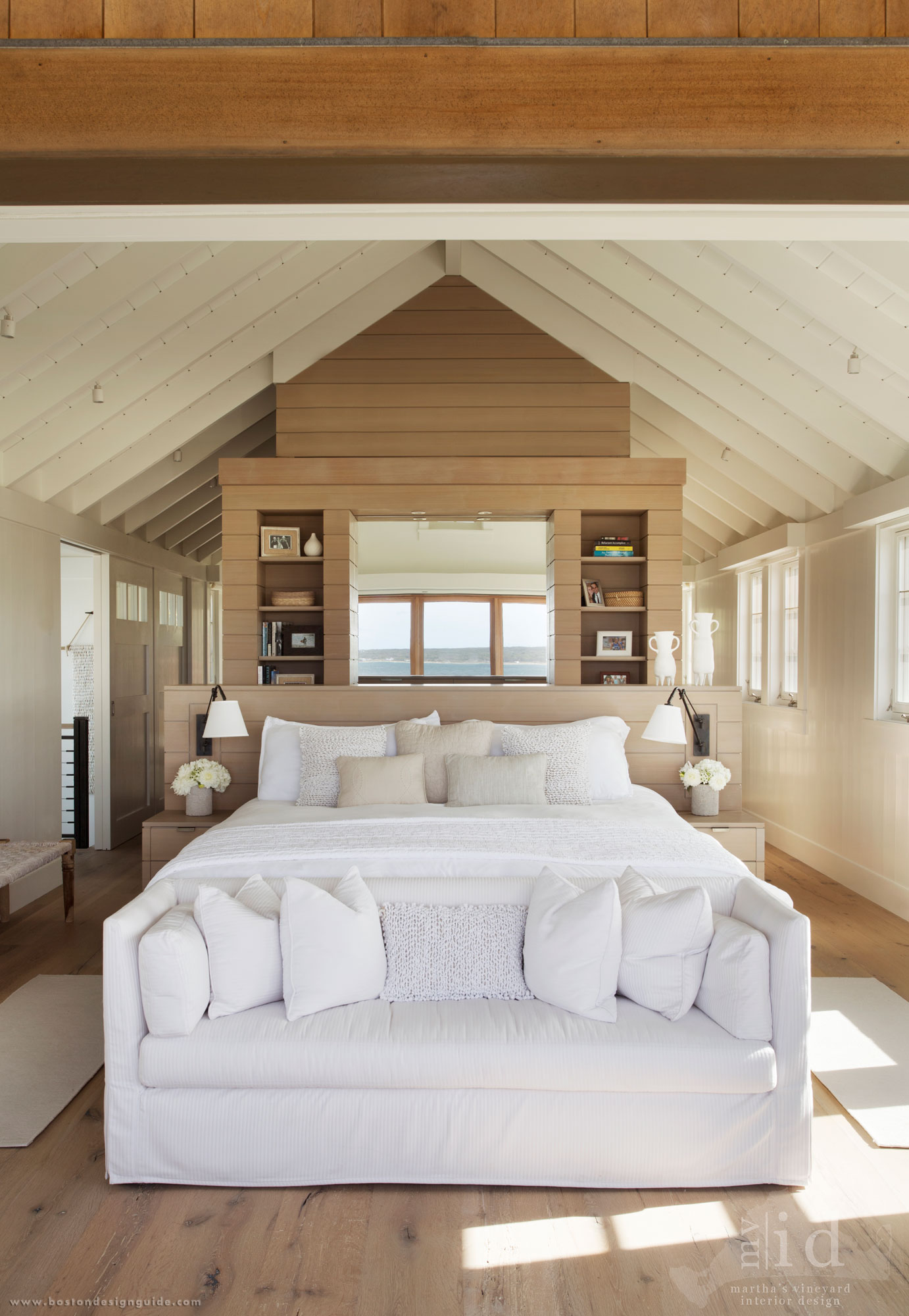
Interior Design by Martha’s Vineyard Interior Design
5

Navy Peony – PANTONE 19-4029
The solid, anchoring shade is your new go-to neutral taking the load off of a harsh black.
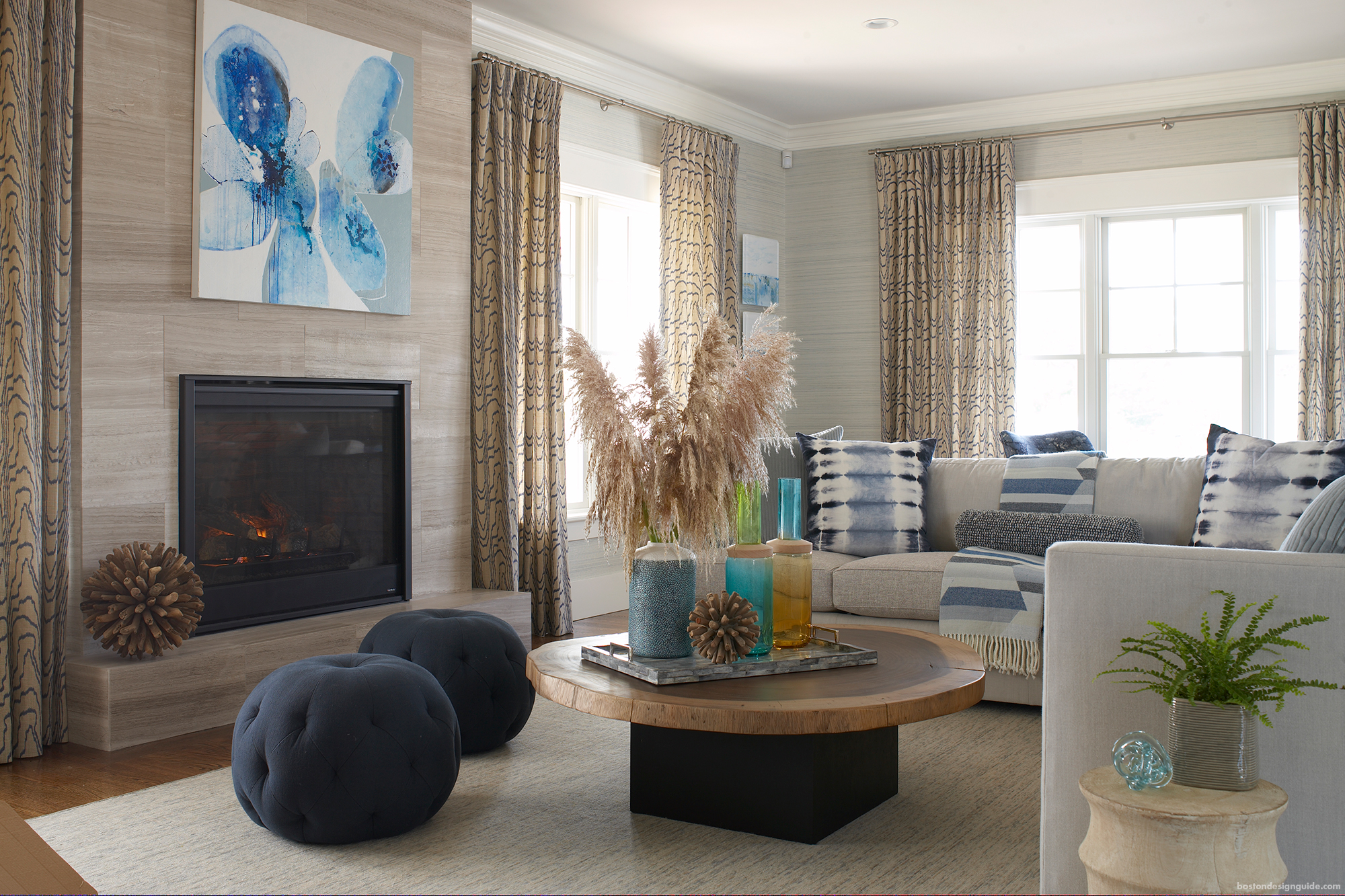
Interior Design by Rachel Reider Interiors
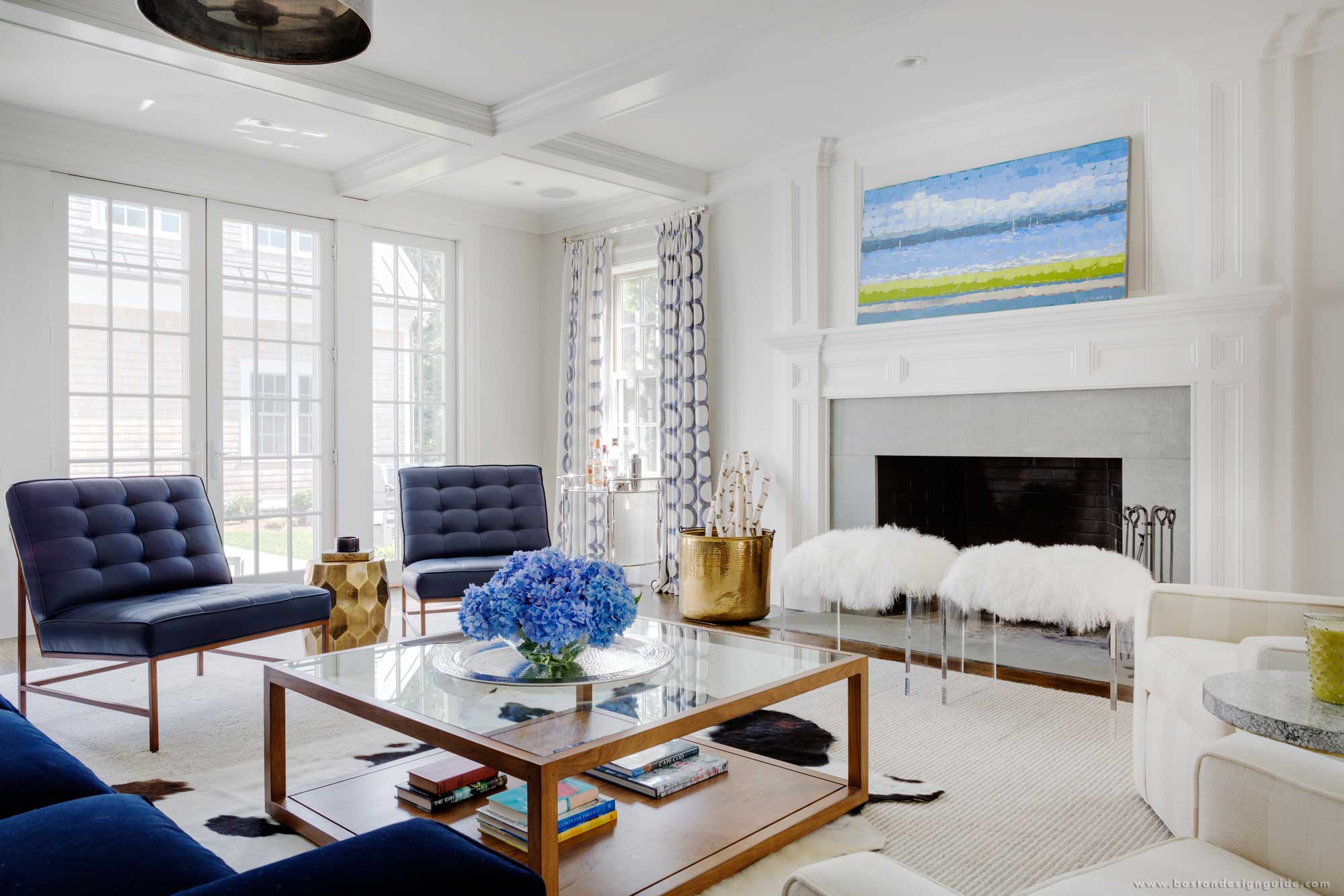
Interior Design by LDa Architecture & Interiors
6

Neutral Gray – PANTONE 17-4402
Alongside Navy Peony as the neautral of the palette, Neutral Gray can always be looked to as an accent or statement piece.
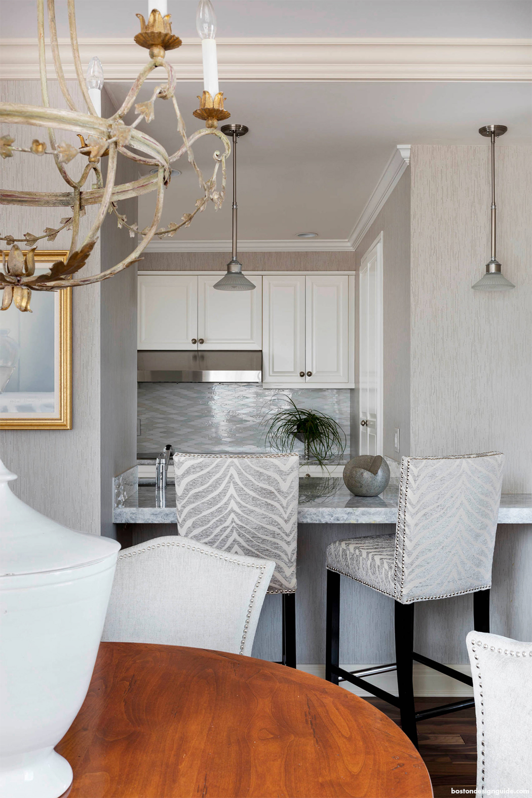
Interior Design by Heather Vaughan; Photo by Greg Premru
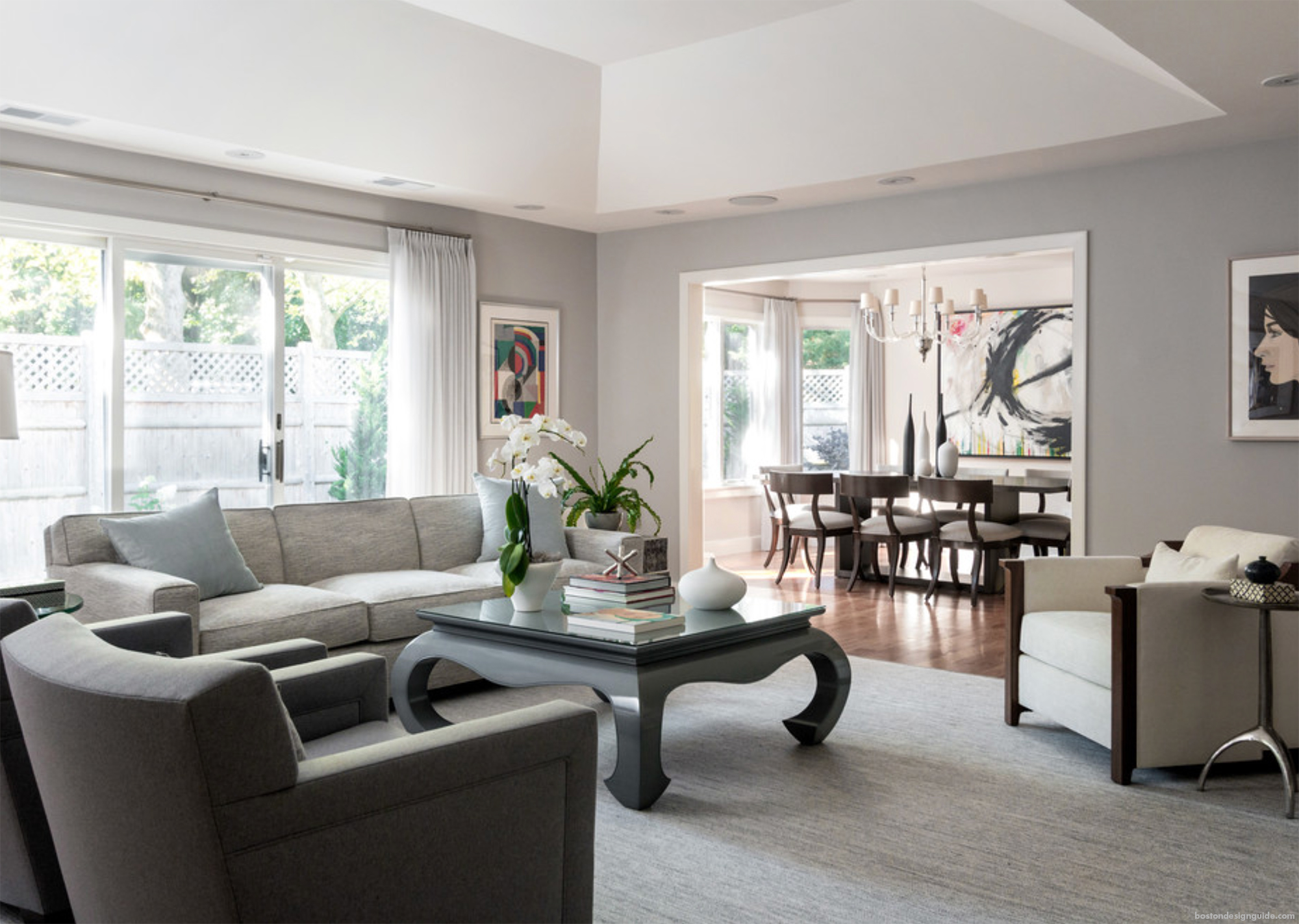
Interior Design by Janine Dowling; Photo by Michael Patrick Lefebvre
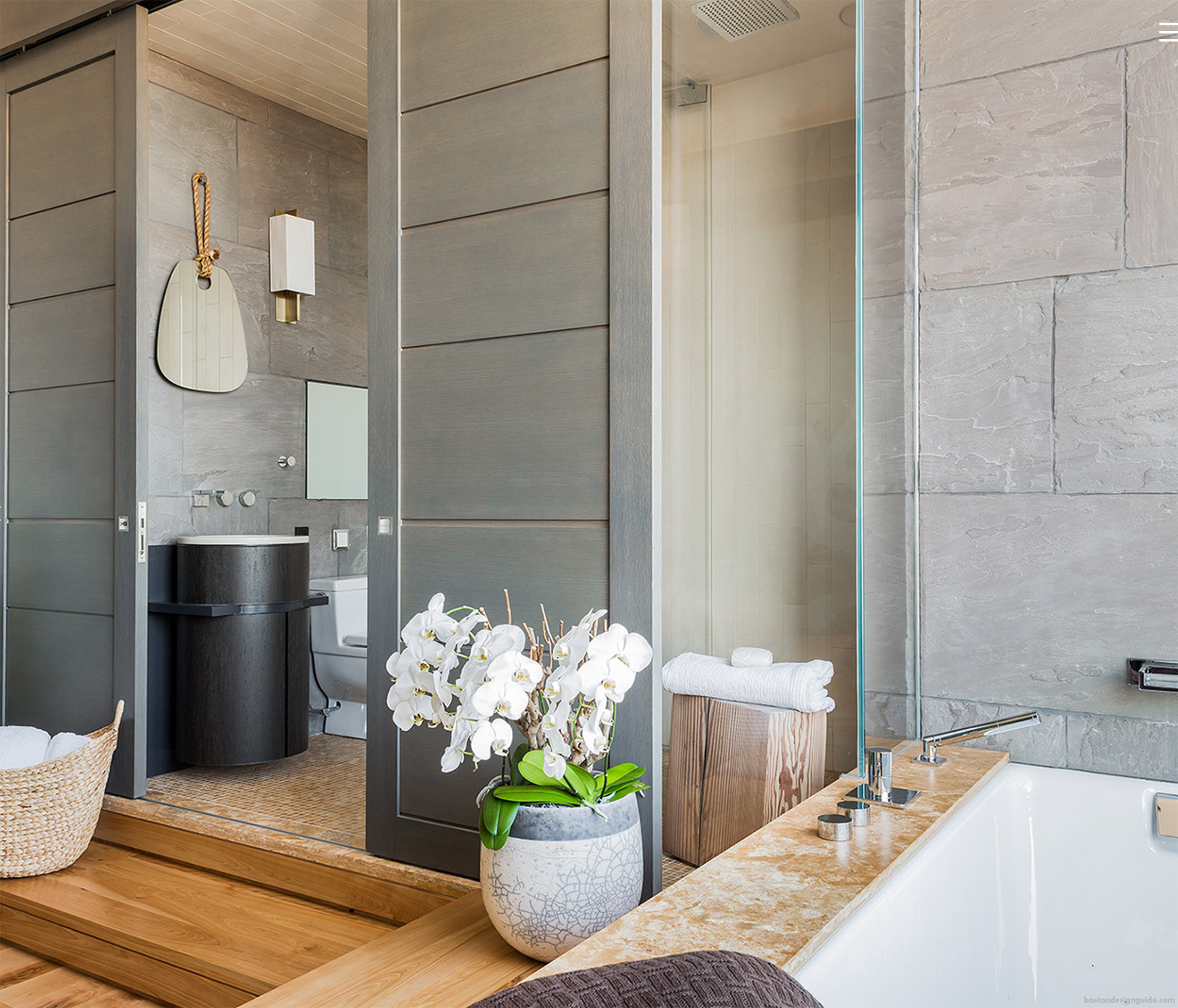
Custom Built by Sea-Dar Construction
7

Shaded Spruce – PANTONE 19-4524
This tone is a rich, eye-soar that explores the feeling of being in the forest, sheltered by evergreen trees.
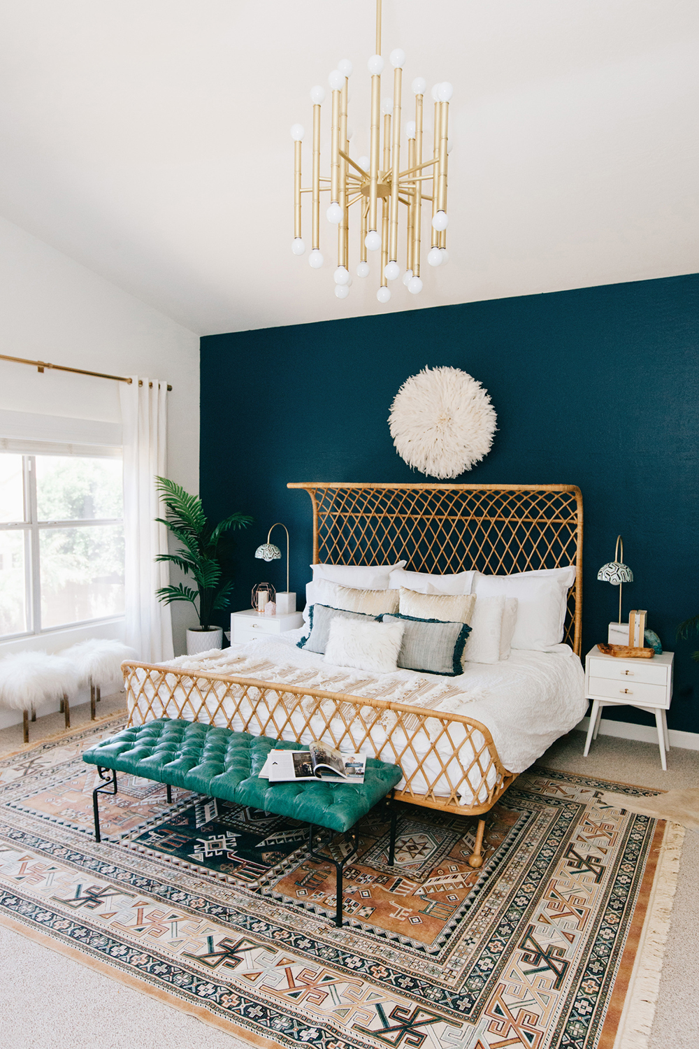
Design by Decorist; Photo by Rennail Hoefer
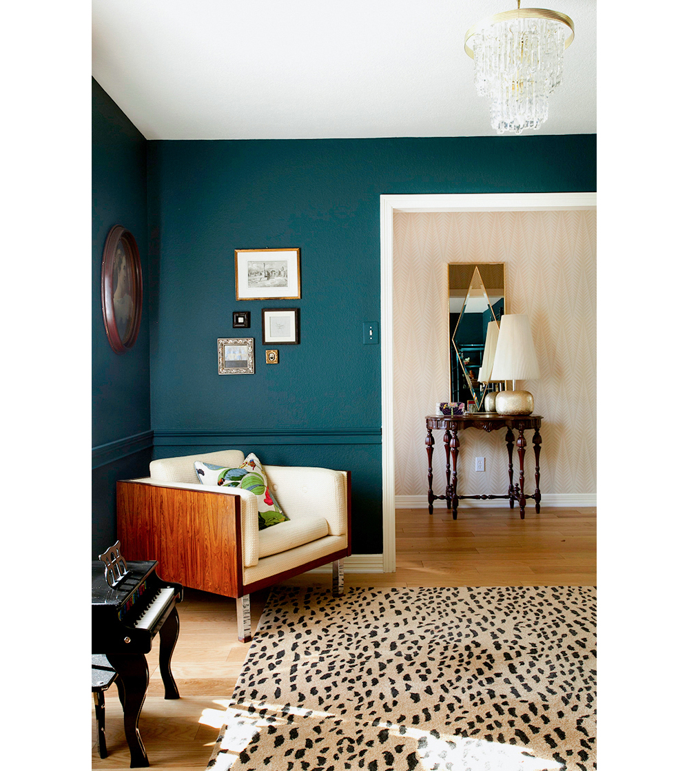
Erin Williamson Design
8

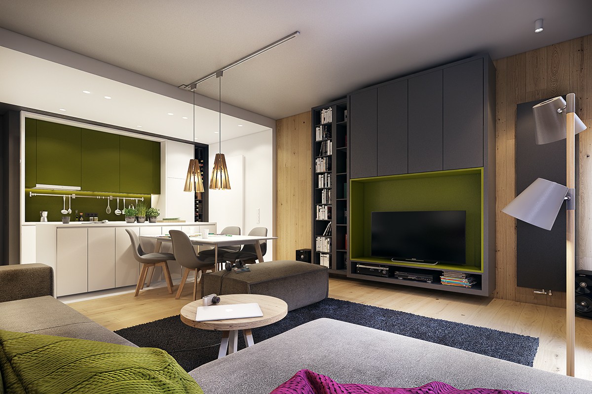
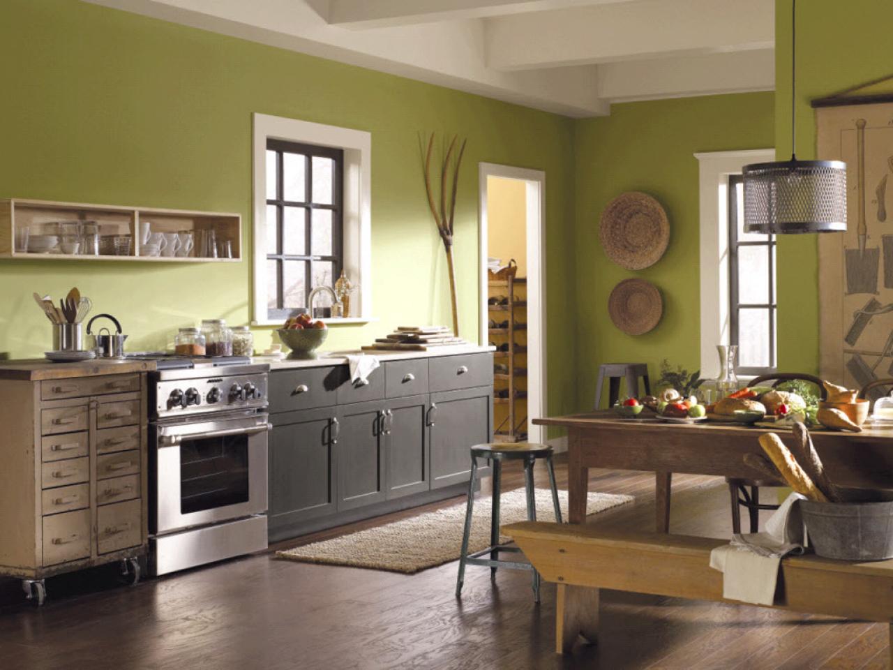
Golden Lime – PANTONE 16-0543
The golden undertone of this earthly shade evokes a refreshing compliment to fall classics.
9

Marina – PANTONE 17-4041
Marina brings both freshness and brightness to the fall palette enhancing a cool vibe into your overall design.
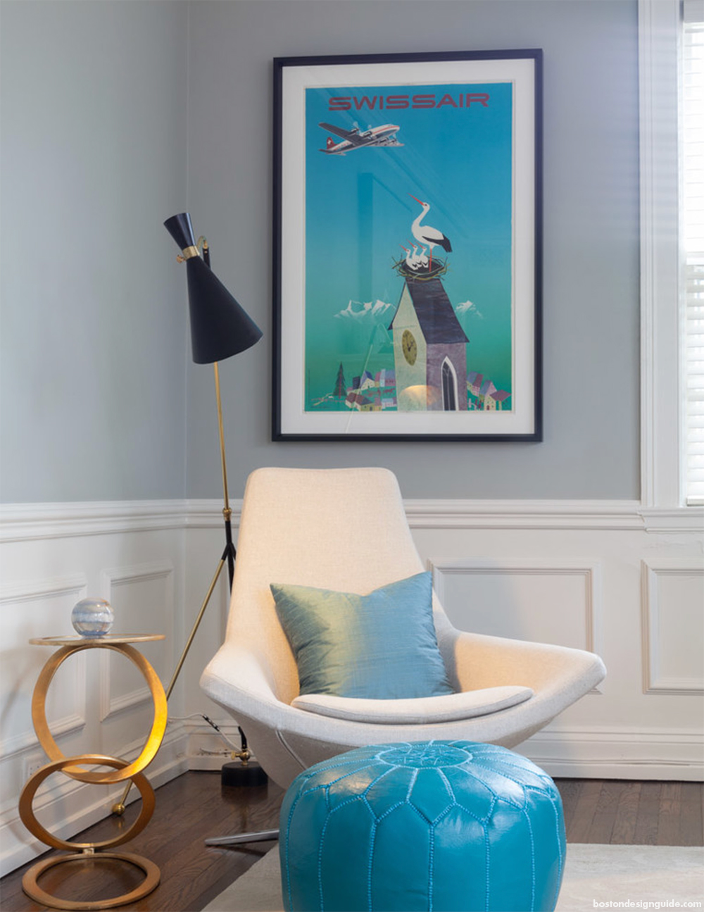
Interior Design by Janine Dowling; Photo by Sam Grey
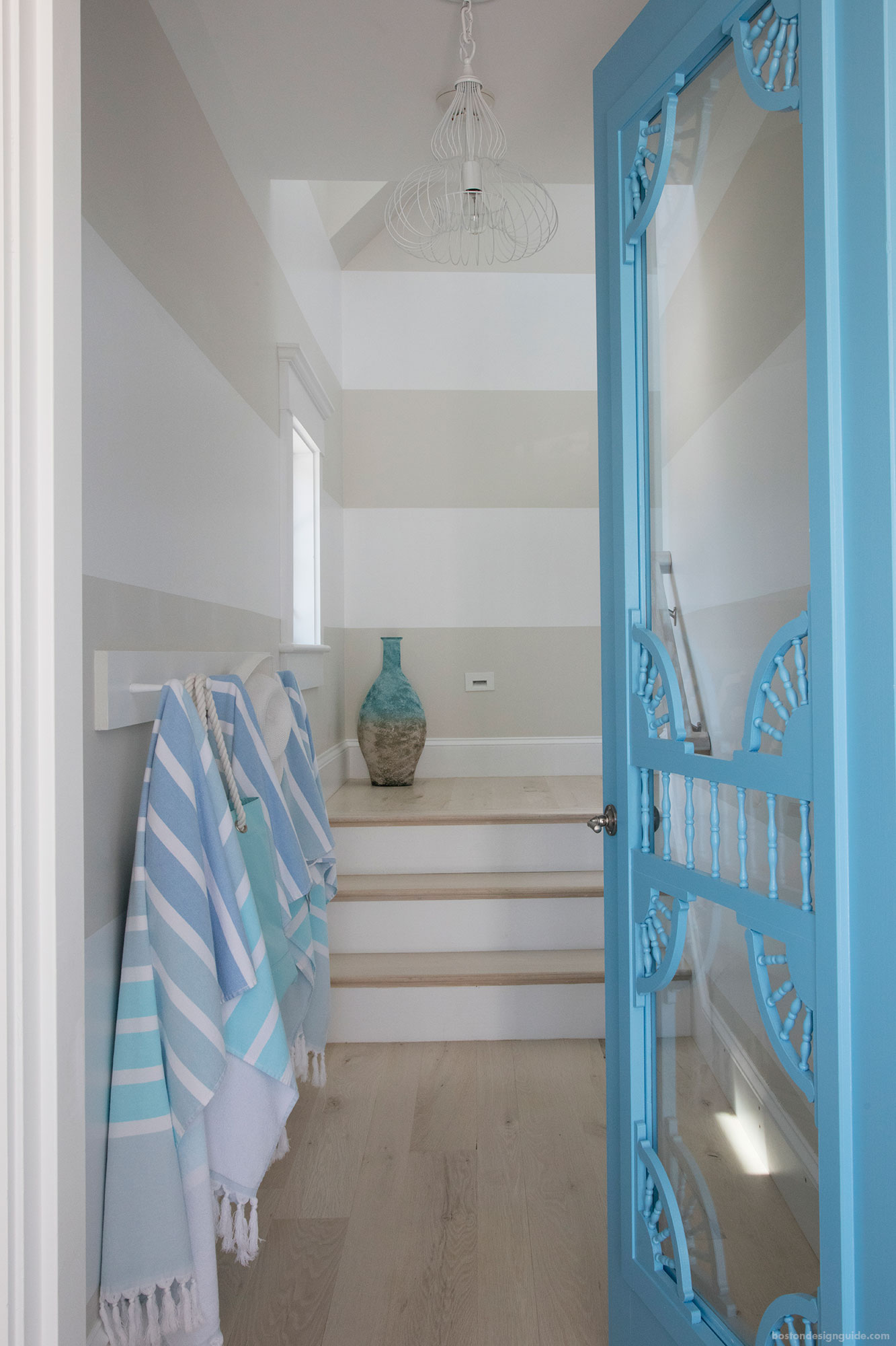
Interior Design by Vu Design
10

Autumn Maple – PANTONE 17-1145
This warm, quintessential autumn color introduces warmth into the palette and your home.
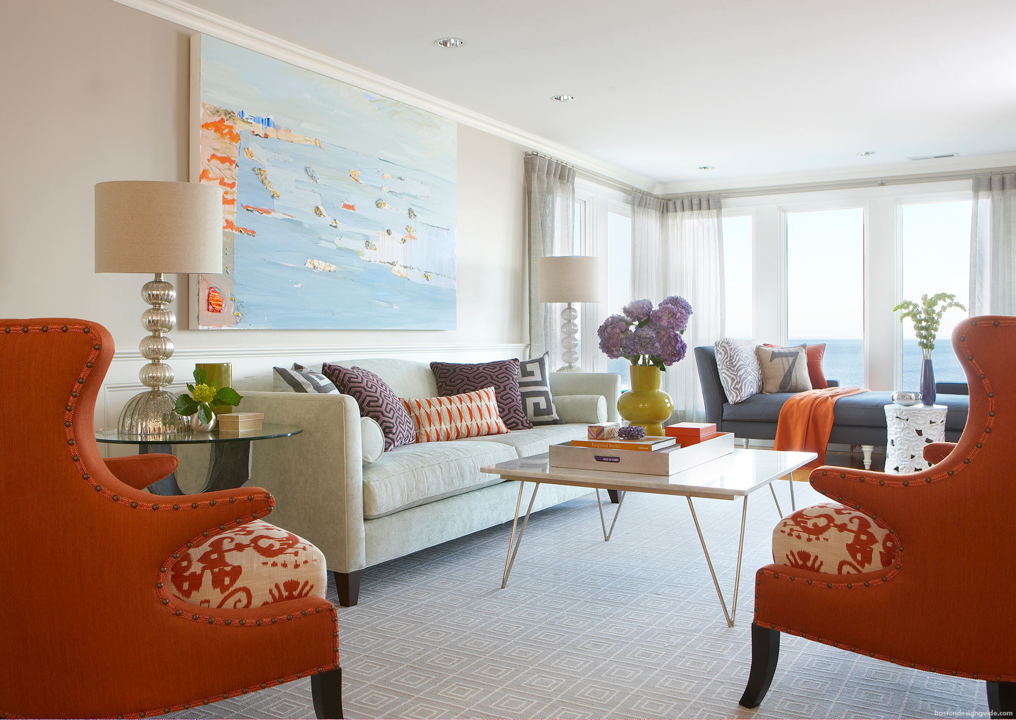
Interior Design by Racher Reider Interiors
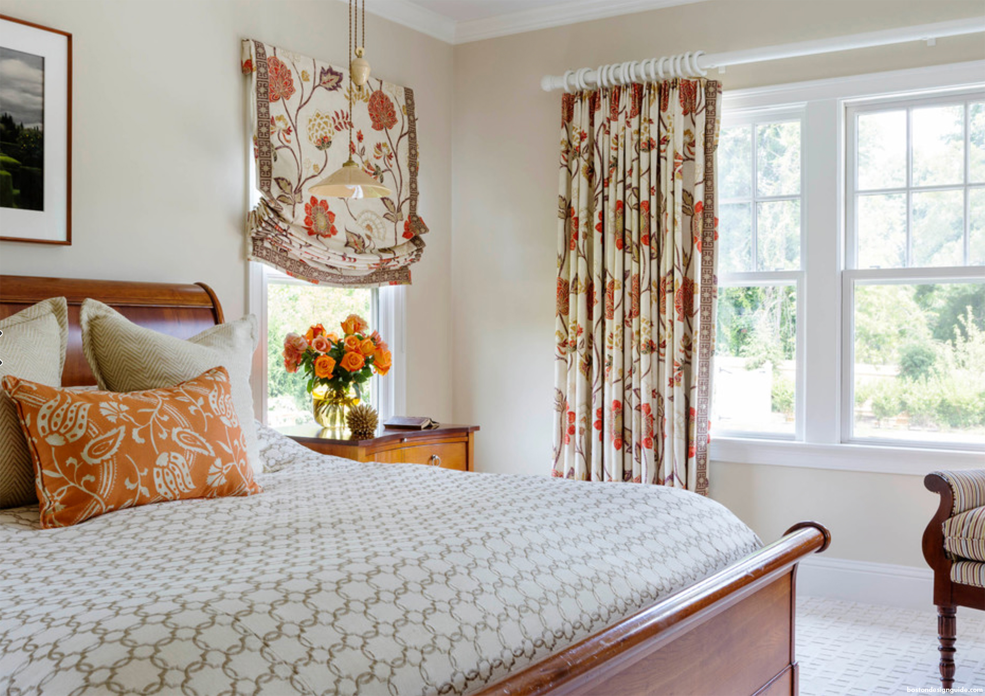
Interior Design by Heather Vaughan; Photo by Greg Premru
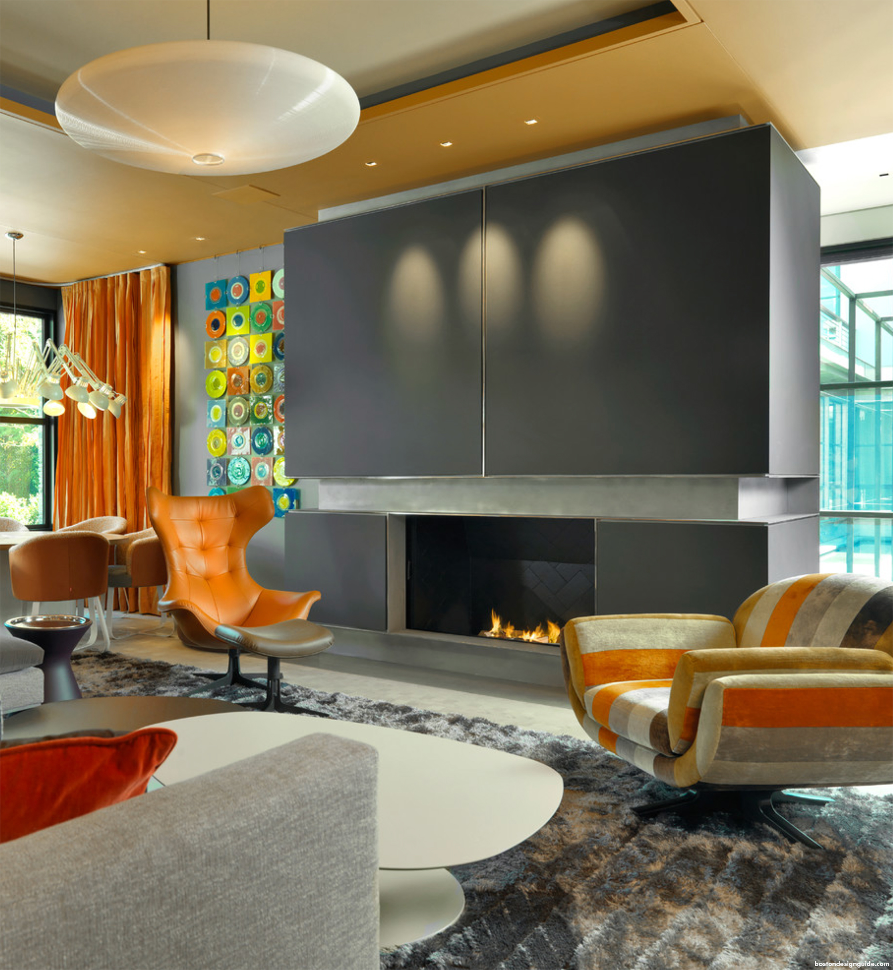
Architecture by Adolfo Perez Architect; Photography by Richard Mandelkorn
How do you incorporate the Fall 2017 PANTONE colors into your home design? #BostonDesignGuide
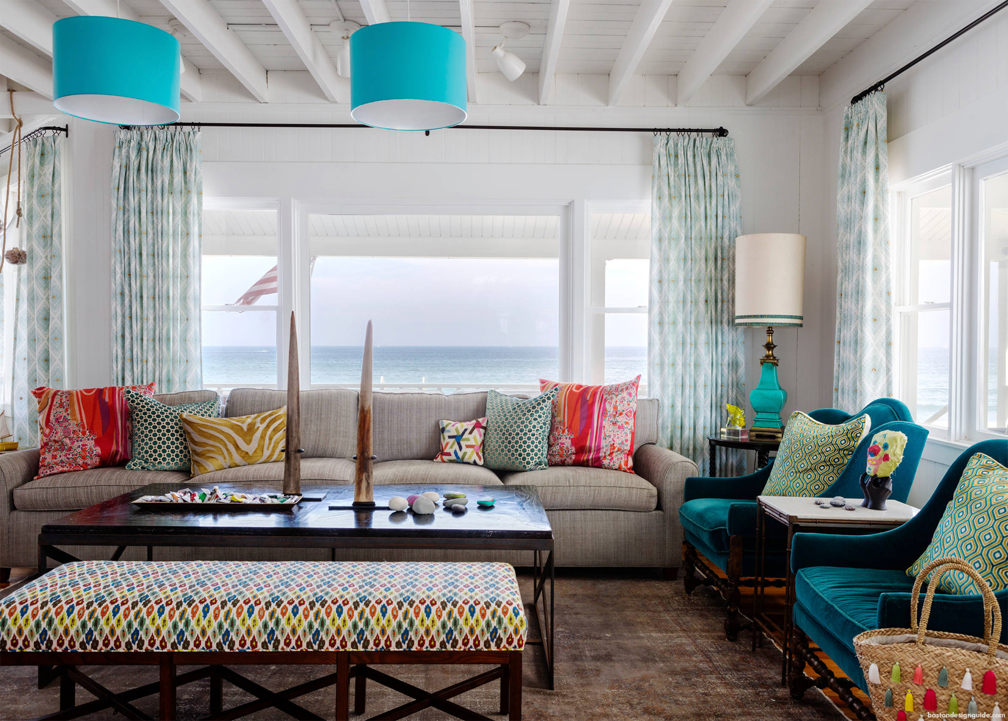 Interior Design by Heather Vaughan; Photo by Greg Premru
See How To Use the PANTONE Spring 2017 Fashion Color Report in Your Home


Add new comment