January 12, 2017 | carly stewart
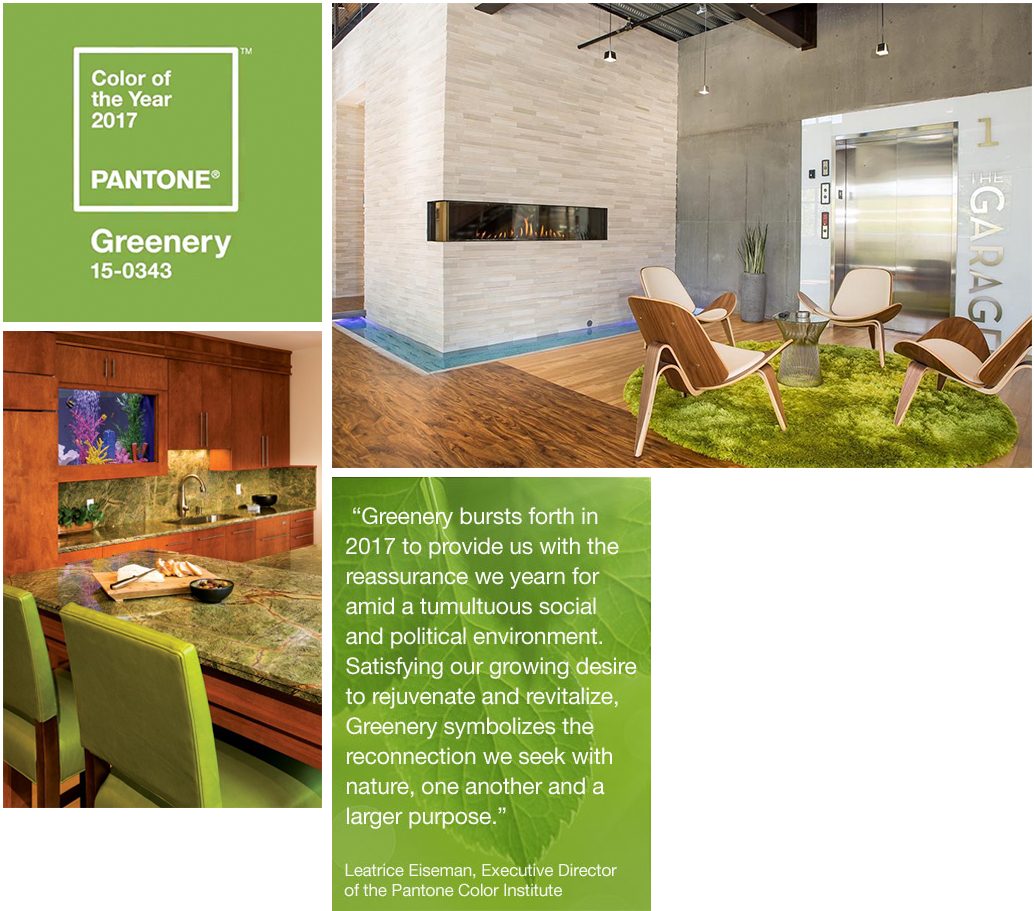
2017 is the year for new beginnings. PANTONE Color Institute symbolizes these changes in choosing the Color of the Year, Greenery. PANTONE Color of the Year is a symbolic color selection of what the experts see taking place in the global culture throughout the year that brings a specific expression of mood and an attitude.
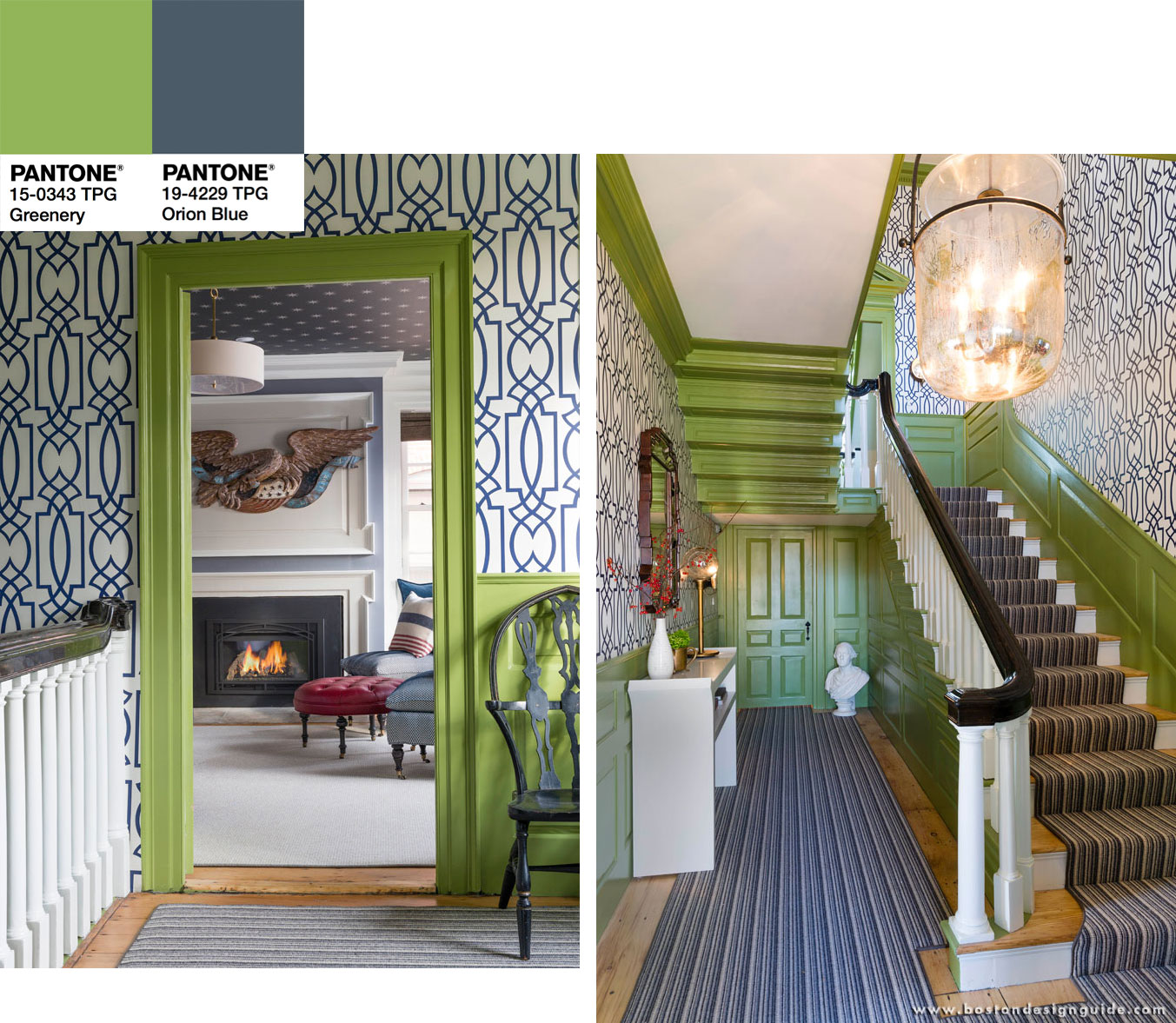
PANTONE Greenery is the neutral color of nature and is versatile in pairing with neutrals, brights, deeper shades, pastels, metallic and even Rose Quartz and Serenity, PANTONE Colors of the Year for 2016.
(Left: Cumar, Inc.; Right: Ortal USA modern fireplaces available at Commonwealth Fireplace)
GREENERY TRANSITIONS

Greenery - Color of the Year 2017
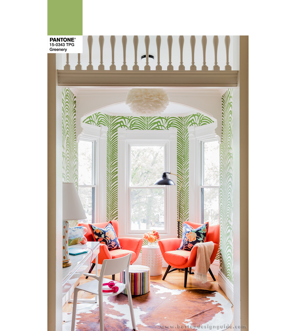
Interior Design by Elizabeth Home Décor and Design
Serenity - Color of the Year 2016
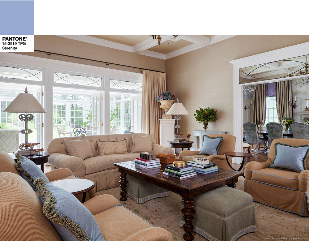
Interior Design by Weena & Spook
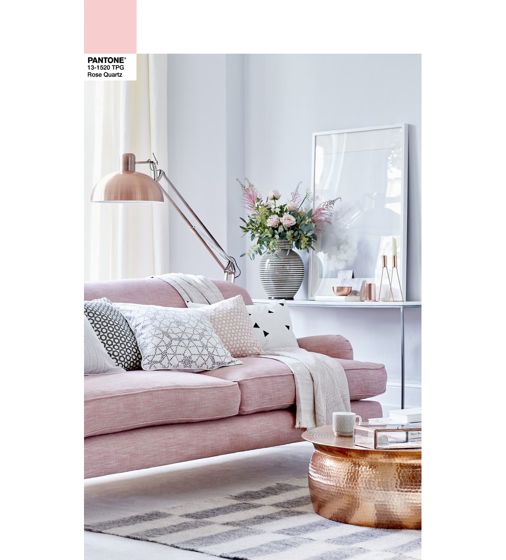
Rose Quartz - Color of the Year 2016
Treetop
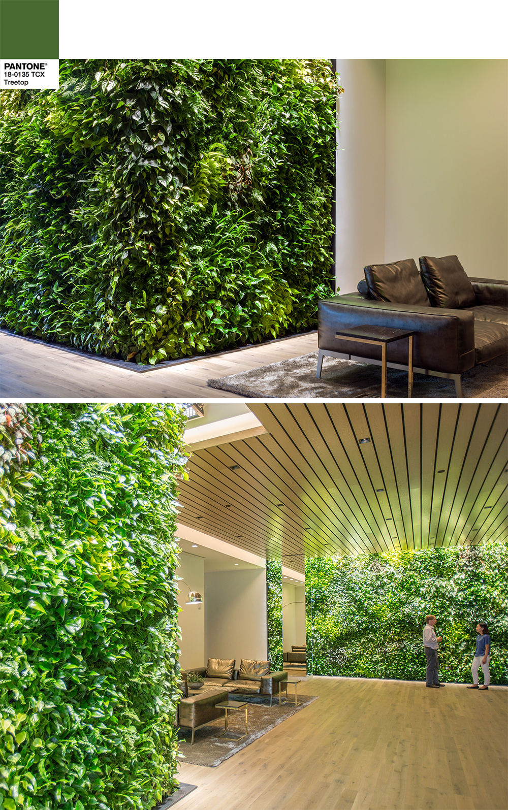
A touch of Treetop. LeBlanc Jones Landscape Architects literally brings Greenery into your space for a lively and refreshing atmosphere.
Twilight Purple
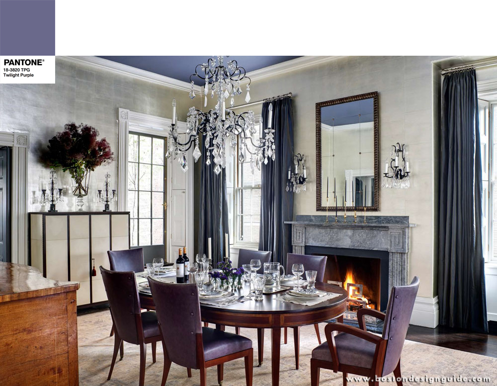
The custom draperies designed and fabricated by Carole Bruce Workroom are complimented by the color of the ceiling, chairs and accessories in this elegant, English style dining room.
Orion Blue
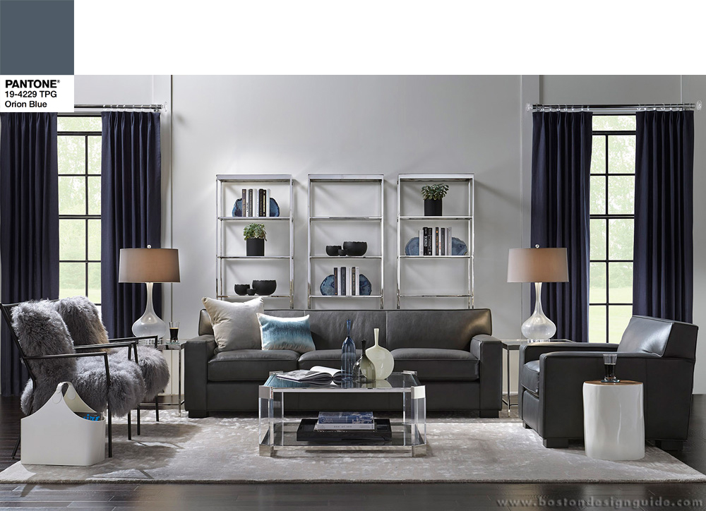
Mitchell Gold + Bob Williams, Boston
Calypso Coral
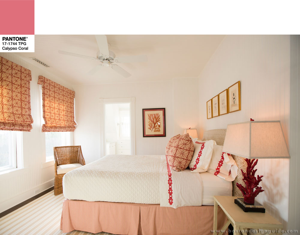
Interior Design by Carolyn Thayer Interiors
Nimbus Cloud
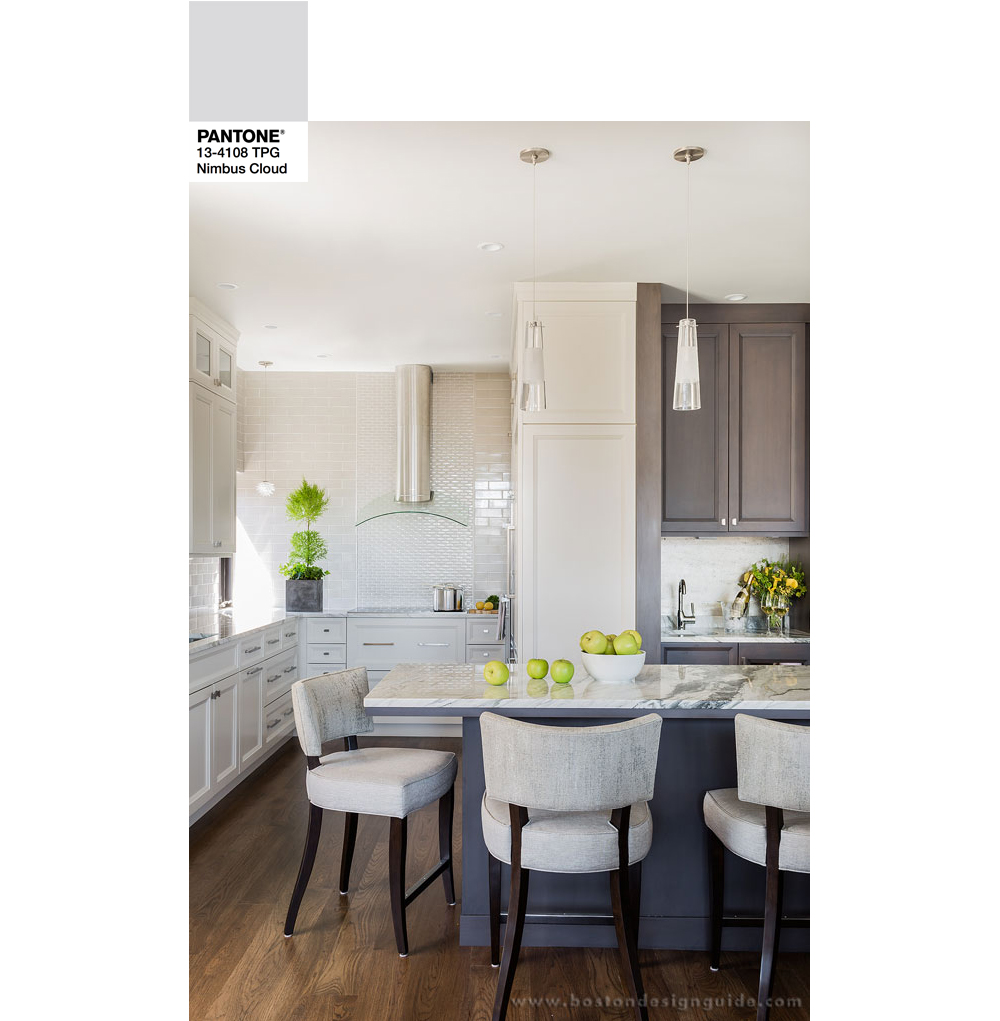
Interior Design by Daher Interior Design
The light gray Nimbus Cloud opens and warms a room while naturally flattering Greenery tones throughout the space.
MORE GREENERY 2017 TRANSITION COMBINATIONS
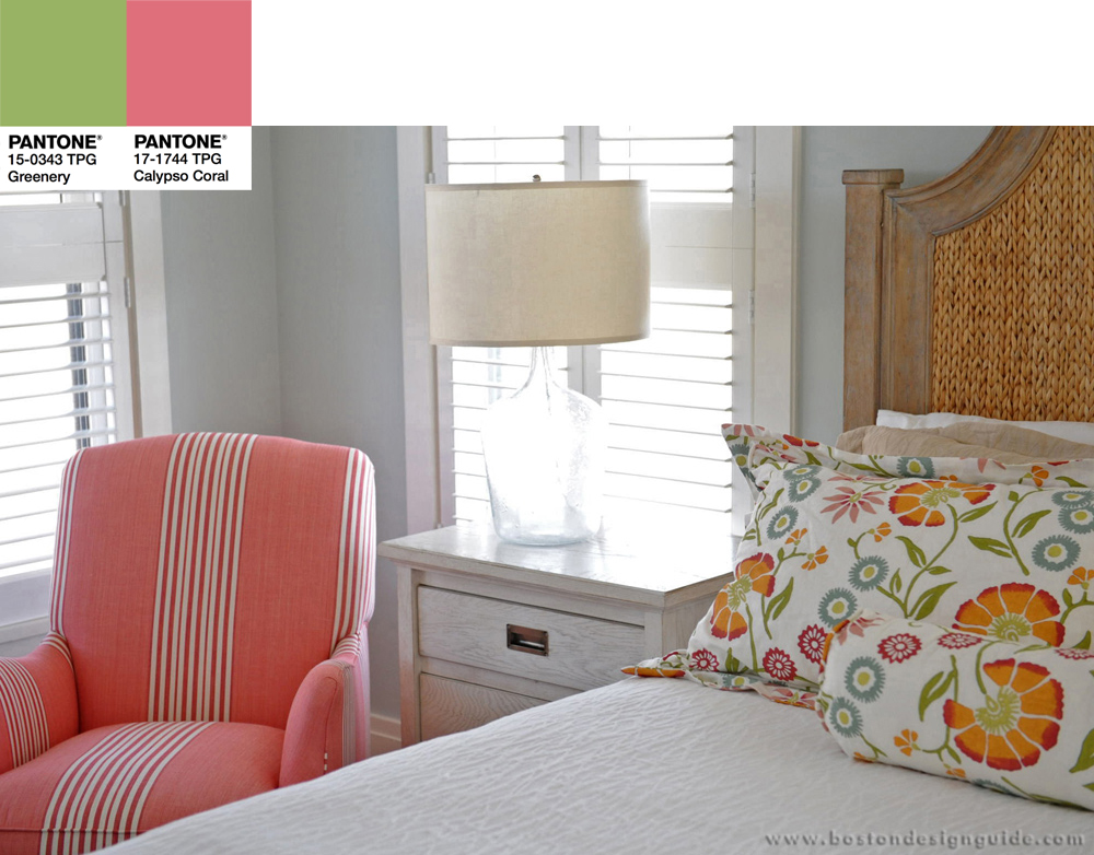
Interior Design by Donna Elle
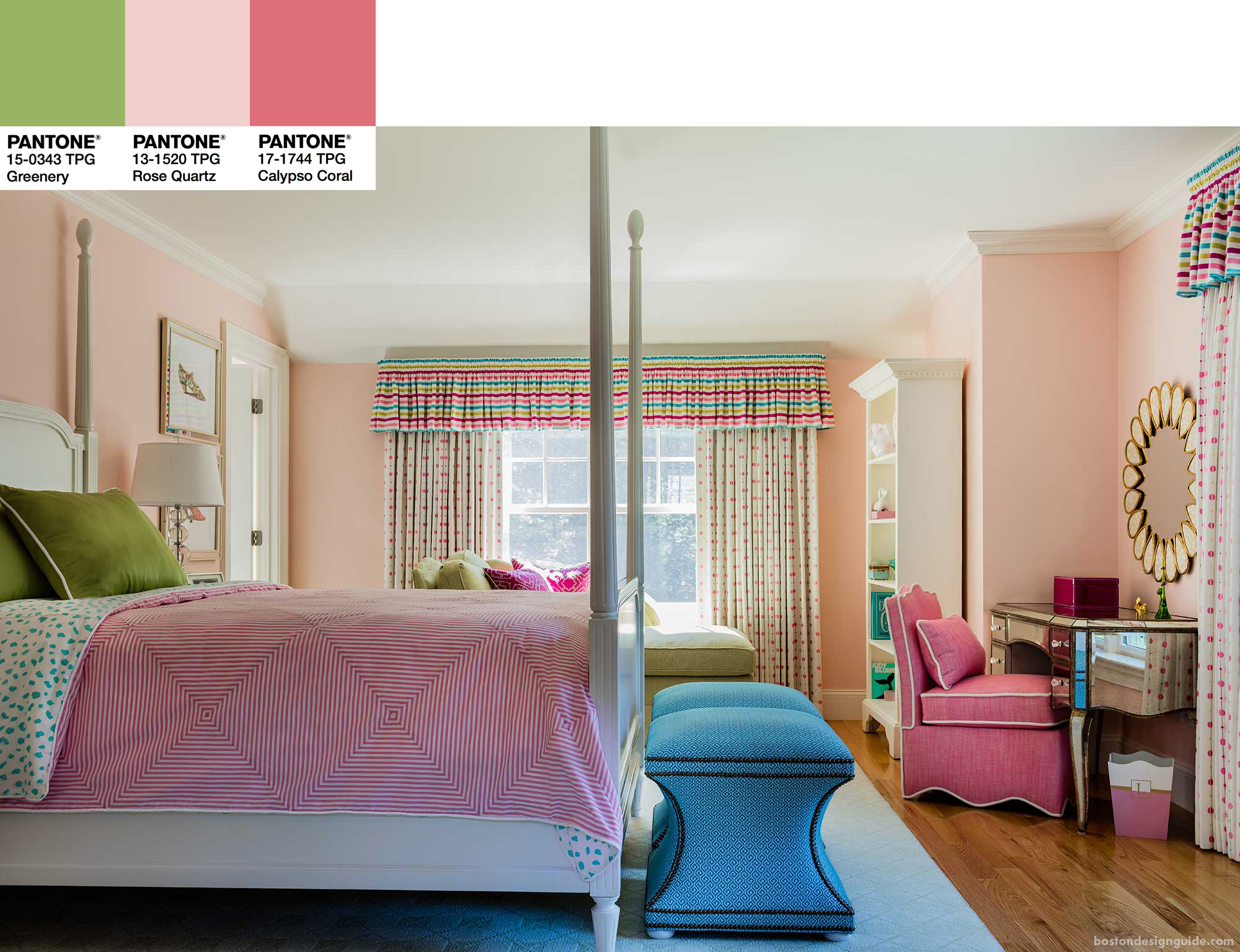 Interior Design by Wilson Kelsey Design
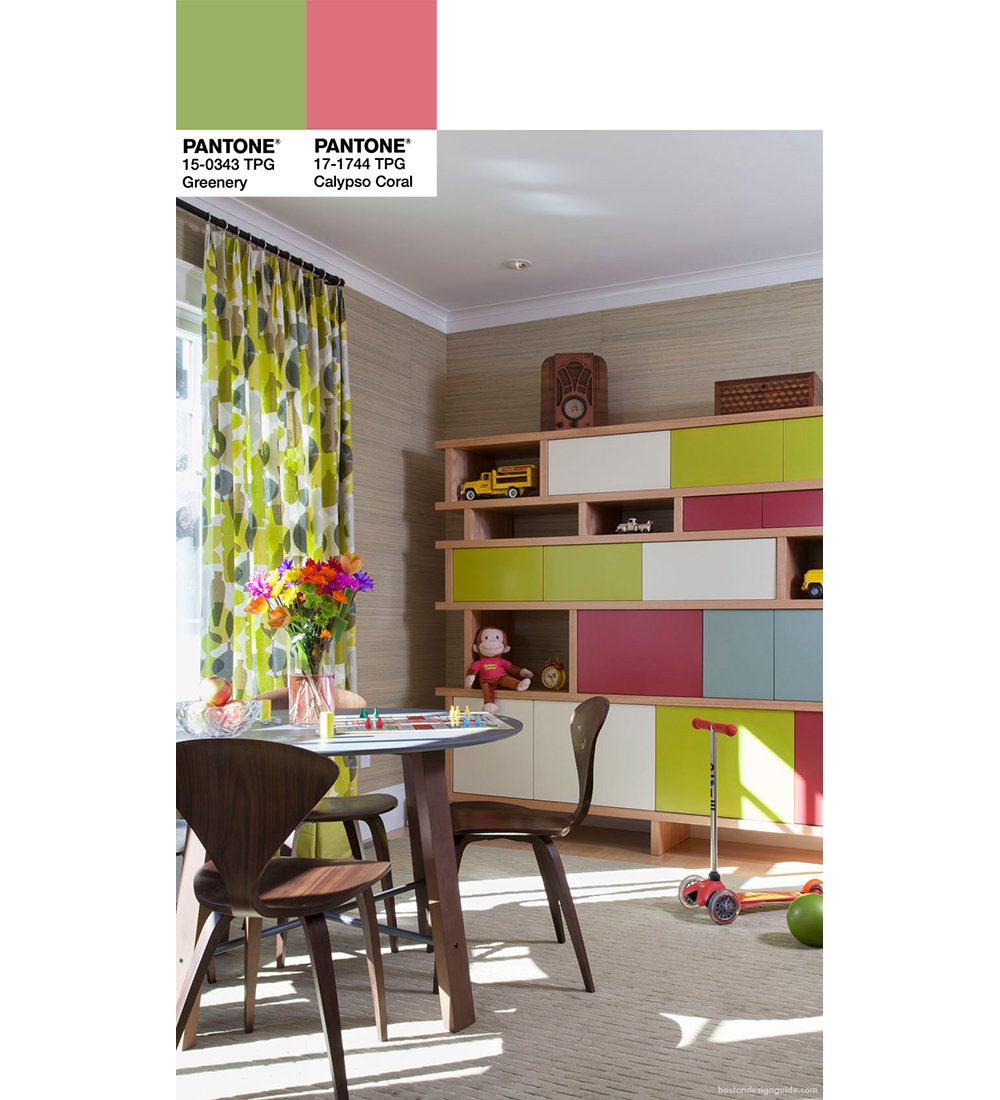
Interior Design by Plum Interiors
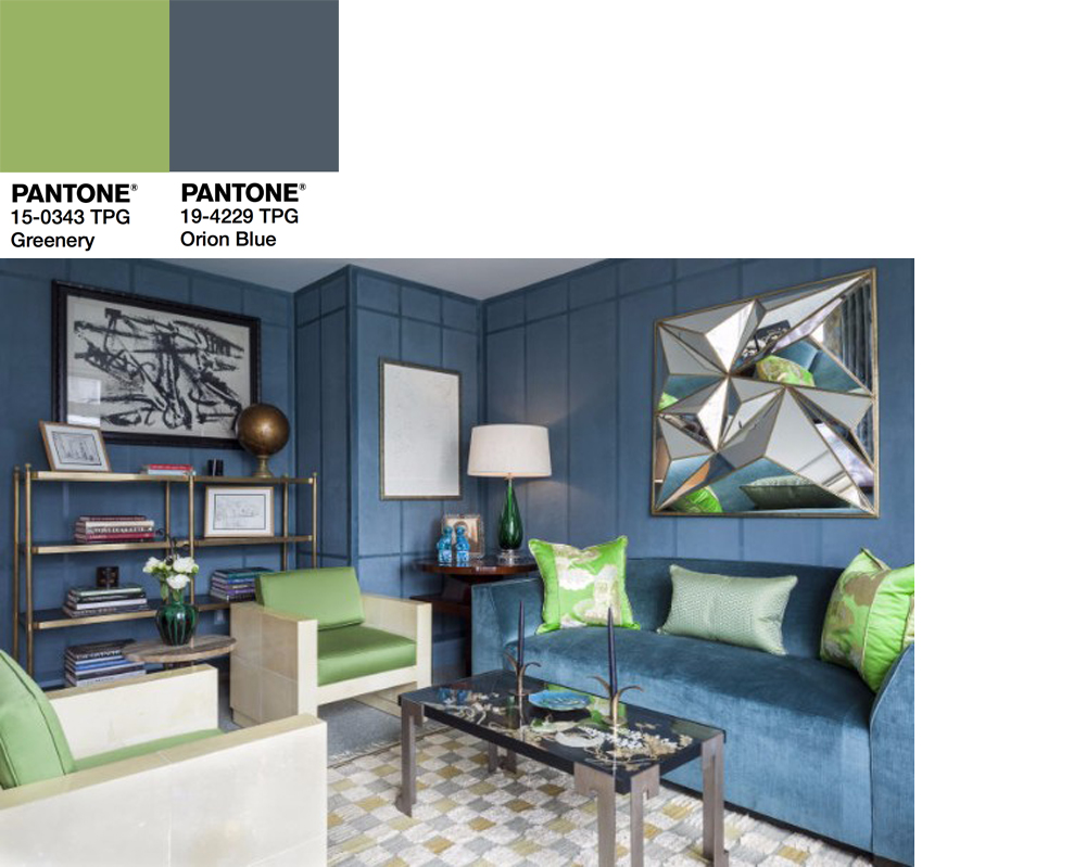
Shop this look at Il Decor in Boston.
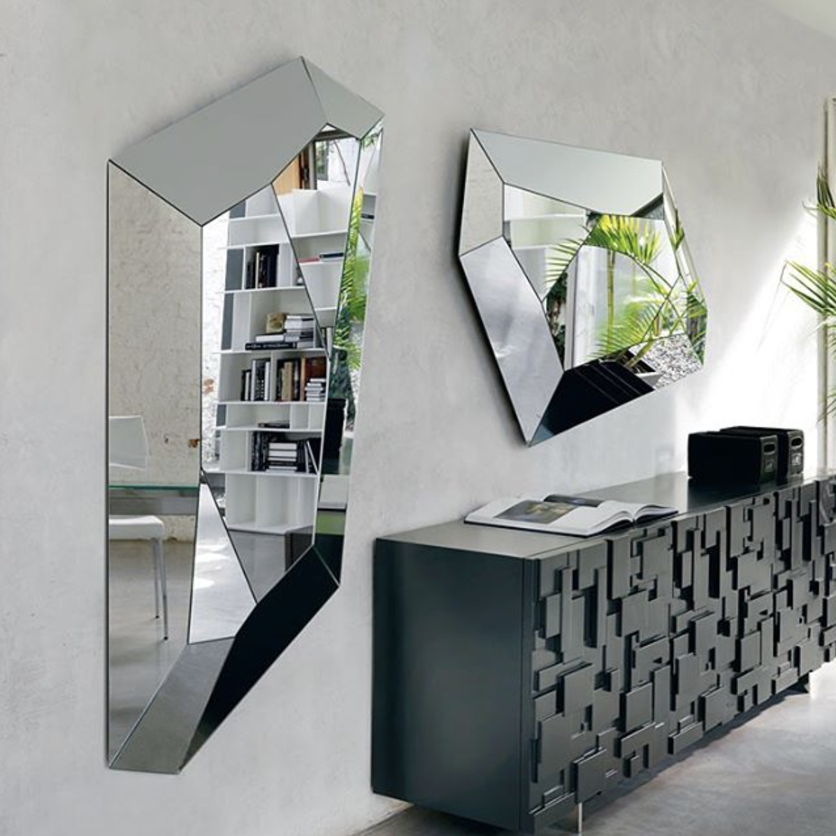
Diamond mirror by Cattelan Italia; available at Il Décor – European and Italian furniture showroom in Boston


Add new comment