October 9, 2018 | Sandy Giardi
“Everyone likes modern cars and modern fashion, why not modern architecture?” muses Adolfo Perez, principal of Adolfo Perez Architect, who is known throughout New England for his contemporary constructs. “To say you don’t like modern architecture just doesn’t make sense to me as an aesthetic choice.”
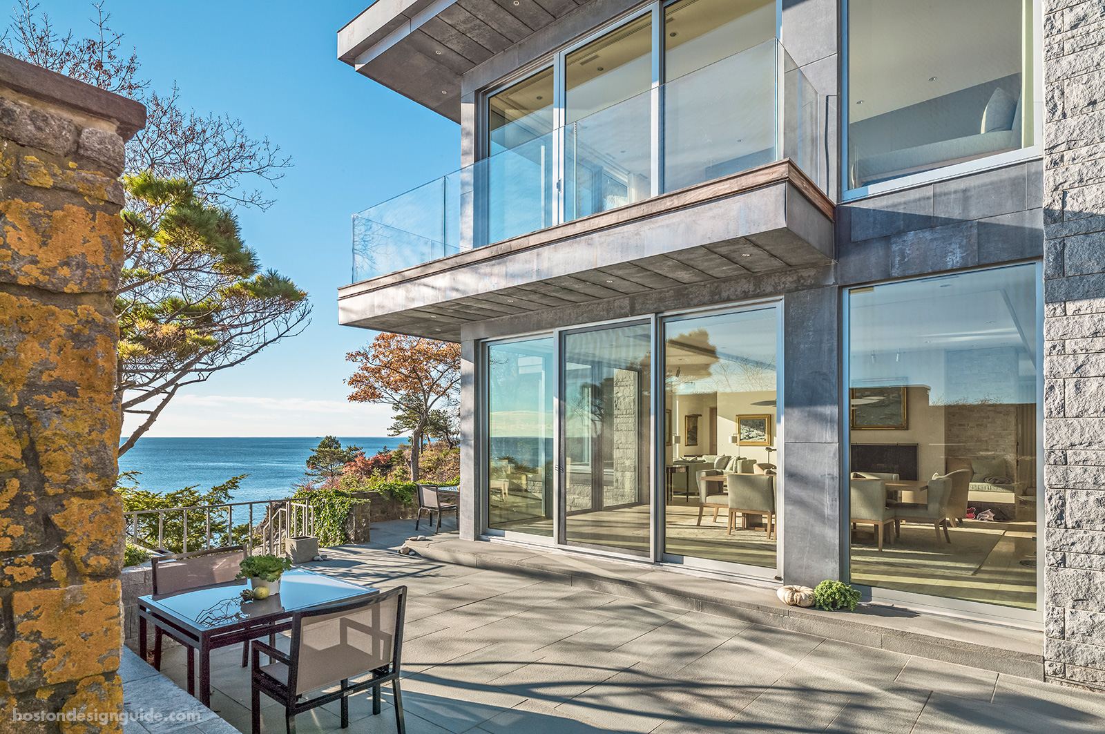
Many of the style’s hallmarks—an inherent relationship to site, a mindfulness for materials, a bona fide indoor-outdoor relationship, a flat roof—can become pastiches if not well thought out. That isn’t the case for Perez. With all of his architecture, he ruminates over details large and small. A new home in Manchester-by-the-Sea, perched atop a cliff overlooking the rocky terrain and tides of the Atlantic, epitomizes his aesthetic approach.
Says Paul Reidt, president of Kochman Reidt + Haigh Cabinetmakers (KR+H), who worked on the project, “Adolfo can go from the global to a molecular level of detail.” Which, for this home, meant “a very crisp modernist detailing and an exacting vocabulary.”
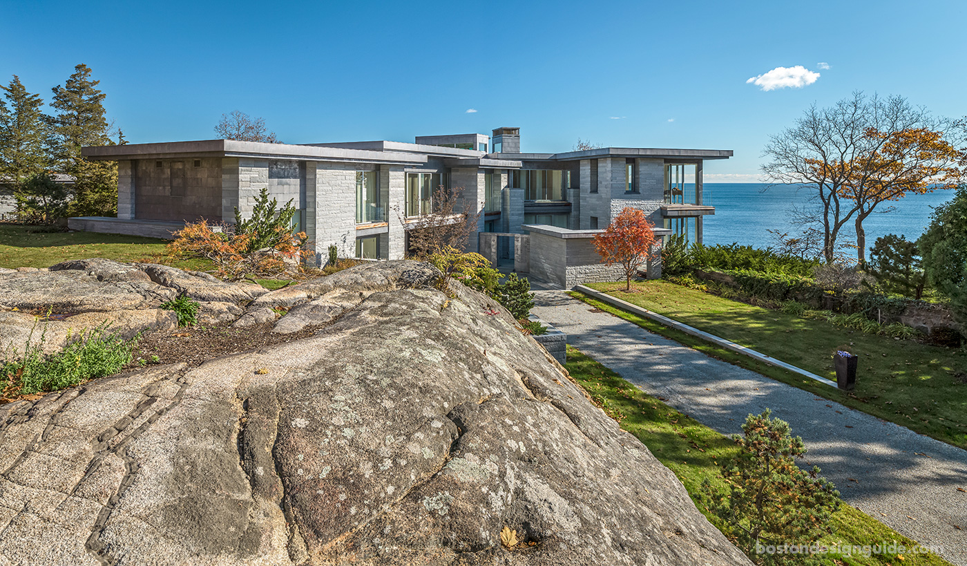
The home’s exterior represents the global end of the spectrum. “We all agreed that the home had to be stone,” says Perez, who selected granite due to the pronounced stone outcropping fringed by thickets of vegetation. Perez would have gone darker yet to reflect the palisades, but the client preferred a lighter shade of gray. The granite chosen has an organic appeal that speaks to its site, as well as permanence, says Perez, and a windswept—and sunswept—vibe.
The roof is a maintenance-free, lead-coated copper. Where others in New England have a predilection for wood, shingles or clapboard, Perez employs stucco, stone and lead-coated zinc—“durable materials that can stand the test of time.”
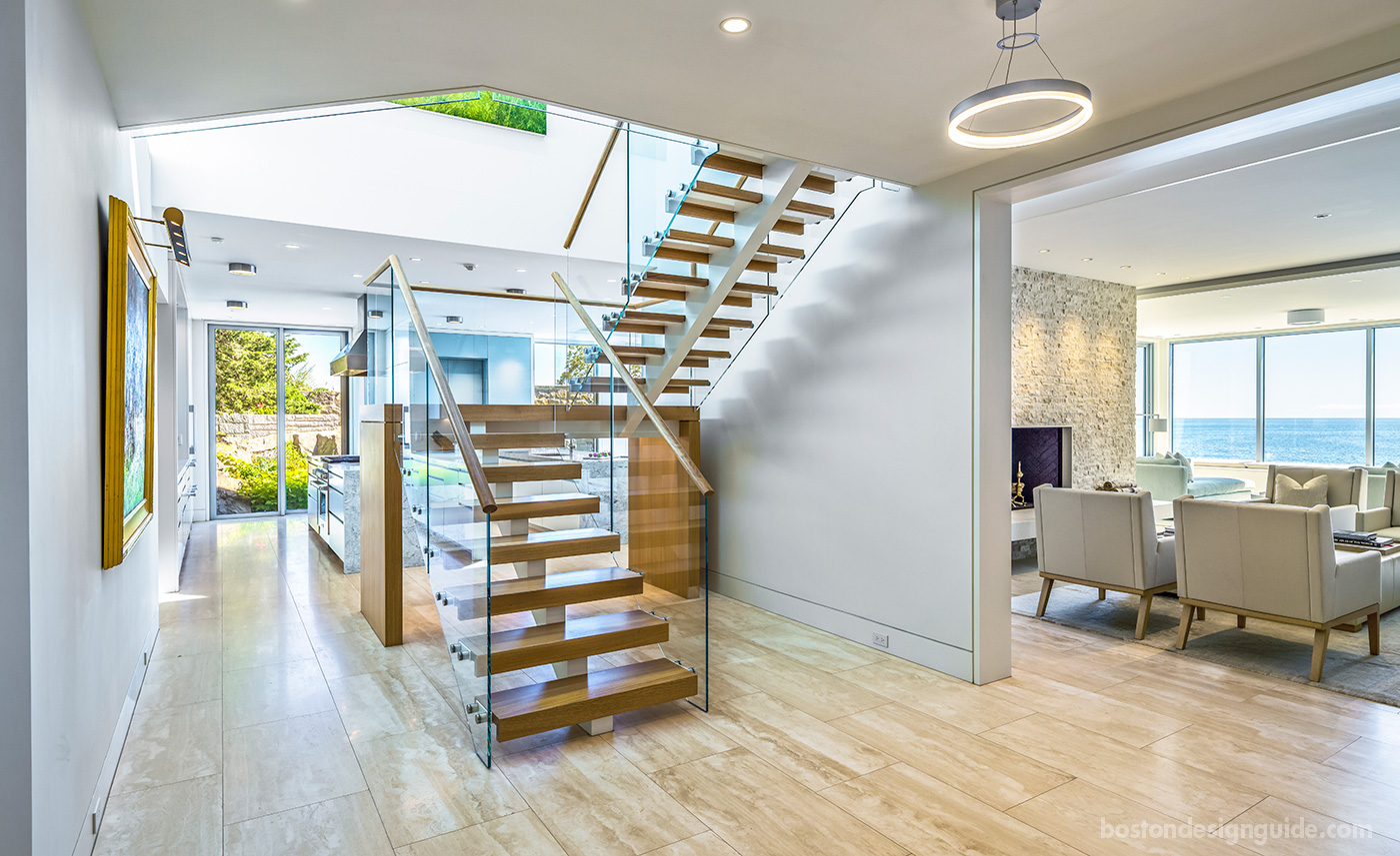
The stair is the knuckle of the home and takes a sculptural shape. The travertine floor comes from a full block from Italy that was dry laid and numbered. Its connected veining is "unlike any other project," says Peng.
Perez uses materials to forward the design. His choices are integral to the structure, sculptural even. “This same house rendered in wood or plaster wouldn’t look the same,” he says. Besides, granite, steel and glass have an essential nature, he continues. “They’re not trying to be anything they’re not.”
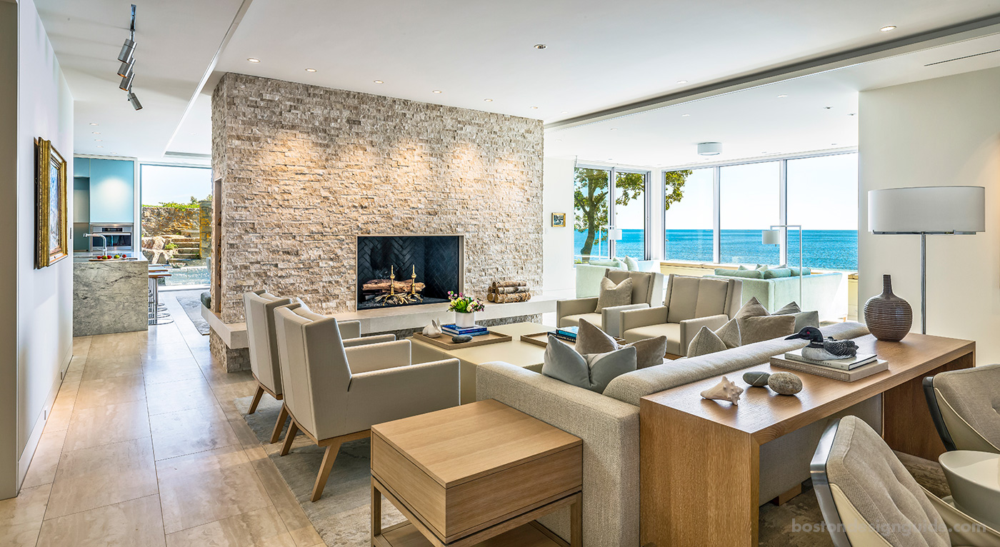
The limestone fireplace commands attention as the focal point in the room and serves as an architectural divider. It is designed and detailed differently, one side to the other, with a beautiful bench feature by Cumar, Inc.
Glass was a must for this private home that drinks in the azure waters at its feet. By all accounts, the setting is exquisite, rife with cantilevered spaces that take you closer still to the elements. “The home is in service to the view,” says Perez. “The view becomes everything. The house is almost incidental to it.”
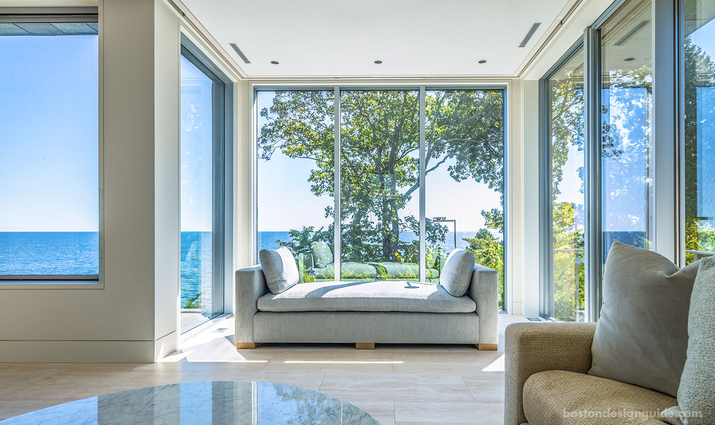
The house's many seating areas have distinct designs and purposes within its open plan. This allows the homeowner to experience the living spaces in many different ways—from convening at the dinner table to quietly reading a book by the ocean.
The architect doesn’t see the structure as modern with a capital “M,” no doubt because the homeowners—fearlessly, credits Reidt—left a traditional home in Hamilton, for this clean, minimalist new home by the sea. Perez, together with interior designer Meichi Peng of Meichi Peng Design Studio, called for interior architecture that is as crisp as can be, using rich materials of stone, wood and tile in ways that keep the surfaces simple, and the forms seamless and appreciated.
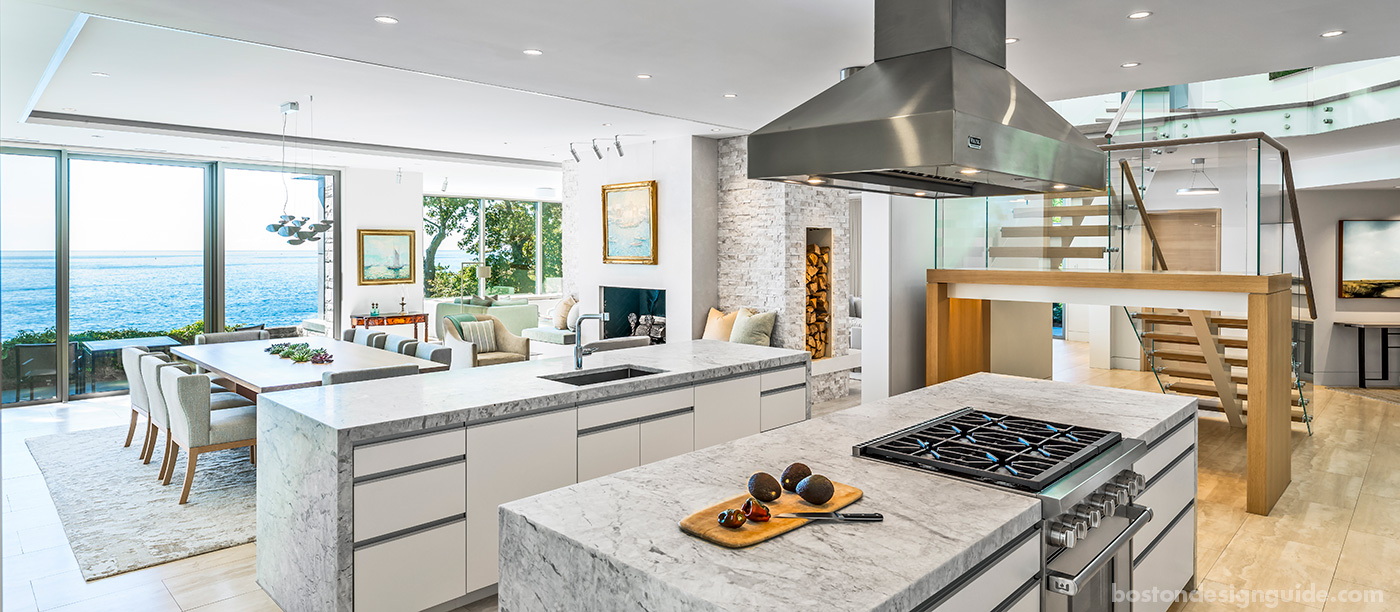
The contemporary kitchen was zoned specifically to take full advantage of the home's main asset—the ocean. The rectangular layout has a "sociable arrangement" with dual islands topped by hardy quartzite by Cumar, Inc. that "waterfalls" on both ends. The counters echo the limestone and tile installed by Installations Plus of the hearth.
In the kitchen, KR+H sank its teeth into the modernist details and finishes selected by Peng, like “assertive” quartzite countertops, an absence of hardware (and the complications thereof), and shelving fronted by clear and back-painted glass, which is, typically, not a cabinetmaker’s medium. “To the casual observer, modernist detailing may look simple, but it isn’t,” explains Reidt, giving a nod to the molecular. “Every detail plays a role.”
For the furnishings, Peng took a gentler approach, using the interior design scheme to reconcile the clients’ two disparate worlds. Peng struck a transitional balance within the homeowners’ comfort zone that also ties in the cherished, classic art collection from their former home. “We didn’t go for slick, modern furniture,” maintains Peng. “We wanted a clean, modern look, but with a softness.” In this sense, the furnishings became a bridge between the artwork and the contemporary interior, and the art was better for it, underscores Peng, because of the contrast.
"There is a misconception that contemporary interior design is hard and unfriendly. I'd like to change that perception. You can do a contemporary design that is comfortable and soft." —Meichi Peng
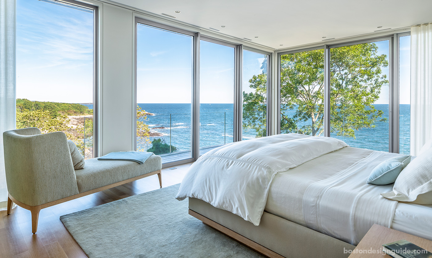
The bedroom overhangs the ocean and revels in the view. The glass balconies nearly disappear but are essential, says Perez. "When you do floor-to-ceiling glass, you have to open up to something."
The home’s monochromatic palette was driven by the landscape, with pale sea foam colors that stretch from one room to the next. The overarching concept reflects the “tranquility of the space,” says Peng, as well as the outside environment. It is light and airy, and inspired by the ocean vistas, rock formations and natural colors of the site.
The Team
Architect: Adolfo Perez Architect; Builder: Karpowich Building Contractors; Interior Design: Meichi Peng Design Studio; Kitchen Cabinetry: Kochman Reidt + Haigh; Millwork: Herrick & White Architectural Woodworkers; Stone: Cumar, Inc.; Tile Installation: Installations Plus; Technology Consultant: Eric Thompson; Landscape Architect: ZEN Associates
Images by Richard Mandelkorn


Add new comment