December 21, 2018 | Sandy Giardi
The goal of every custom new home is to create a welcoming, pleasing living environment that an owner will enjoy to the fullest. From the get-go, the architects, designers and builders set out to craft “joy-filled, happy spaces,” says architect Thomas Catalano of Catalano Architects. That goes without saying.
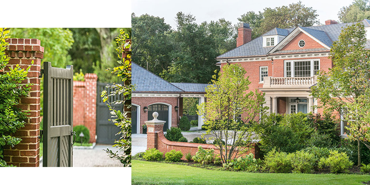
But not all new construction homes cast a light and exuberance of time gone by the way this one does. Built by Pioneer Construction under the deft hand of President Jeff Birnbaum with design input from Melissa Gulley of Melissa Gulley Interior Design, the home was conceived by Catalano in concert with the owners’ vision for a “classical brick house with a symmetrical front courtyard.” Its charm is a reflection of the mindset of all involved in the project—including the homeowners—as the team sought to embed context and character at every pass, and delighted in doing so.
The home is laden with care and dimension. Says Birnbaum, it is a “highly personalized setting” and a product of Pioneer’s close interaction with the owners that endures to this day. This is by design; Birnbaum deliberately keeps his company small to ensure he is “deeply involved in the building experience,” as well as every detail.
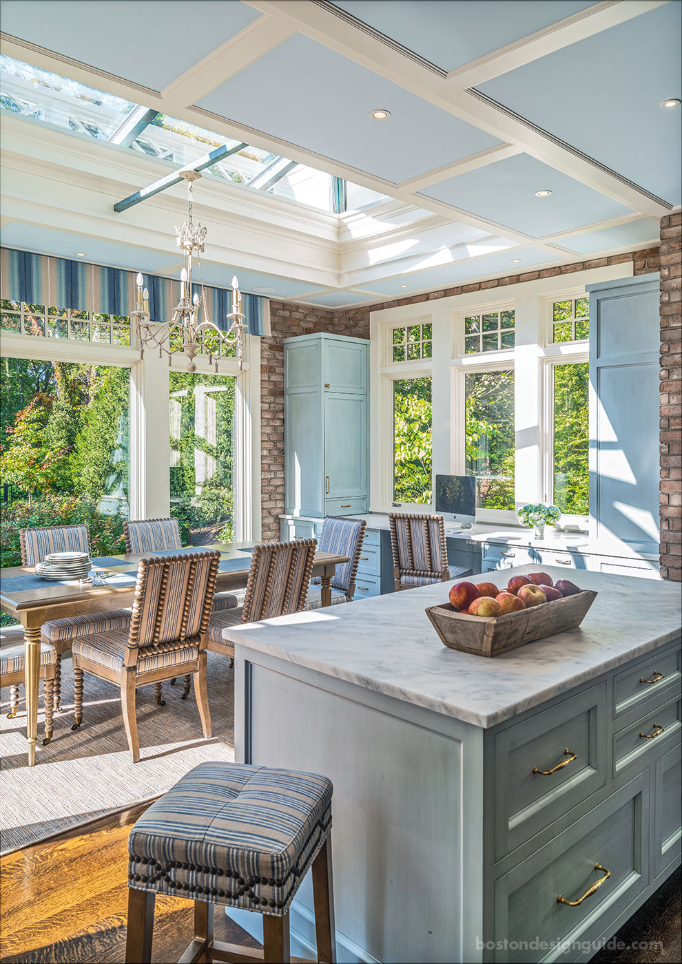
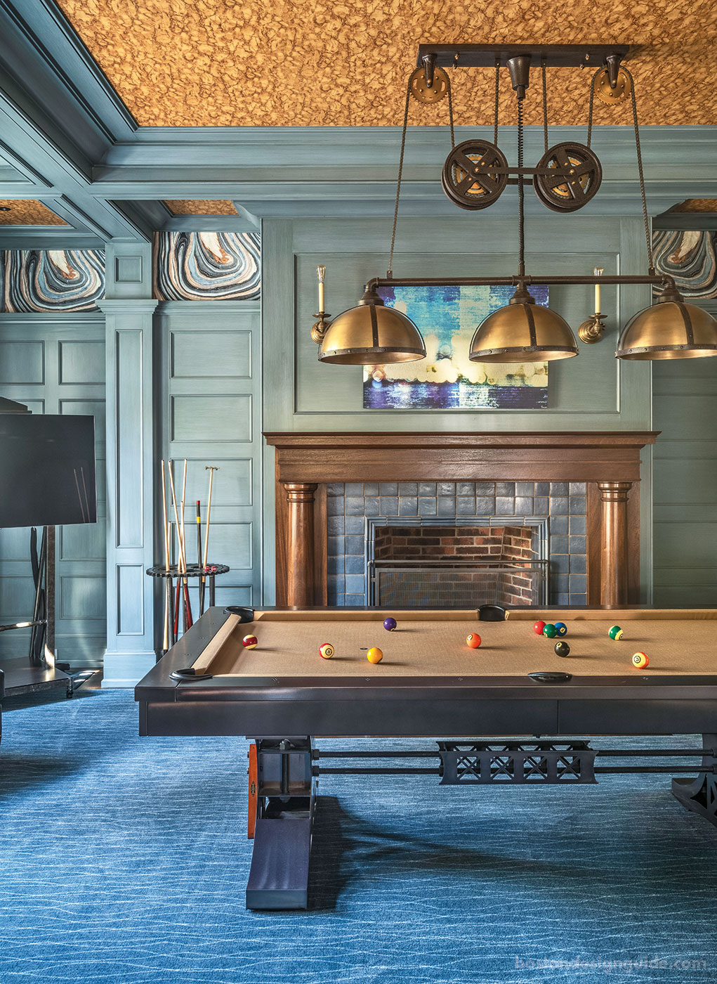
“Virtually every surface in the house has texture to imbue it with architectural character,” says interior designer Melissa Gulley, from the cerused scrubbed oak cabinetry and washed brick of the kitchen to the pervasive interior millwork, molding and paneling of the walls and ceilings to the doubly papered billiards room. “When you lose [texture],” explains Gulley, “a home looks like a new construction.”
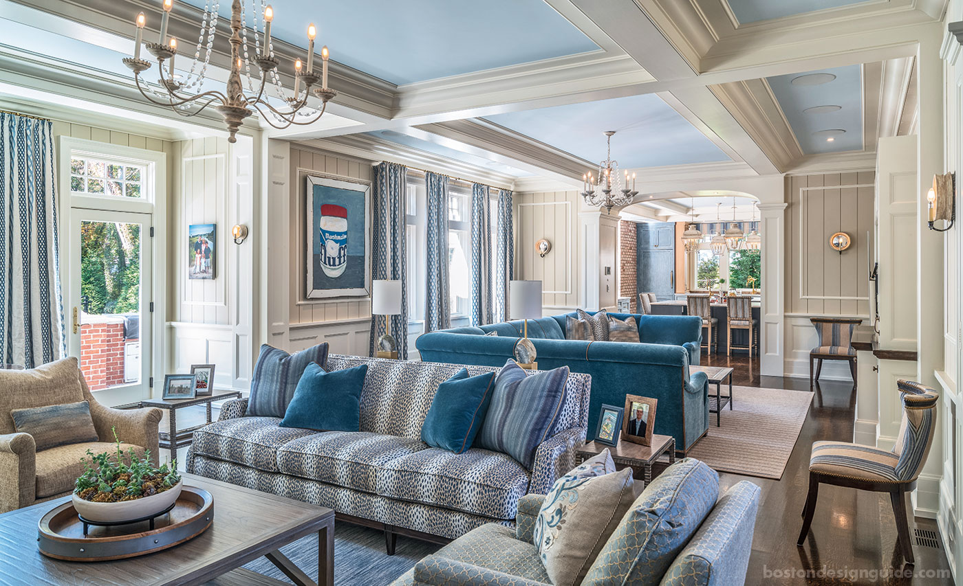
This house, however, reads like it has a memory, and yet it’s as fresh as new paint. With indigo sofas you can sink into, and a sun-soaked kitchen and stair halls, it has a buttoned-down chic that fits the family it was built for. There is a high level of detail and attention—from two-sided pillows to cascading, weighted draperies to unconventional nailhead designs that outline select furnishings—but there is also practicality. No areas are off-limits; everything is meant to be enjoyed.
And there is blue, in a spectrum of shades throughout the first floor, where the rooms open up to one another and flow easily from one space to the next without losing their individual identities. The hue owes its prominence to the site’s southern exposure. “The blue only works because of the degree of sunshine that comes in the house,” explains Gulley. “Without all that warm light, the blue would be cool.” The interiors become a study in contrast, and are undeniably cozy.
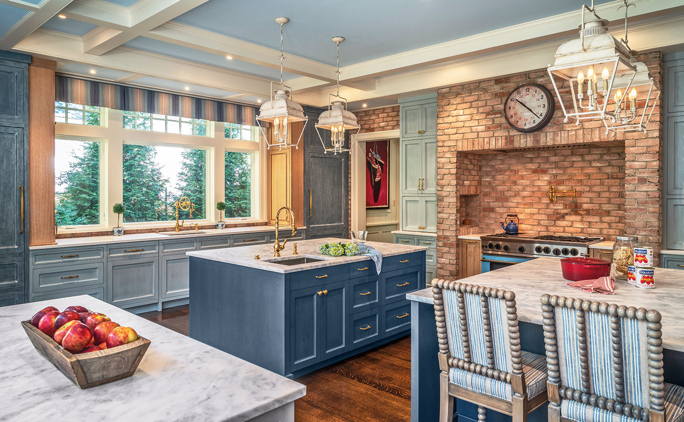
The home’s textiles served as the inspiration for Venegas and Company's fine, feel-good kitchen, and prompted kitchen designer Donna Venegas to integrate different shades of blue with the oak cabinetry. "The client and designer had selected sumptuous fabrics that we just had to spring from," shares Venegas. "The kitchen feels like a cashmere sweater and your favorite jeans—elegant yet so comfortable."
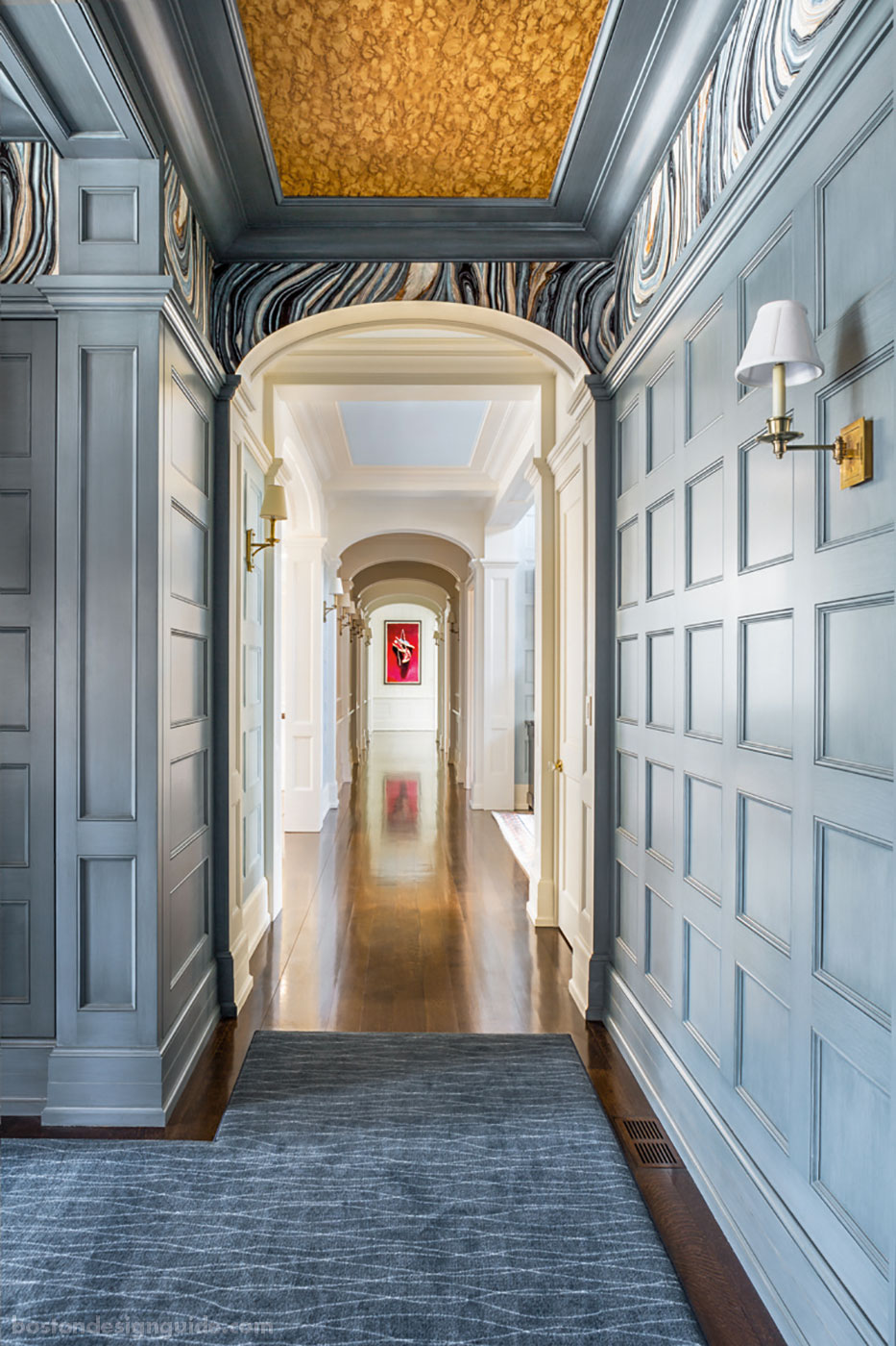
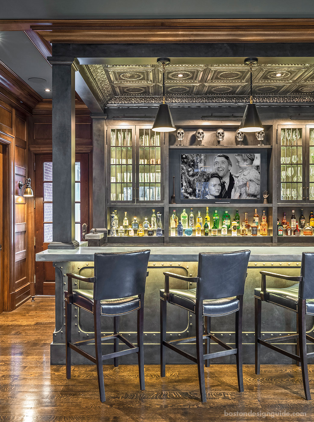
It has a strong point of view and plenty of personality, much like the billiards room and bar, a favorite area of both Birnbaum and Catalano. The former, a fireside gaming haven, is fashioned in slate-blue paneling punctuated by wallpaper depicting enlarged antique book paper and tortoise shell paper on the ceiling. The adjoining bar, also a masculine lair, has a steampunk vibe. It boasts a bar made to look like steel girders with a zinc top, a tin ceiling and a mirrored backdrop for choice bottles, precisely stepped and backlit. The space was fashioned from pictures taken by the owner in London, explains Birnbaum. “Melissa and the homeowner and I kind of ‘freelanced it.’”
As a whole, the interiors are wildly successful and pleasing. “Oftentimes, you don’t know why you like being in a space,” says Gulley. “And, really, if it’s done well, you shouldn’t.” It isn’t obvious,“it’s just a wonderful feeling.”
Though the homeowners live casually within their home, the composition of the exterior of the house is formal and historically accurate. It is all about classicism, symmetry and context. “For a home like this, we build on the architecture,” explains landscape architect Dan Gordon, principal of Dan Gordon Landscape Architects. His cues for the landscape stemmed from Catalano’s Georgian Colonial design, and he sought to participate in nestling the home within its context.
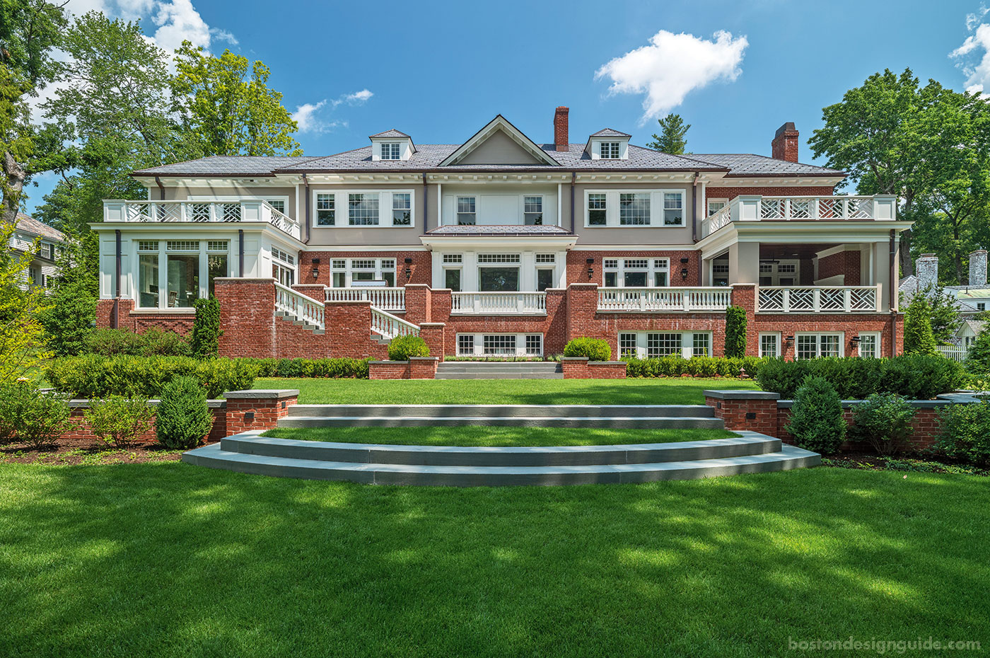
This interplay of landscape to architecture is apparent on the rear facade, which is organized in formal terraces with an asymmetrical stair. “We worked closely with the architect to create a lawn terrace that relates closely to those features, so that you land in a defined space, and transition from the terrace to the more naturalistic lawn and to the wetland.
It’s a team mentality, and a deep appreciation for architecture and landscape, that made this project truly come together.


Add new comment