November 9, 2021 | Jaci Conry
Architect Catherine Truman maximizes storage and minimizes wasted space in a 19th century Beacon Hill residence.
The homeowners loved this unit for its location, in the heart of Beacon Hill, and its gracious size of 3,000 square-feet, but knew it had two issues: lack of storage and a lot of wasted space in hallways. A young family with one child and others planned, they knew they needed to maximize every inch of the space and worked with architect Catherine Truman to make modifications to address their needs.
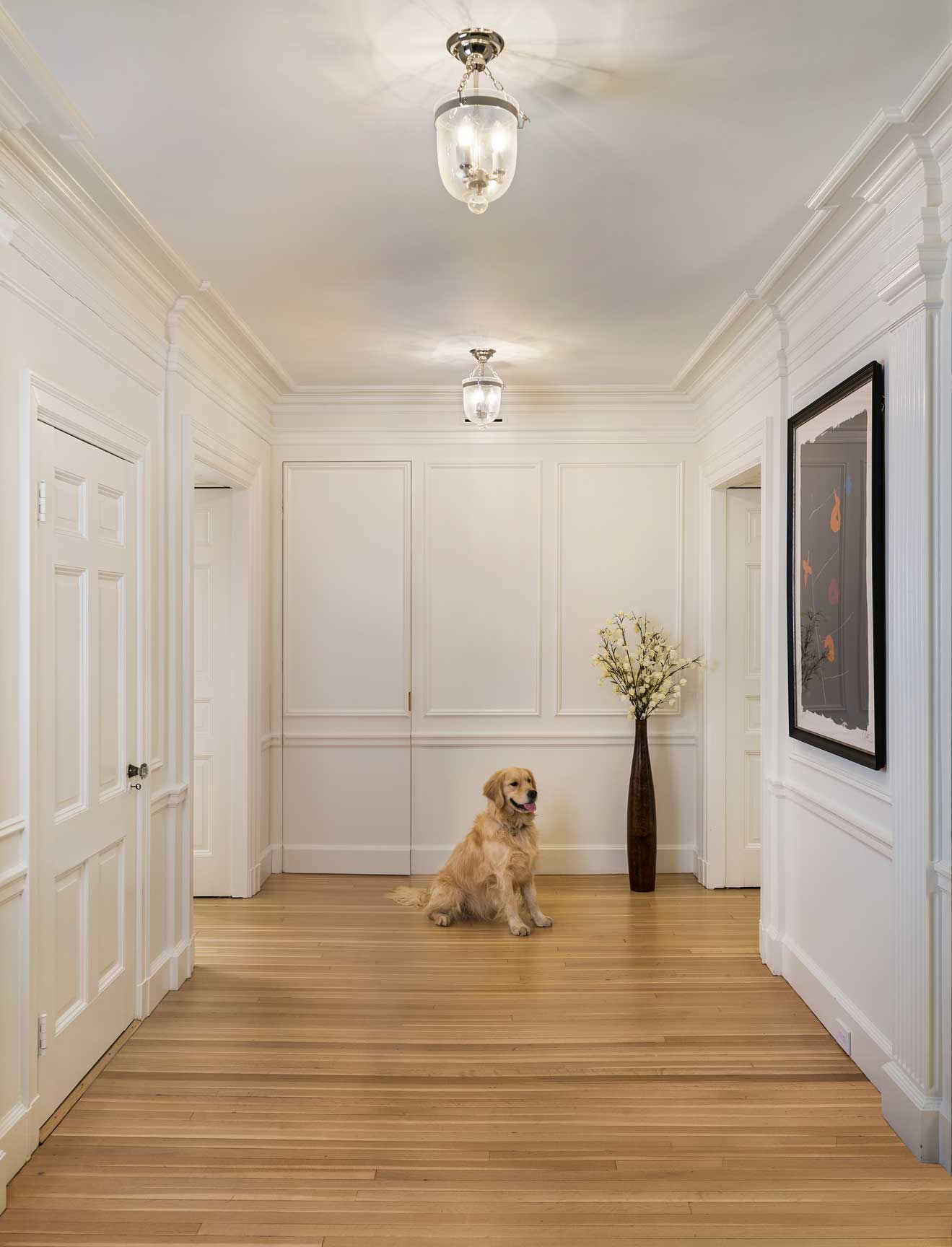
Truman was very much up to the challenge of making the home work better. “I like to find solutions and get creative with challenges like this,” she says. “We made a lot of small moves in the apartment that have a huge impact on how the space works.” The creativity starts at the front hall, a grand paneled room, with only two very small closets. Since such a grand entry hall was not necessary, but a catch all mudroom was, Truman suggested walling off the back portion of the hall with a new wall and creating a large walk-in closet that doesn’t change the grand character of the entry. “The closet is six feet deep, so it provides a ton of storage. All of the family’s coats and boots fit in there along with a stroller, and it can stay messy without the whole entry area being cluttered,” says Truman. The door to the closet is concealed by applied moulding replicating the original rear wall panels.
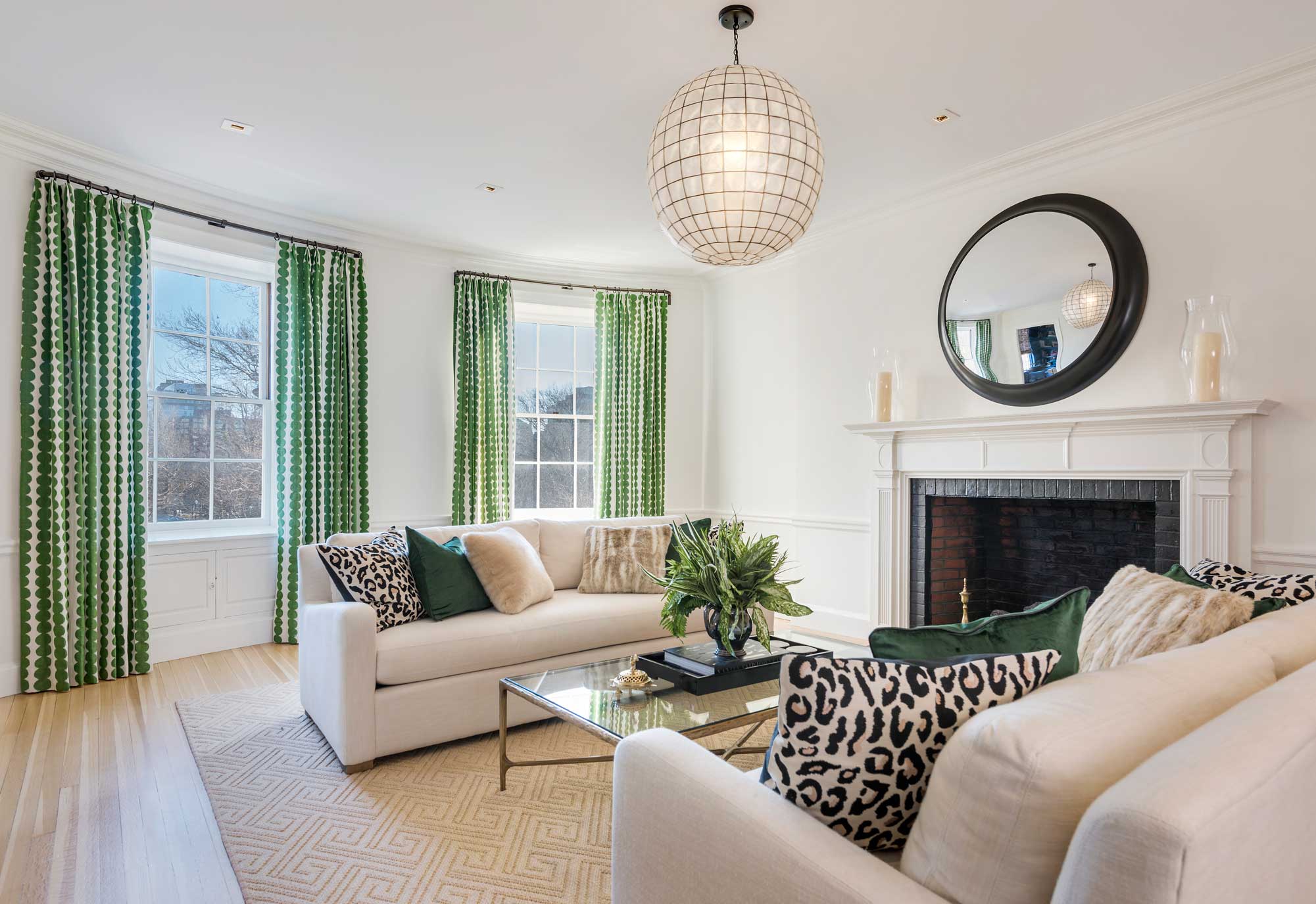
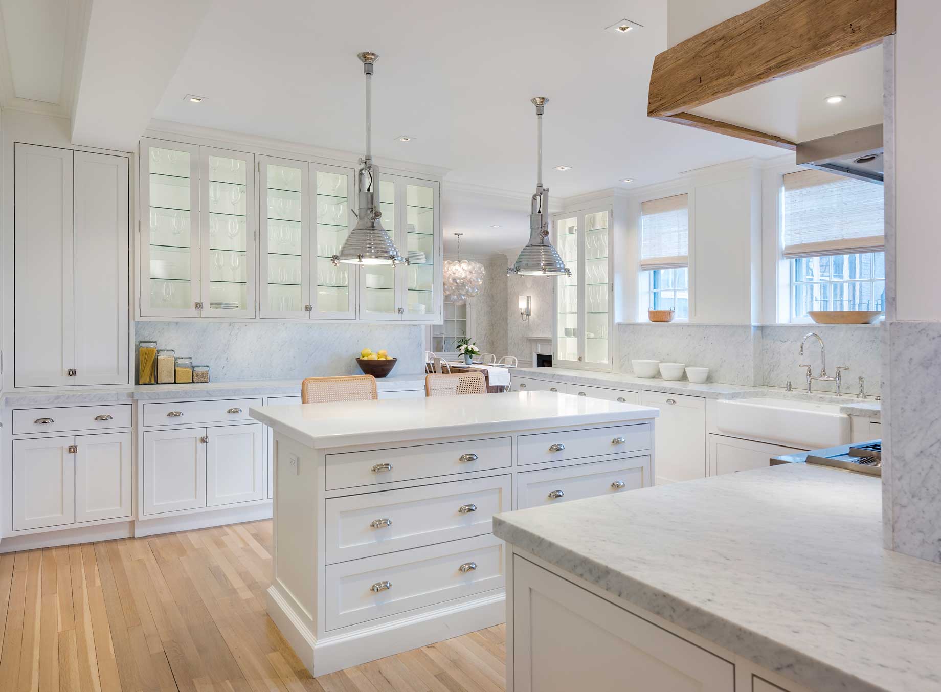 The most work was in the kitchen and family room, where a three-foot-wide back hallway was removed and incorporated into the kitchen, and a series of structural columns that split the family room were removed. The added three feet allow the wall of kitchen and pantry cabinetry to spill out of the kitchen along the wall, past the laundry, and into the family room. Visually they connect the spaces, and functionally, they do everything – the ones near the kitchen are pantry storage, the ones across from the laundry hold linen, the ones near the family room hold books, photo albums, and lots of kids’ toys. “It’s an urban apartment, there’s no playroom in the basement to stash the kids’ stuff, so the built-ins really help organize games, toys, and books and get them out of the way,” says Truman.
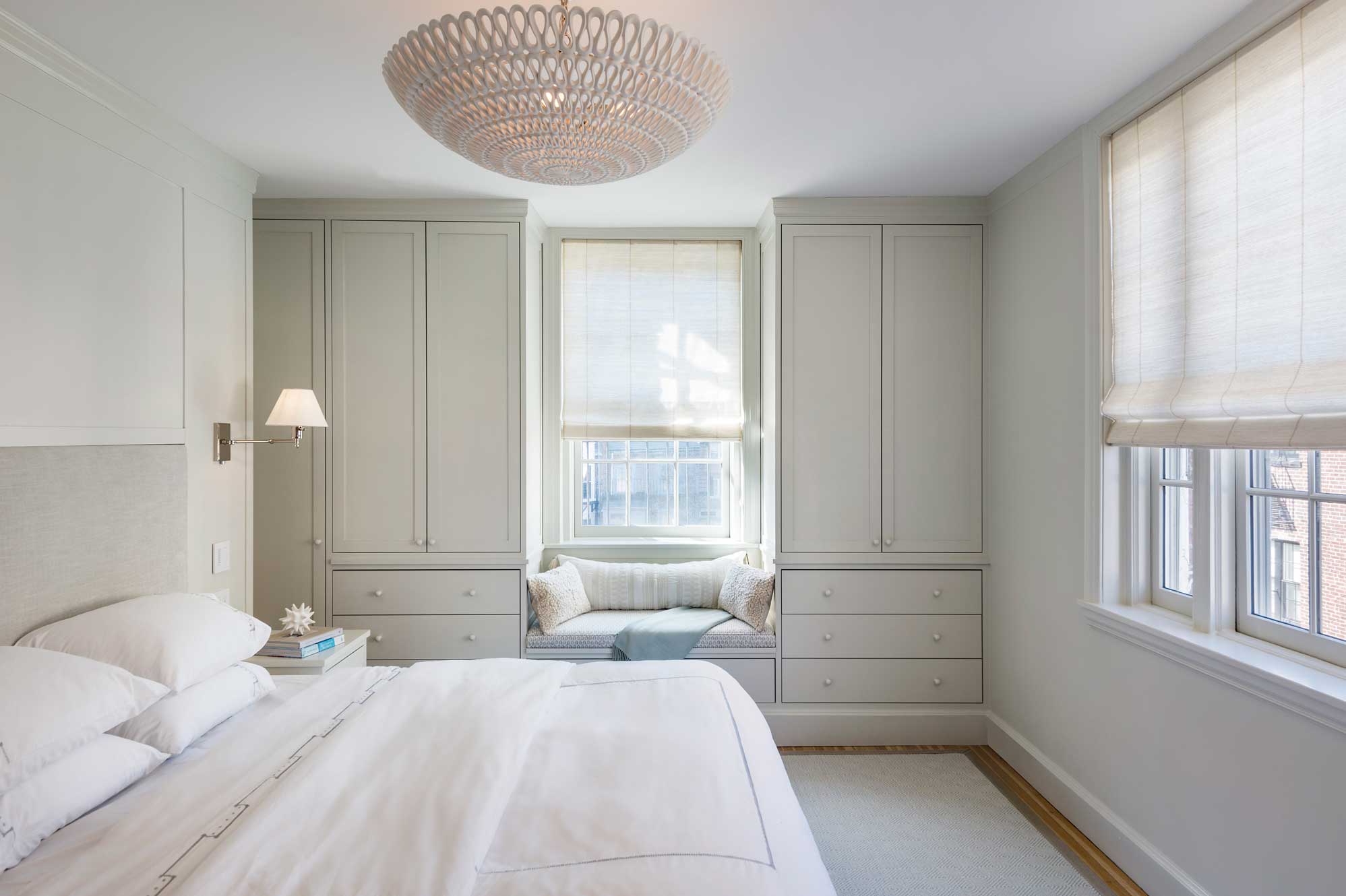
The master bedroom also lacked closets, so Truman came up with a creative solution to add more; she moved the door from the end of the hall to the mid-point, capturing the hall into the bedroom, and adding a long bank of closets, gaining a lot of storage without changing the size of the bedroom. “We didn’t have room in the bedroom to create much storage, so building the closets in the hallway got us the much-needed closet space,” says Truman. “The closets are incredibly tightly designed with no wasted space; there is a home for everything.”
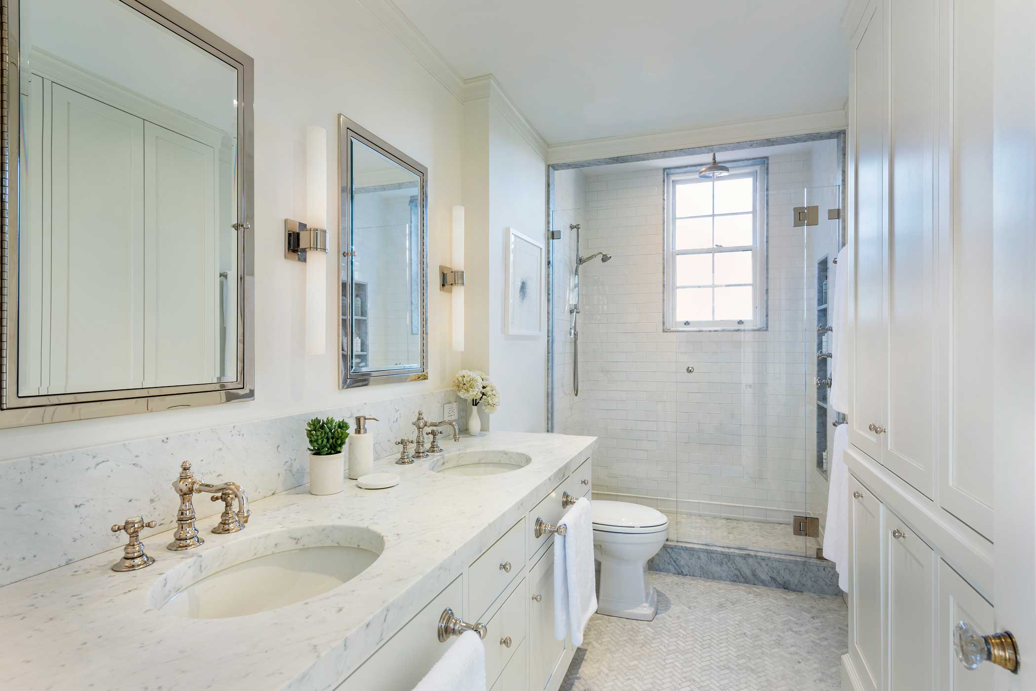
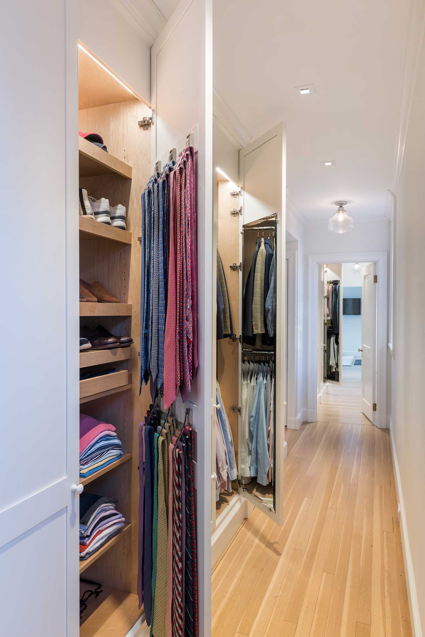 The master bathroom didn’t have enough space for full depth storage for towels, but moving the wall ate into the master bedroom. Instead, Truman came up with a creative double-sided cabinet: towel storage in the bathroom, and the built-in headboard and nightstands in the bedroom. “It’s all one giant piece of cabinetry,” says Truman. Built-in drawers and shelves were installed in the home’s other bedrooms and a long, uncomfortably narrow hallway was removed and made part of the living space after Truman devised a plan to relocate the powder room.
“When you look at the home, there weren’t major changes made—but we did many small adjustments to the floorplan that totally changed how the place works,” says Truman. “It now functions really well for the young family.”


Add new comment