October 1, 2021 | Jaci Conry
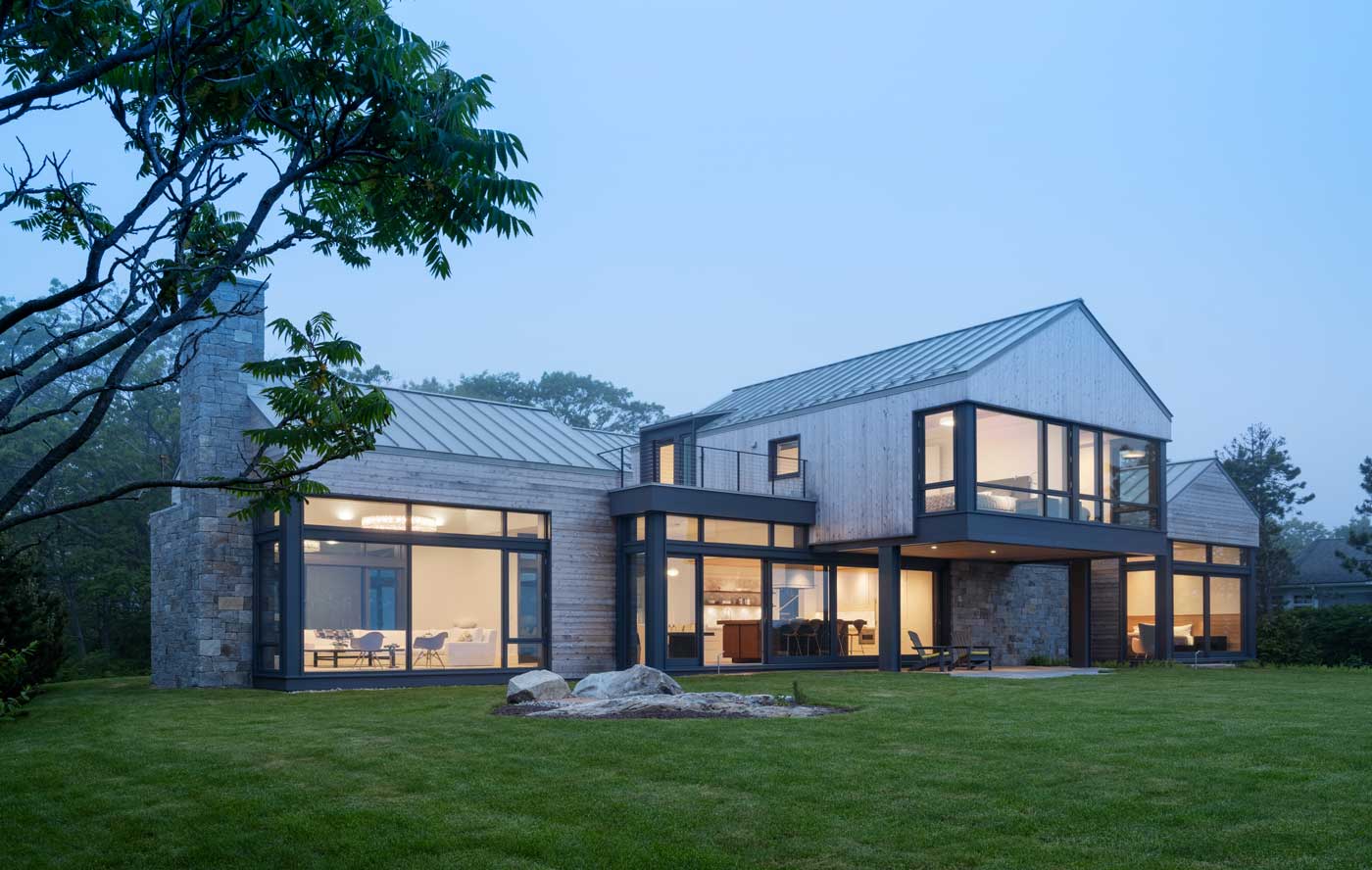
Marcus Gleysteen designs a Maine residence that’s fine-tuned for its empty-nester inhabitants.
Architect Marcus Gleysteen is most interested in designing floorplans based on the real needs of the people who will live in the home.
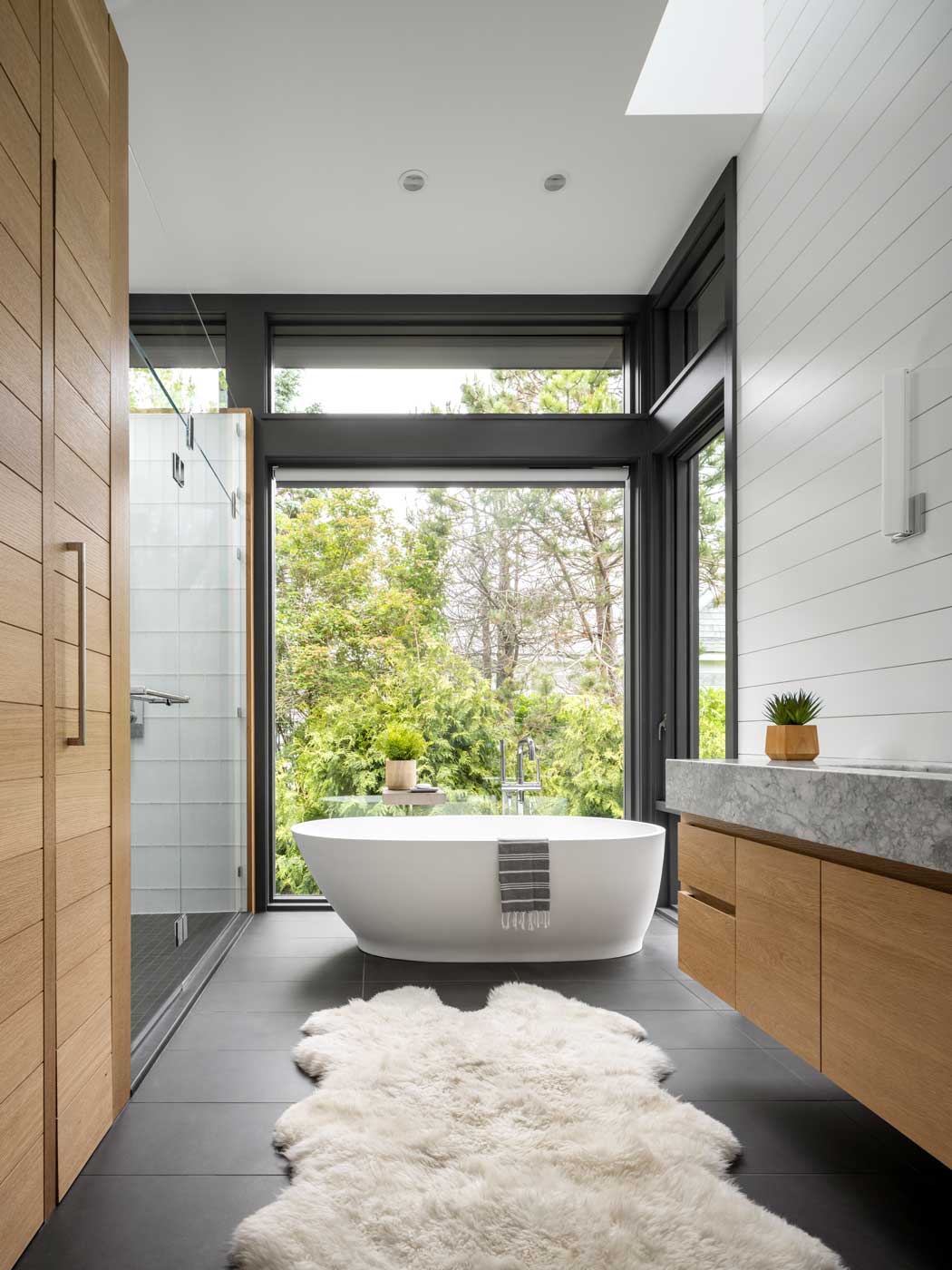
For a couple in their 50s with grown children, he recently implemented a prototype concept he devised for empty-nesters in which all the primary living spaces are on one level. “It’s a very efficient plan with a great room on one side and the master suite is on the other side of the home, while the kitchen is in between,” says Gleysteen of the coastal Maine retreat. There are two bedroom suites on the second floor.
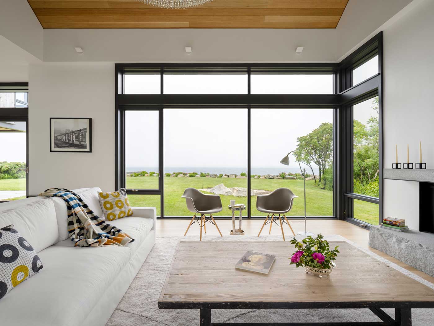
“With this layout, the cool thing is the spaces that you are not occupying are out of sight, out of mind. The purpose of this design is to create a really warm living space that’s useful.”
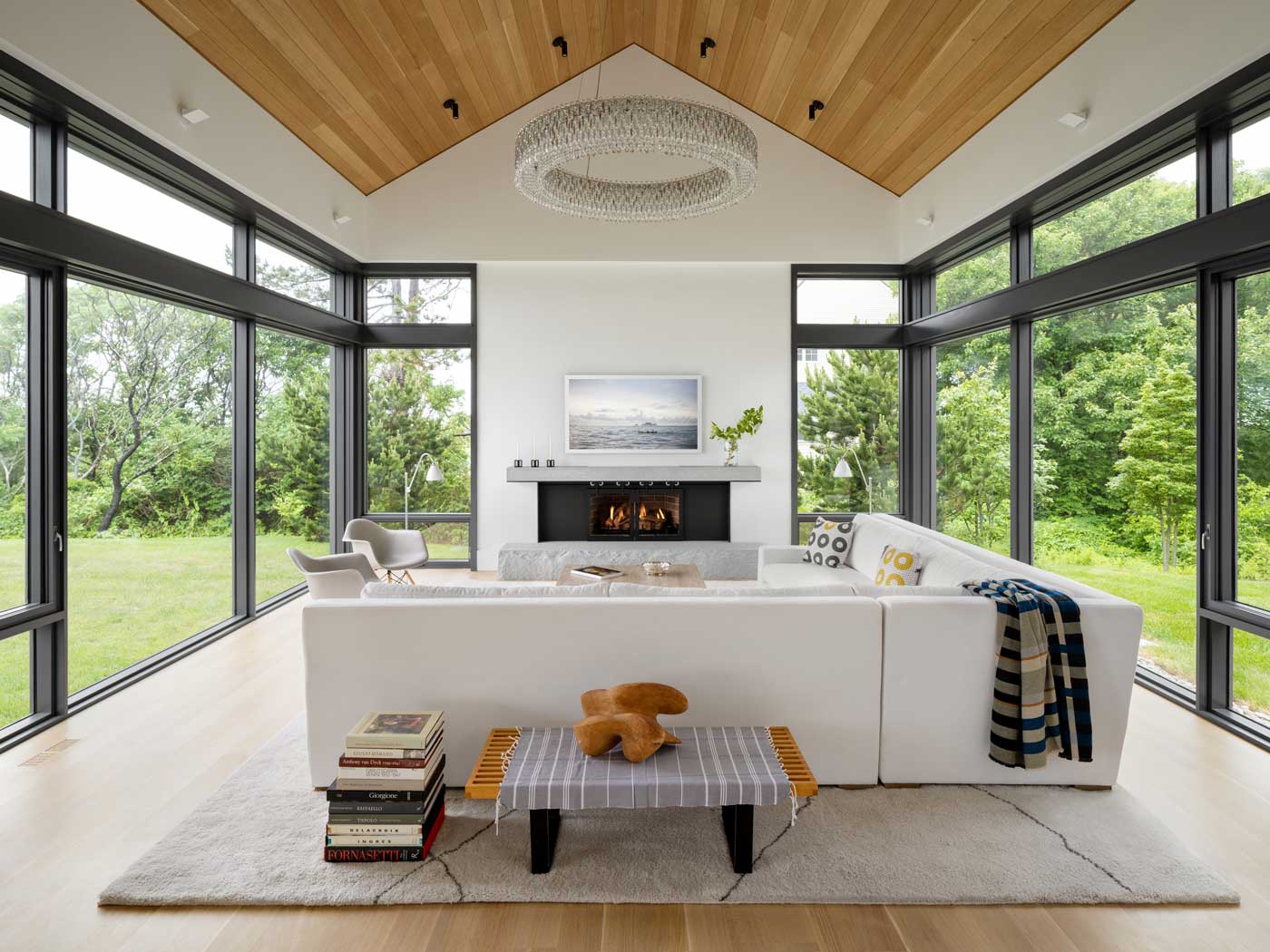 Glass walls along the back of the home are oriented toward the majestic ocean views. Gleysteen also designed large windows on the front, street-facing side of the cedar-clad home. “A big problem with waterfront homes is that they are one-sighted and have just a single orientation,” says Gleysteen, who wanted there to be multiple vantage points to appreciate from the interior. In the front yard, a lush private garden sheltered from the street offers a Zen-like view from the great room.
The home’s three volumes were designed to loosely recall the forms of lobster shacks that dot coastal Maine’s granite jetties. “We wanted to design something that was evocative of a simpler time and place, while still feeling modern,” says Gleysteen, noting that it was also important the house be energy efficient. A metal roof contributes to the home being airtight and wood was used on the ceilings warm up the interior.
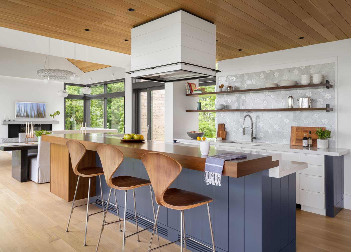
The naturally finished wire brushed oak on the ceiling and floors is paired with a walnut-topped kitchen island made by a local craftsman. Dark blue paint on the base of the island gives it an unfussy appeal while adding detail; whimsical marble inlaid with a floral motif was used for the backsplash.
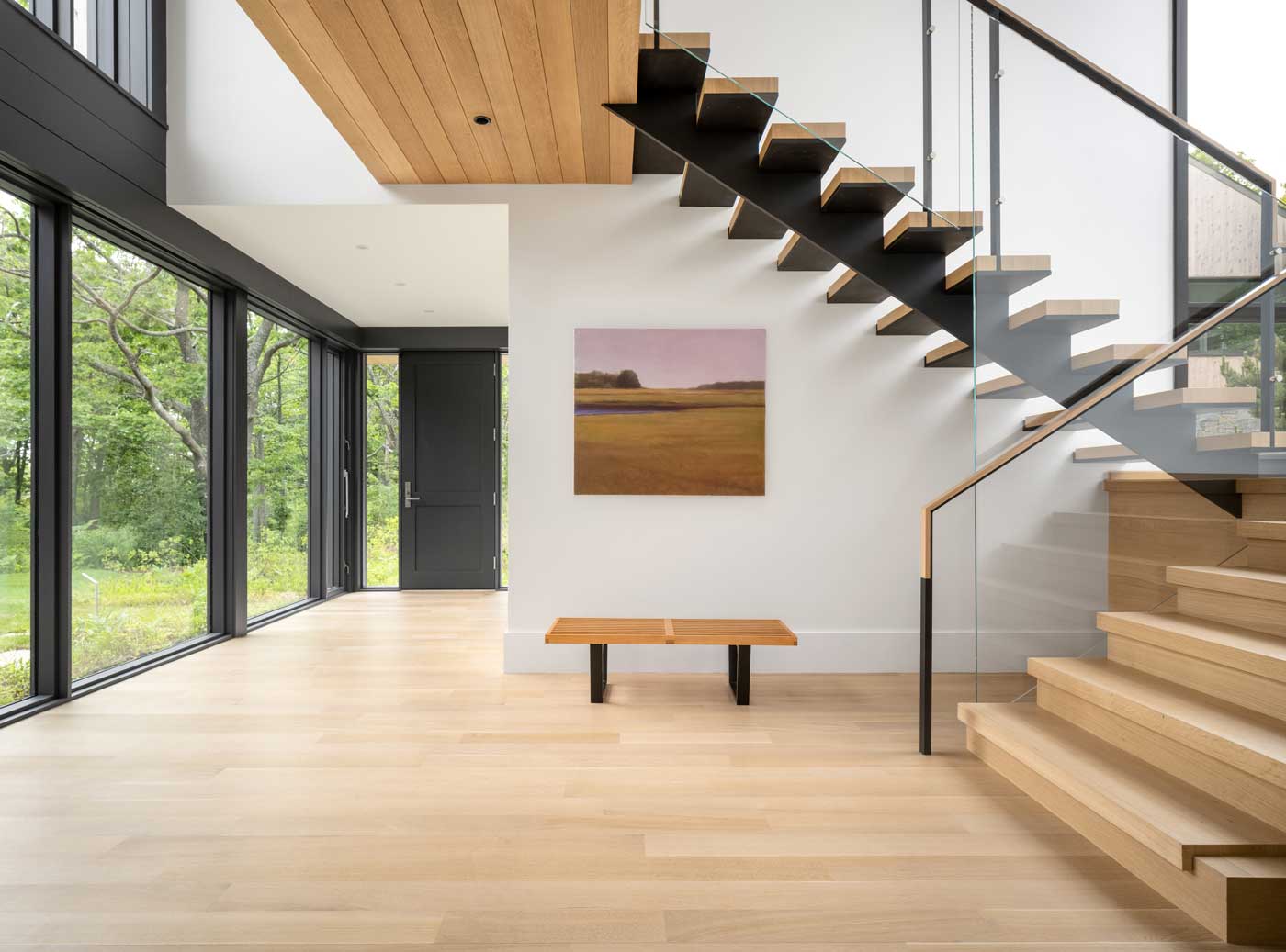
Among the home’s focal points is the stairway: a wood, steel, and glass form that feels both simple and elegant. While the sculptural stair may have hallmarks of others Gleysteen has created, it isn’t an exact replica of another design. “We don’t use the same details over and over,” he explains. “We may take something we did in the past and use it as a starting point for something we do in a new home, but the end result will always be different. Each house we do has to be better than the last one we did.”
Photos by Trent Bell and Marcus Gleysteen


Add new comment