March 30, 2020 | Sandy Giardi

While shiplap has been around forever, there is no doubt that the clean-lined application is the darling of home design. Homeowners adore the rustic yet refined “modern farmhouse” look, and shiplap is one of the style’s defining features. Yes, Joanna Gaines of Magnolia fame and television’s many home shows deserve some of the credit, admit Design Associate Lauren Passaretti and Jessica Chabot, VP Business Development and Design, of Hawthorn Builders, but the two also attribute shiplap’s renaissance to a trend away from “overly complicated design” and a shift to a fresh, full look.
Roughly 60 percent of Hawthorn Builders’ clients are using shiplap, says Chabot; no doubt, because it is affordable, readily available, easy to install and can be used in any number of ways. A new home in Needham beautifully illustrates its versatility as well as the custom builder’s inventive applications, which were used to create visual texture. “We walked a fine line,” explains Passaretti, “incorporating a detail with shiplap but not making it overbearing or overpowering the whole space.”

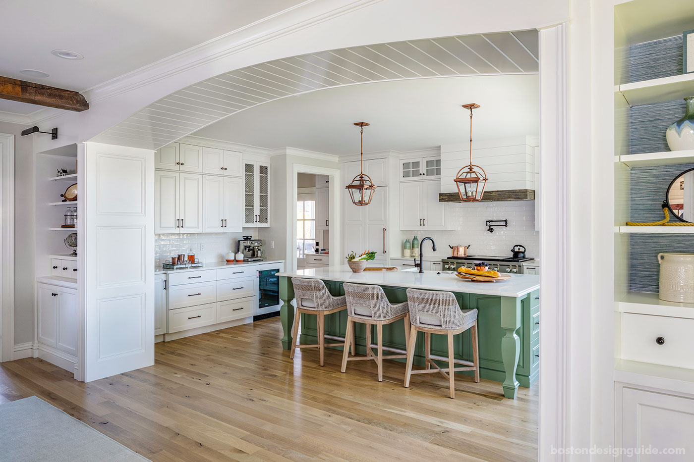
The resident had an appreciation for the Magnolia look, but wanted to make the modern farmhouse style her own. The Hawthorn team was encouraged to take artistic liberty, and shiplap was among the modes of expression. Above, a shiplap archway ensures that the open-concept layout doesn’t feel too “exposed,” and its lines guide you into the kitchen.
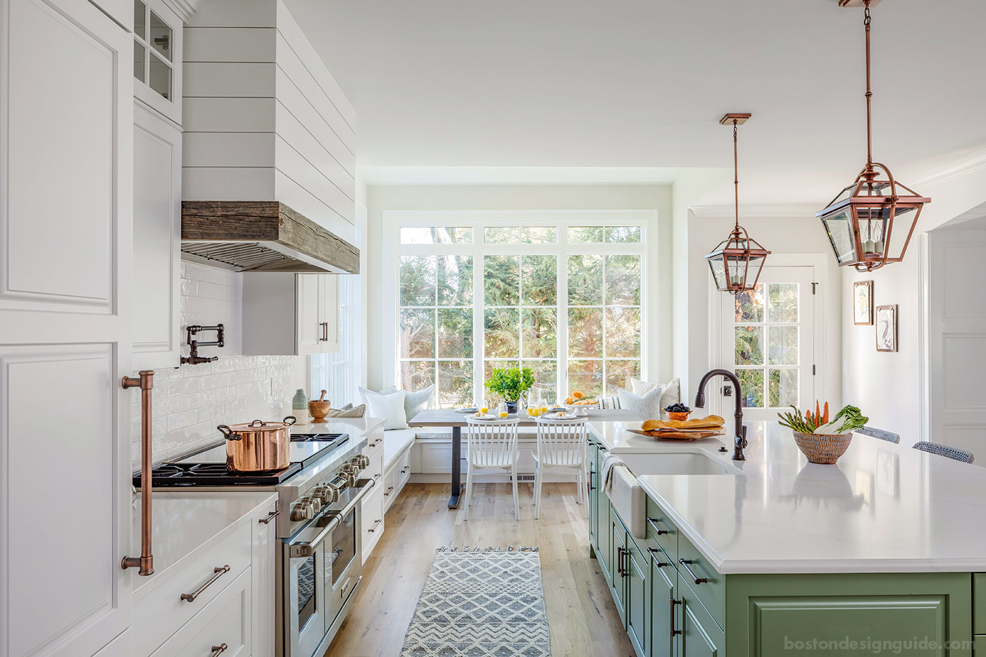
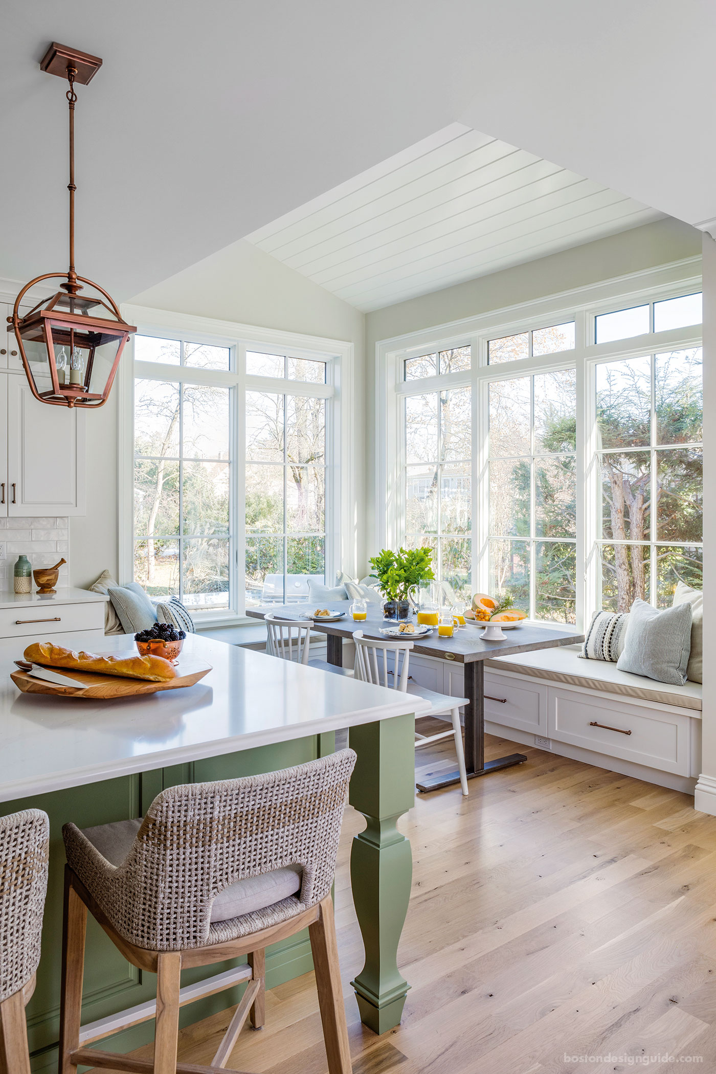
“We selected creatively where it will get the most attention, but in the right way,” she continues. Shiplap adorns the graceful archway that leads to the kitchen, giving the open-concept space definition and a sense of ceremony, and clads a statement-making hood over the stove. It also shines as a ceiling over the breakfast nook, delineating the area and drawing attention to a change in volume. “Even though there is no case opening or wall definition for that space,” says Chabot, “the ceiling makes it feel like it’s a different space even though it’s the same room. Without the texture of the shiplap on the ceiling, that space wouldn’t have been as successful.”

Shiplap has become an alternative to wainscoting and isn’t overly fussy. Hawthorn Builders was strategic in its application, and used it for the ceiling of a sun-filled breakfast nook. “You get just enough,” says Design Associate Lauren Passaretti, “but it’s not overdone.”
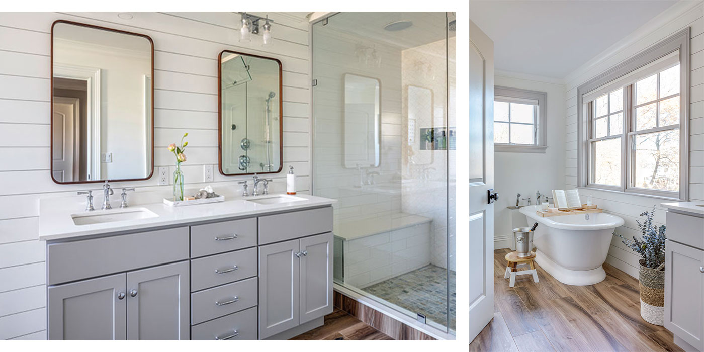
Shiplap’s dimension also has a cozy air and a way of making a home feel well established, warding off a sense of sterility that can accompany a new construction. The master bath, another area where the team “mixed it up,” shows how shiplap can bring warmth and additional interest to the rear wall. Its horizontal lines draw the eye through the space, elongating the room and connecting its amenities.

Chabot had the idea of painting the bathroom trim to match the cabinets to make the shiplap pop, while the wood underfoot and on the mirrors provided a nice sense of warmth.
Unlike other trends, Hawthorn Builders doesn’t expect shiplap to go away anytime soon. In fact, Chabot, conjuring her inner crystal ball, forecasts bigger and more varied applications in the future. “I would like to see an even more modern bent on it, where it gets even wider—eight or 12 inches wide—where you get a really subtle detail. I think that’s probably how it will morph.”
Photography by Greg Premru


Add new comment