October 13, 2016 | carly stewart
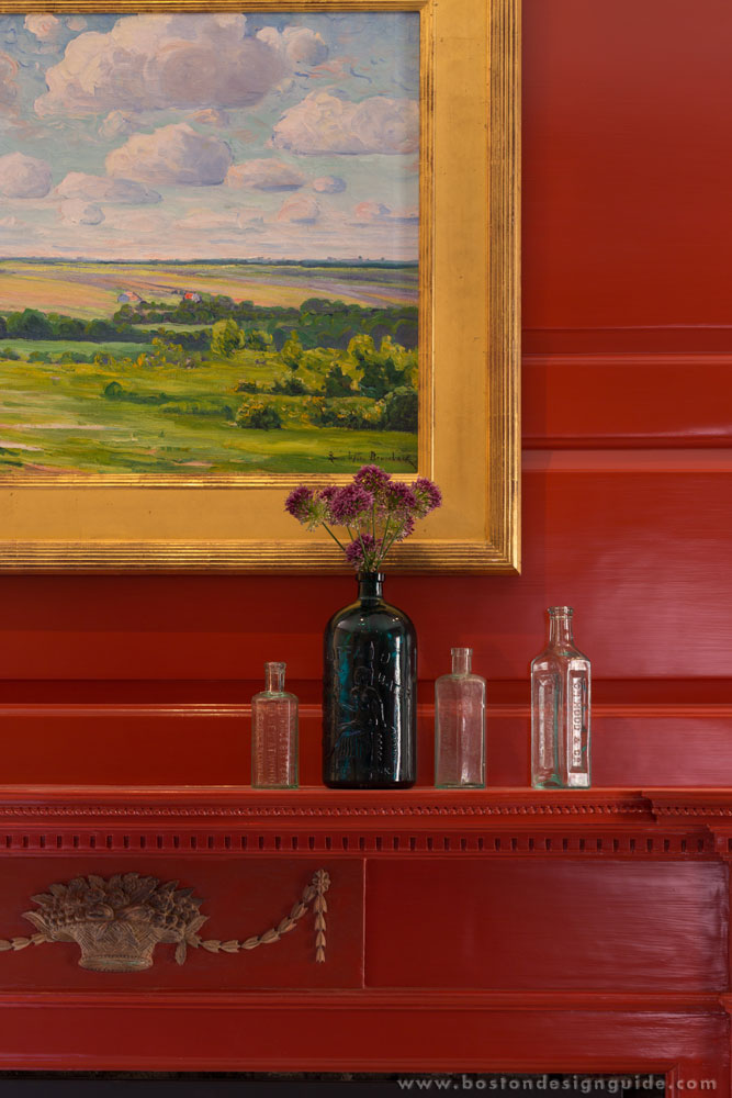
Our Fall 2016 Color Report! If you have been living under a rock, we’re here to remind you how genius Pantone is with color creations and providing the new color trends for the season. Leatrice Eiseman, Executive Director of the Pantone Color Institute, describes the Fall 2016 palette as “A Unity of Strength, Confidence and Complexity.” Under the Blue family, these creations consist of vibrant pops of color, and act as playful but structured departures from your more typical fall shades.
1. Riverside (17-4028)

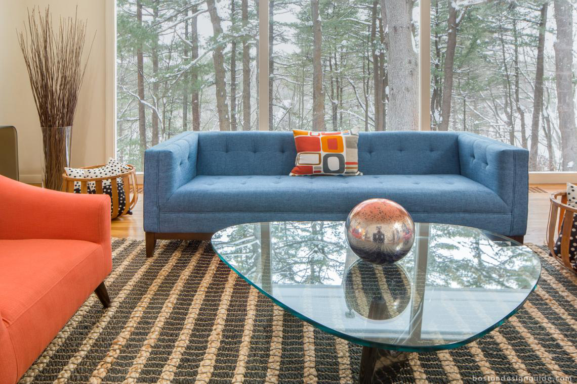
Design No. 5 incorporates this stunning blue couch to a warm room during our chillier days. Riverside blue is cool and calming yet displays subtle vibrancy and sophistication.
2. Airy Blue (14-4122)

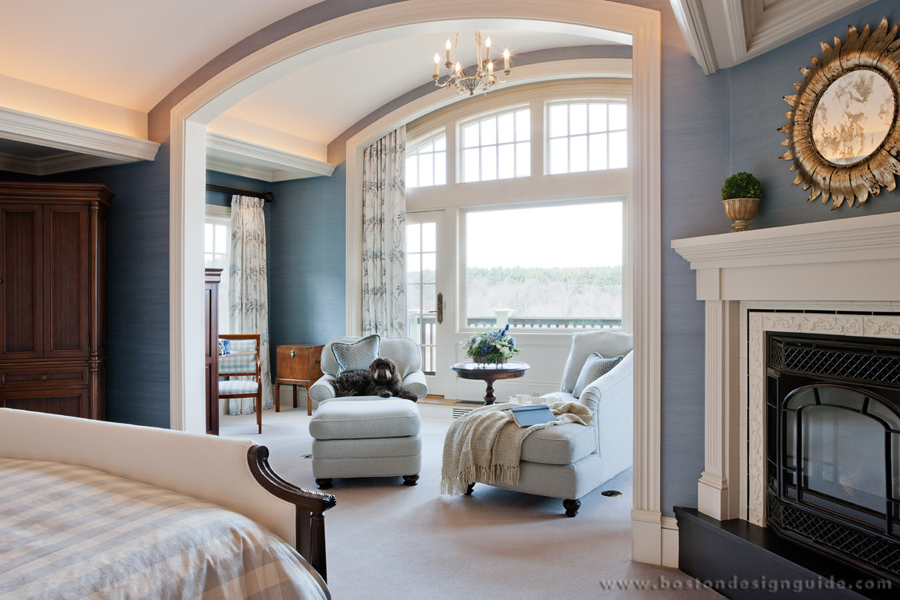
A sense of lightness and freedom is brought to this bedroom with this fresh shade of Airy Blue. [Interior Design by The Cottage]
3. Sharkskin (17-3914)

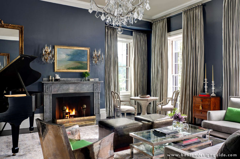
A spectacular gray tone is brought by the Sharkskin shade that can be paired with nearly any bright fall color. The curtains presented by Carole Bruce Workroom bring an edge to the room while managing to remain neutral.
4. Aurora Red (18-1550)

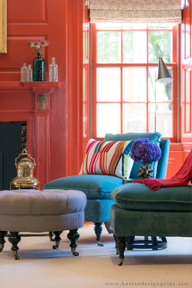
Wow! The Aurora Red color brings a welcoming punch to this room that is similarly pleasing to the eye. [Find your color match with Fine Paints of Europe]
5. Warm Taupe (16-1318)

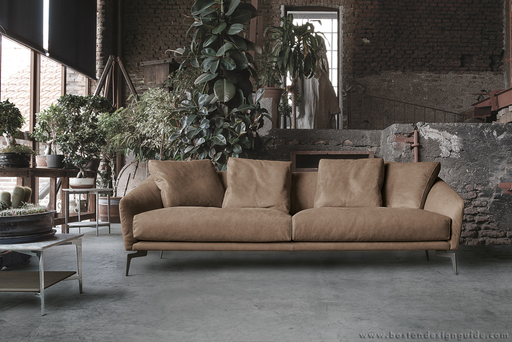
Warm Taupe easily pairs with any of the colors on the Fall 2016 palette. This sofa, available at Il Decor, is timeless while suggesting reassurance and stability.
6. Dusty Cedar (18-1630)

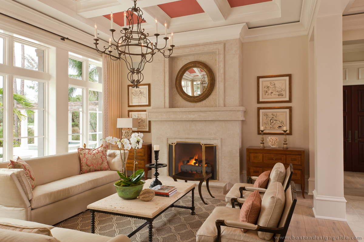
A subtle suggestion of Dusty Cedar is ultimately elegant and gracious in this space designed by Theo & Isabella Design Group. The coloring of the ceiling squares and pillows are a simple technique to provide warmth and welcoming.
7. Lush Meadow (18-5845)

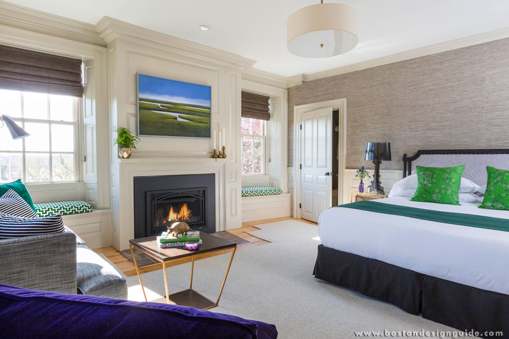
A rich, elegant pop of the Lush Meadow shade is elevated from the more natural greens. A fresh brightness is brought to the room while incorporating overall elegance. [Fine Paints of Europe]
8. Spicy Mustard (14-0952)

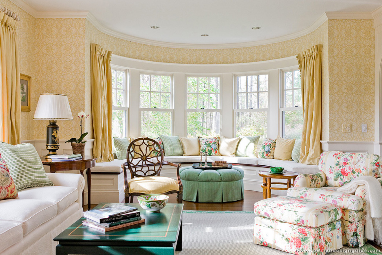
Now, don’t get scared away by the Spicy Mustard shade. Golds are in. This color is an exotic addition that adds a splash of vibrancy when paired with the other shades. This zesty yellow bounces elegantly when designers employ geometric and abstract accents; as displayed in this room designed by Hamilburg Interiors.
9. Potter's Clay (18-1340)

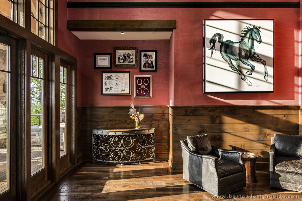
A country-lover’s paradise. The degree of sophistication brought by the Potter’s Clay shade gives a grounded feeling with neutral earth tones. [TMS Architects]
10. Bodacious (17-3240)

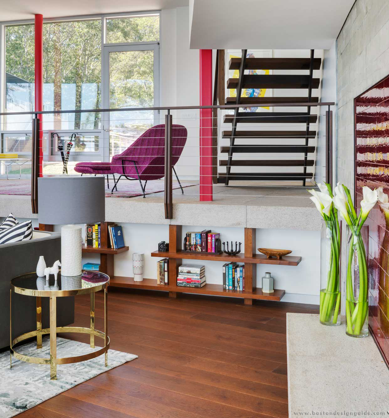
How Bodacious! Though this shade may be unexpected for fall, it has the ability to alter fashion accents into fashion statements. The color’s versatility allows it to be paired with pinks and reds. Look at how LDa Architecture & Interiors balances this chair and ottoman with the colored beams and fireplace tile. Brilliant!


Add new comment