
October 14, 2014 | Anonymous
This fall, neutrals are more stylish than ever, and interior designers are loving this trend in every room in the house. A neutral palette creates a tranquil sanctuary in calming shades of white, grey, and beige. Let us walk you through a home of neutral hues, and you can see for yourself how well this trend adapts to a variety of rooms, styles, and spaces.
Below, a kitchen by Architectural Kitchens awash with white and light. The cabinets, walls, and ceiling are all the same shade, but the room does not look monotone or boring. Instead, the white tones are balanced by slightly darker greys in the mosaic tile backsplash and dark brown in the hardwood countertop. With such a light palette, the space looks large and expansive.
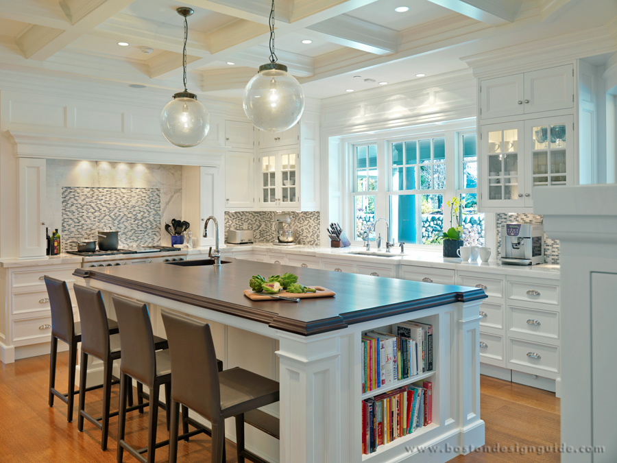
Kitchen by Architectural Kitchens, Architecture by Jan Gleysteen Architects, Interior Design by Kate Coughlin Interiors
Grey, often overlooked, is one of the most popular neutral shades this fall. In the Carter & Company living room below, we see a dark grey on the walls, complemented by white and gold moulding toward the ceiling. There are lighter shades of grey on the chairs and throw pillows, creating a room whose uniform palette allows for more experimentation with unique room accents like the gold mirror, crystal chandelier, exotic floor lamps, and large white urn.
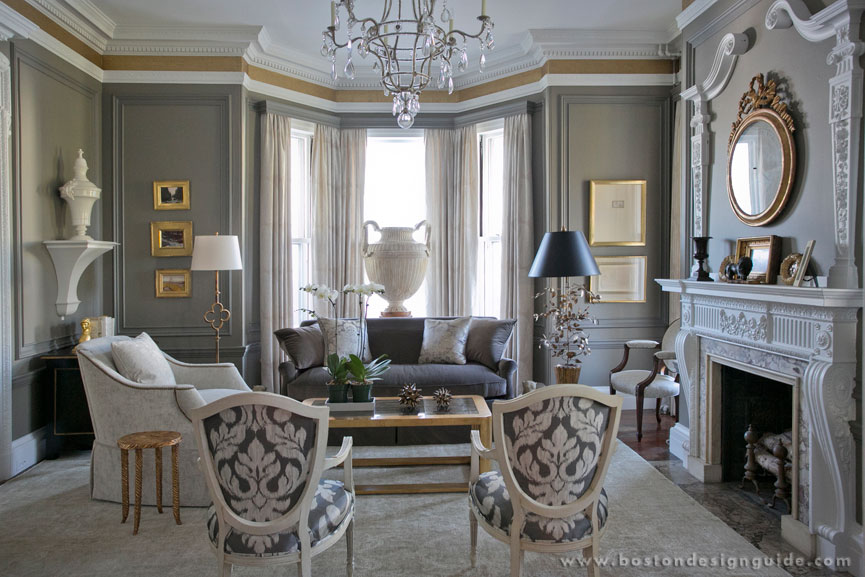
Interior Design by Carter & Company, Photo by Eric Roth
Neutrals also work in the simpler, more contemporary Benson Interiors living room below. The cream shades combine beautifully with the white walls and white stone fireplace. The celestial blue accents create a heavenly retreat.
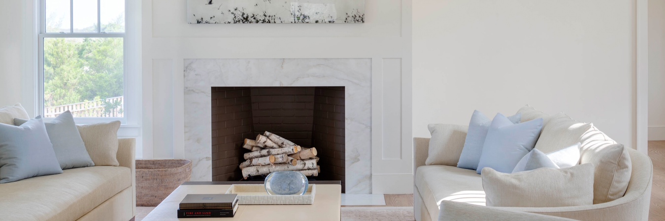
Interior Design by Benson Interiors Inc.
Susan Reddick Design uses shades of light grey-ish blue and white to create the bedroom sanctuary below.
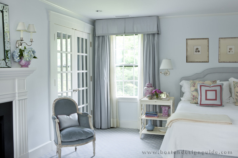
Interior Design by Susan Reddick Design, Inc.
The light palette lets pops of color shine through, like in the side table arrangement below. The fuschia hue stands out beautifully against the otherwise uniform color scheme.
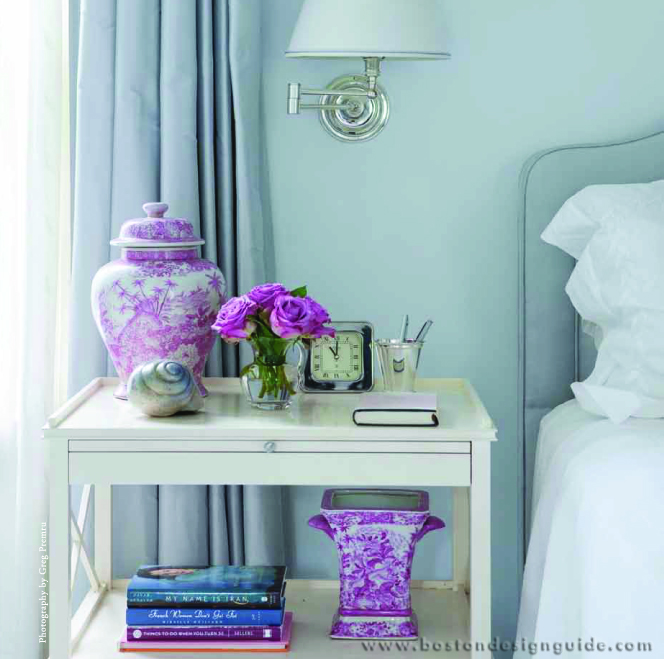
Interior Design by Susan Reddick Design, Inc.
For bathrooms, neutrals are always a good idea. The white, ivory, and grey tones below make for a clean, crisp, and calming space.
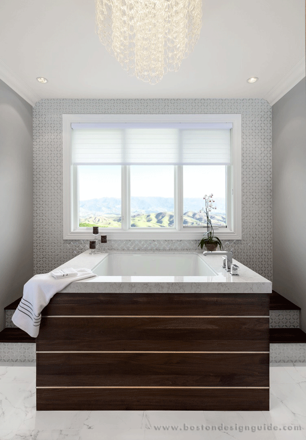
Stone and tile by Boston Granite Exchange
Neutrals work in different ways depending on the style and size of the space you are working with. How do you use neutrals in your own home? Let us know in the comment section below!
Add new comment