March 20, 2015 | Sandy Giardi
Spring-forward designs give plenty of reason to lighten (and brighten) up!
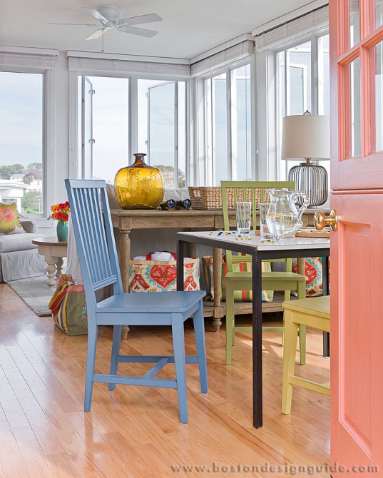
Interior design by Wilson Kelsey Design; photo by Michael J. Lee
Here in New England, we've seen enough of the white stuff and listless shades of gray outside of our homes to last us quite some time (like, say, for another record-setting 20 years). Inside, many of us are seeking an alternate universe: spaces so drenched with color that they warm us to the core, or, on the other end of the spectrum, coolly elegant tones that soothe the soul, enveloping us in beauty. No matter the color quotient, the following interior designs are nothing short of brilliant. Some take a go-big-or-go-home approach while others are more about pop and circumstance, color counterpoints against bright whites and neutrals.
Here comes the sun….
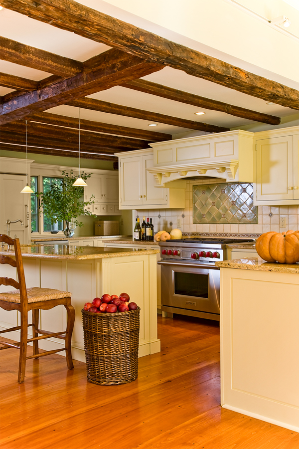
Interior by Wilson Kelsey Design; photo by Michael J. Lee
This sunny kitchen by Wilson Kelsey Design is the interior design equivalent of a perfect cup of coffee first thing in the morning: inviting, cheerful and utterly mood lifting. Created as an addition to a 1780’s Lincoln home, Wilson Kelsey Design considered its historic context when selecting the color, steering clear of “21st-century tones.” Principal Sally Wilson offers, “the almost milk paint look of this yellow keeps the kitchen bright and welcoming, but alludes to an older time.”
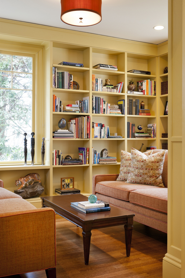
LDa Architecture & Interiors; photo by Greg Premru Photography
LDa Architecture & Interiors also brought home the gold for the library of a recent renovation, though their design (above) has an eclectic sensibility. Its flaxen walls and built-in bookshelves pair well with ginger-colored sofas configured for close readings and encounters. The library abuts a soft turquoise living room, meadow-green dining room, and family room that brings the array of tones together, making the inspired mix all the more interesting.
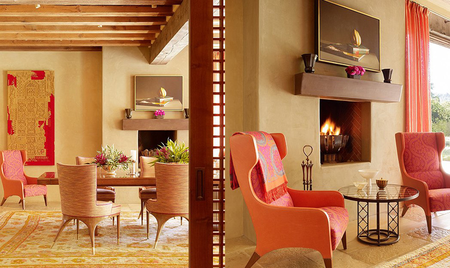
Interior design by Jeffers Design Group; David Allen Smith Architects; Construction by Rich Tincher Construction; landscape by Tito Patri & Associates; photography by Matthew Millman.
“It” designer Jay Jeffers of his eponymous San Francisco firm Jeffers Design Group all but bottled the sunset in the above estate’s palette for a color-conscious client. Save for the foyer, which is drenched in persimmon, the Bay Area style setter opted to keep the plaster walls neutral to best highlight the bold and beautiful tangerine and fuchsia furniture, textiles, art and accents.
Interior Design by Cebula Design; photo by Rixon Photography
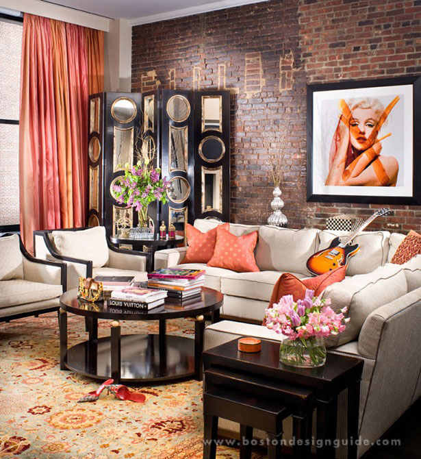
Back on the East Coast, Cebula Design amplifies a neutral backdrop with splashes of sultry orange and coral for a look that’s heavy on style and attitude. With its beige upholstery, black mirrored screen and exposed brick walls, the hip living space avoids a masculine feel thanks to its soft silk draperies and throw pillows.
Singing the blues
Interior by Cebula Design; photo by Rixon Photography
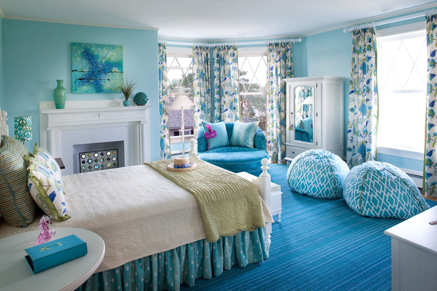
Now that we’ve saluted the sun, we’re hailing the tones of the sea and sky by singling out blues that make us feel anything but. In the whimsical bedroom, above, Cebula Design mingles shades of peacock, baby blue and teal to create a serene but uplifting setting that succeeds as a comfortable retreat and a place for rejuvenation. With its friendly disposition, glorious picture windows, and the interplay of texture and pattern and florals, this design is literally a breath of fresh air.
LDa Architecture & Interiors; photo by Michael J. Lee Photography
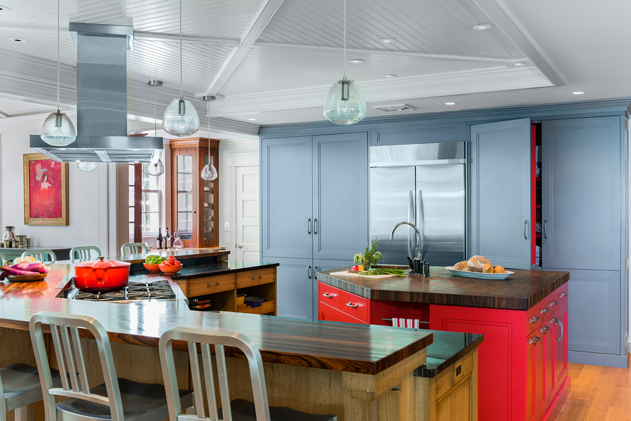
Speaking of fresh, we adore LDa Architecture & Interiors’ color-forward take on a contemporary kitchen that runs both hot and cold. The slate-blue cabinetry plays up the silvery tones of the stainless range hood, light fixtures and galvanized chairs, while the poppy-red secondary island ignites the rich grain of the wood found on both the countertops and main island’s millwork. Talk about chemistry.
Opposites attract
Interior by Wilson Kelsey Design; photo by Michael J. Lee
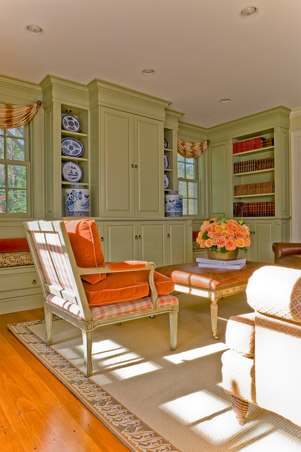
Wilson Kelsey Design also taps in to a dynamic color duo, maintaining “green and orange can be very bright and exciting together.” We couldn’t agree more. To create the look of the remodeled living area in the Lincoln house, above, Wilson and partner John Kelsey selected an olive green “that is soft enough to live with but also gives warmth and historical character to this new addition.” The team played it against type with orange as a foil, but dialed it down to a “slightly toned-down version” of cinnamon, making the space “quieter and very livable.”
Tickled pink—and purple!
As versatile as it is striking, purple is gaining popularity. We think it has a lot to do with its multiple personalities; it can be demure, like hushed lilac, or dramatic, think aubergine, and many faces in between. Ever since we learned that Boston designer and tastemaker Manuel de Santaren swept a resplendent shade of eggplant throughout a Back Bay living and dining room, we’ve been convinced of purple’s reign.
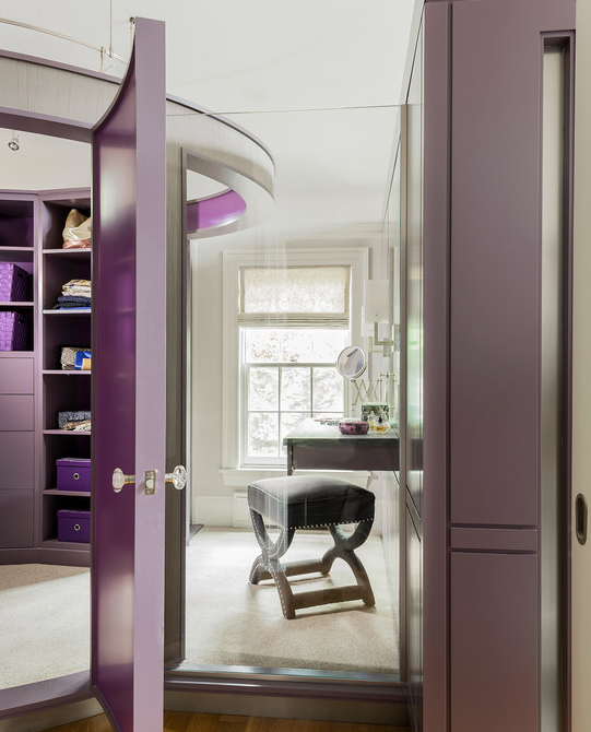
LDa Architecture & Interiors; photo by Michael J. Lee Photography
If you’re not quite as daring as de Santaren, powder and dressing rooms are an apt place to try out purple with a bold hand. The hue is a courageous decorating choice to be sure; so using it out of the sightlines of the main house can free up homeowners to really have some fun. In this master suite renovation, LDa Architecture & Interiors certainly did, layering on the color—Benjamin Moore’s kasbah (but, of course)—in the master bath, dressing room and freestanding walk-in closet.
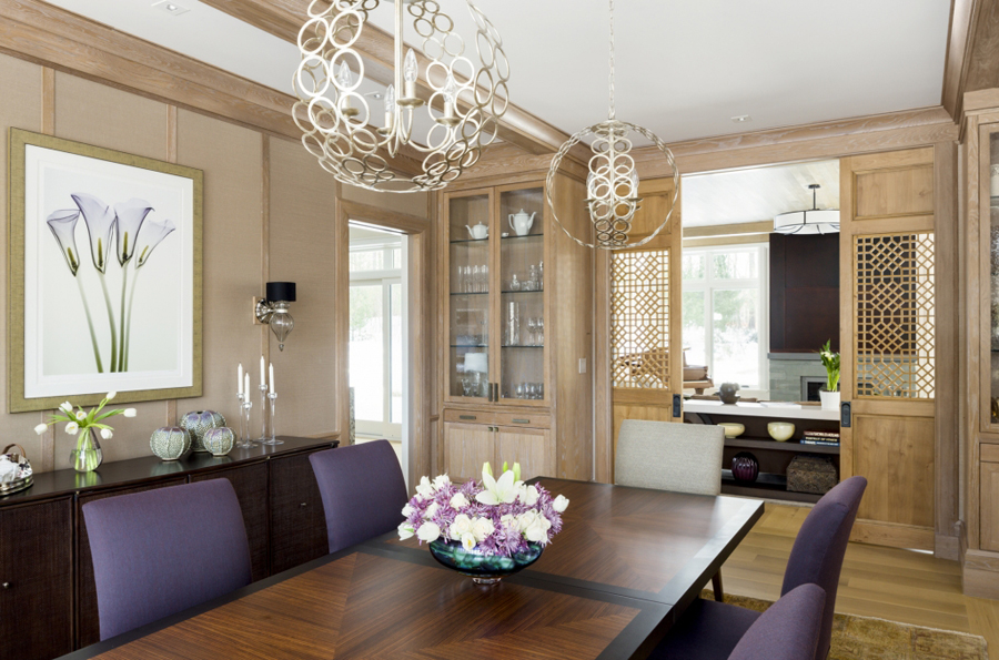
LDa Architecture & Interiors; photo by Greg Premru Photography
Sophisticated yet surprising, purple is also a standout in the dining room. Subtler than the master suite design but just as lovely, LDa Architecture & Interiors capitalizes on the color’s formal yet feminine air by incorporating plum dining chairs in its above design. The elegant purple fabric brings more than flair to the table. Together with the varied woods of the trim, built-ins, sliding doors, flooring and table, the tone elicits an overall effect of beauty and harmony.
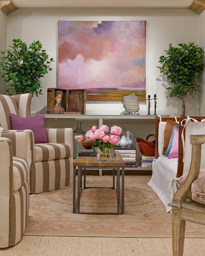
Interior by Wilson Kelsey Design; photo by Michael J. Lee
Wilson and Kelsey of Wilson Kelsey Design employed a similar color scheme for their stunning show house, above, exemplifying the Belgian style of decorating. This method relies heavily on taupes, tans, creams, linen and worn woods for settings of grace and comfort. Since the firm loves color, they gave the space “punch by lots of toss pillows,” says Wilson. Accents no more, custom-made silk satin pillows in orchid, peony, turquoise and deep brown were given a leading role. “They have a great sheen and wonderful touch,” says Wilson, plus they’re “just plain fun.” That the art echoes the profusion of color doesn’t hurt either; in fact, the vignette as a whole makes us think that the lavender fields of Provence are just beyond the doorstep.
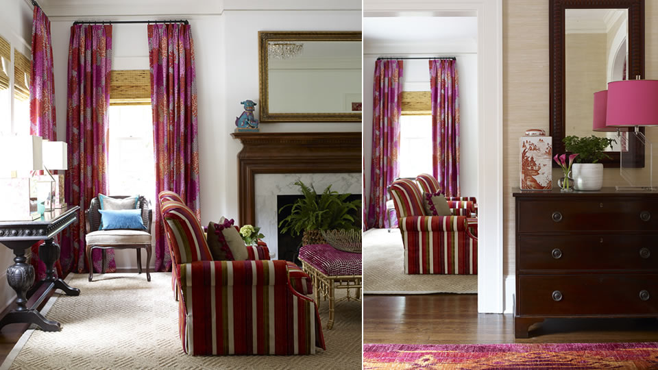
Katie Rosenfeld Interior Design; photo by Emily Jenkins Followill
For a historical home in Atlanta, Georgia, designer Katie Rosenfeld not only turned on the Southern charm, she brought on the pink! Working with the client from the get-go, Katie Rosenfeld Design was involved in the journey from pre-construction to finish selection to the lavish interior design seen above. The owner’s one demand was that pink should be woven in to every last room. As this carefully layered, jewel of a home can attest, Rosenfeld came out smelling like a rose!
Mix it up!
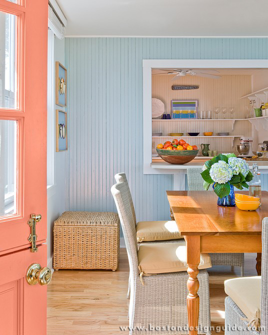
Interior design by Wilson Kelsey Design; photo by Michael J. Lee
Can’t quite settle on a color you like? You don’t have to. Choosing a thoughtful mix of colors can result in an inviting look with plenty of personality. For a beach house in Ipswich, Mass., above, Wilson Kelsey Design had a party with pastels, instilling a cheerful vibe just right for a vacation home. With its dusty apricot door, sky-blue paneling and mint accent walls, the Cottage-style charmer relies heavily on paint color as a decorating tool, which means it’s as easy on the budget as it is on the eye.
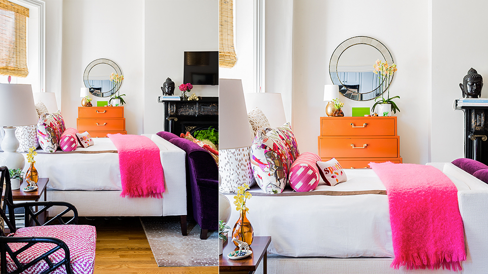
Katie Rosenfeld Interior Design; photo by Michael J. Lee
If subtlety is lost on you, do it up with a mishmash of hot hues in solids and patterns. This Beacon Hill bachelorette pad by Katie Rosenfeld Design is gutsy and glam, with wares culled largely from consignment stores and junk shops. The shocking pink throw and orange dresser, pictured above, appear even more lively against bright white bed linens and glossy black furniture, and, as accents, are easy to swap in and out. The studio is a study in what Rosenfeld terms “maximalism,” meaning that every inch of its 600 square feet contributes to the look—and then some.


Add new comment