October 20, 2016 | Sandy Giardi
At BDG, we’re grateful to have relationships with professionals who have been with us since our inception. Feeling nostalgic, we combed through the archives to see the projects these talents showcased in our first few editions. We weren’t surprised to find designs that are as relevant today as they were up to 20 years ago. We asked the principals what makes these designs so enduring and what they’d do differently today, if anything.…
Gregory Lombardi Design
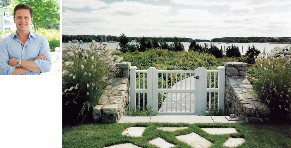
This landscape of a genteel New England waterfront home is successful years later because of the feeling it conjures, says Gregory Lombardi. The scene is “an invitation to slow down” that’s about engaging with the water, and, possibly, memories. Even at the time of completion it harkened back to an earlier time; it was quietly inserted (from scratch!) in a way that preserved the character of the vista. While oceanside environmental regulations are complex, this design has a less-is-more sensibility. The gate is elegant and simple to keep the focus on the view, says Lombardi, while the boardwalk is a trigger that delivers a “jolt of excitement,” compelling onlookers to speed down its path and splash in the sea. [Gregory Lombardi Design]
Jan Gleysteen Architects, Inc.
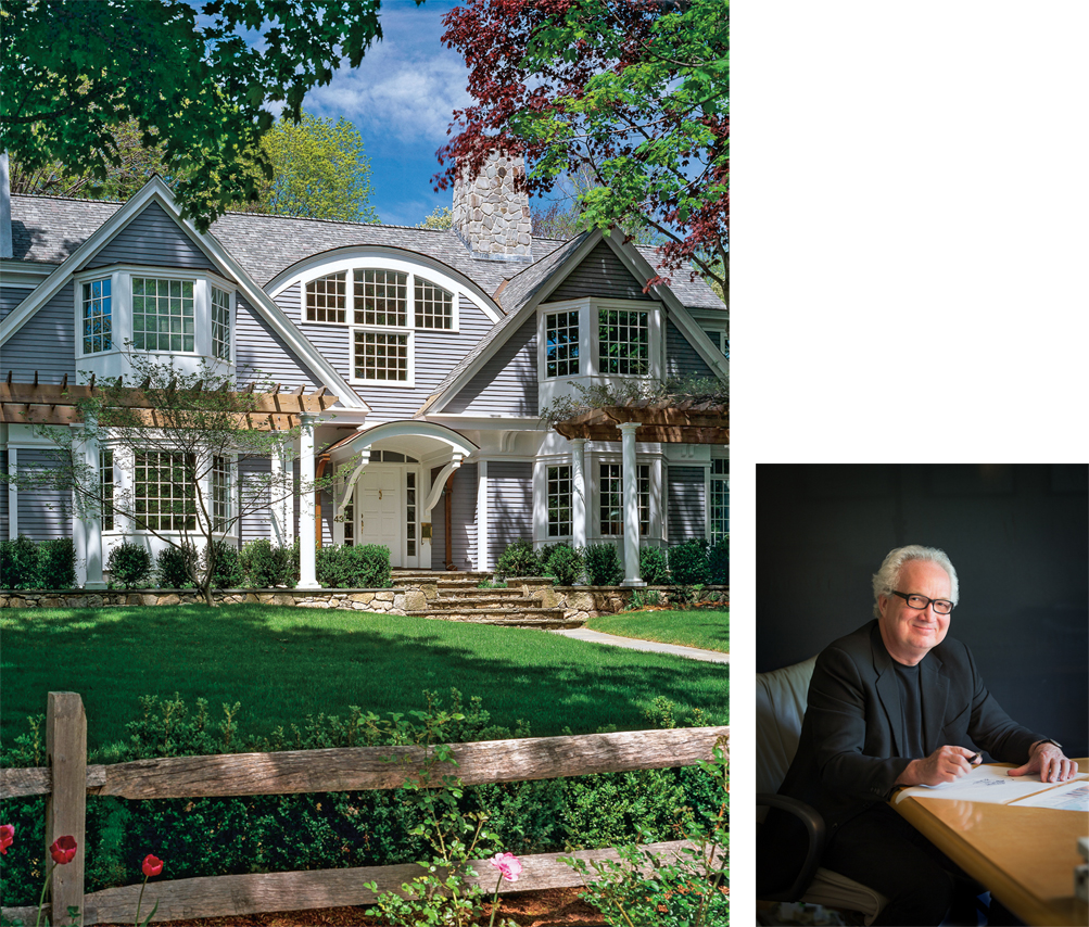
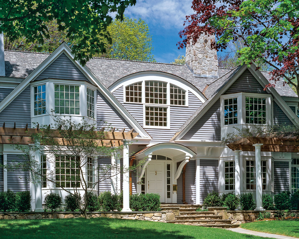
This gray and gracious clapboard home is ageless, offers Jan Gleysteen because it incorporates elements of classicism, employing design principles that stretch back to the Renaissance, never mind 20 years. The studied use of symmetry gives the home lasting appeal (note the two strong gable wings and the “sunrise” archway that echoes the front door portico), as does its geometry and the hierarchy of the home’s massing. Its “bas-relief design,” comprised of four plane walls, creates tension and interest, and the composition as a whole is softened by boxwoods, and wisteria that climbs along the pergola. Were Gleysteen to do it again today? He’d likely panelize the window atop the portico to mirror those of the twin bay windows. [Jan Gleysteen Architects, Inc.]
LDa Architecture & Interiors
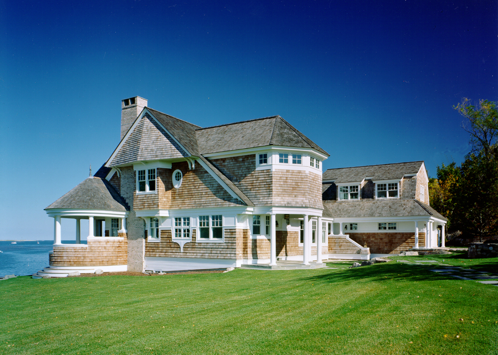
This red cedar shingle-clad retreat in Essex prevails because of its rich architectural character and strong connection to the grand summer homes that have dotted the North Shore coastline since the 19th century, offers Treffle LaFleche. Its durable materials also stand the test of time, and its contemporary composition and open-living floor plan continue to be of-the-moment. While the home’s double-hung windows are still prevalent today, LaFleche might go with larger casements for a more European aesthetic, tone down the historic reference a skosh and change up the crisp white trim that shows the wear more than a darker stain would. [LDa Architecture & Interiors]
Nicholaeff Architecture + Design, Inc.
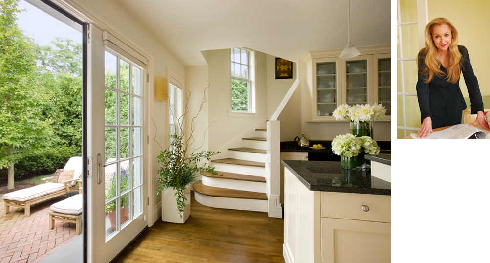
Most architects, maintains Doreve Nicholaeff, strive for designs that are timeless, and Nicholaeff feels she achieved that goal with this complete renovation and addition to a Cape Cod ranch-style cottage. It helps, of course, that the materials she utilized 20 years ago have long been part of Cape Cod’s architectural landscape and show no signs of stopping. Nicholaeff is most influenced by “the big picture,” how the house sits on the land, and how it functions for the owner. If those things are successful, the design endures. If she were to design the house again today, she’d consider advances that fall outside the realm of design. She’d raise the foundation to suit the changed floodplain, update the HVAC system and insulation and enjoy selecting the tile, appliances and fixtures from the wealth of options on the market today. [Nicholaeff Architecture + Design, Inc.]
Catalano Architects
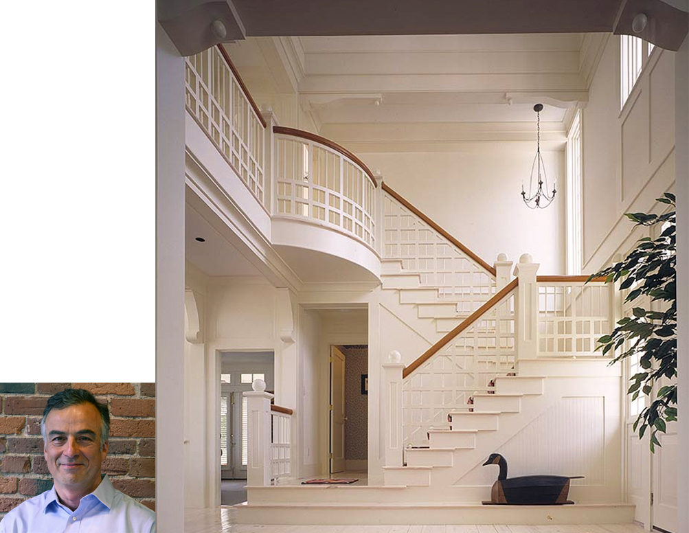
This stunning foyer designed by Catalano Architects pays homage to the “'Living Hall,' which was “an integral element of the Shingle Style work of firms like Peabody & Stearns and Arthur Little,” explains Principal Tom Catalano. The entrance evokes the designs of the storied, prolific firms of the Gilded Age, but updates the traditional configuration of the switchback stair often seen in the Shingle Styles of yore by virtue of its simple detailing and palette of off-white stained wood. There is also a subtle nod to an Oriental sensibility utilized by premier Beaux Arts architect Stanford White. Says, Catalano, “the railing is reminiscent of the way that White's interior architecture was influenced by domestic Japanese interiors.” [Catalano Architects]
Anthony Catalfano, Anthony Catalfano Interiors, Inc. (below left)
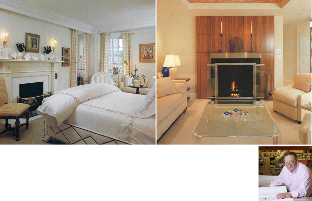
A thorough understanding of proportion and scale give this rich bedroom a lasting appeal that is as relevant today as it was when it was created 20 years ago. It has an “eclectic but clean” feel says Anthony Catalfano, that has staying power, thanks to its neutral palette and decorative accents, including draperies hung from stainless steel wire and a white leather upholstered bed embellished with bronze nailheads. Plus, the room’s fireside vantage and collection of contemporary art never go out of style. [Anthony Catalfano Interiors]
Detail Millwork, Inc. (above right)
This fireplace mantel, crafted by Owner Richard Rigoli of Detail Millwork, “was meant to be simple yet elegant,” says Rigoli, “and I think it hits the mark.” The striking architectural detail is the focus of an inviting living room and was designed in African striped mahogany and trimmed with stainless steel. The rich veneers of the handsome hearth have to be matched to get the look and grain just right, and then vacuum pressed to resemble one solid piece of wood. Good craftsmanship lasts forever, explains Rigoli, so he wouldn’t change a thing. “If you were to look at this today, you’d think I did it last week. But I did it 20 years ago.” [Detail Millwork, Inc.]


Add new comment