October 31, 2017 | Sandy Giardi
Last week, we admired the interior design transformations showcased in the Junior League of Boston’s 2017 Designer Show House. We walked through 20 dynamic rooms within the historic 1853 William Flagg Homer House, an exceptional property with ties to artist Winslow Homer, to find spaces newly awakened with color, pattern and textiles through the efforts of veteran interior designers and industry newcomers.
On Wednesdays, designers attend to their appointed rooms and speak about their styles and solutions for spaces ranging from a morning kitchen to the grand foyer to the parlor and the butler’s pantry. We found a wellspring of inspiration at the property, which is now owned by the Belmont Women’s Club, but were particularly struck by these five tips.
#1 USE EVERY SURFACE
Robin Gannon Interiors & Home; Michael J. Lee Photography
At the Designer Show House, every surface is fair game. “Ceilings absolutely need to be addressed,” says Robin Gannon of Robin Gannon Interiors & Home. Think of the square footage you’re leaving on the table if the ceiling isn’t given its due.
Cutting Edge Homes, Inc.
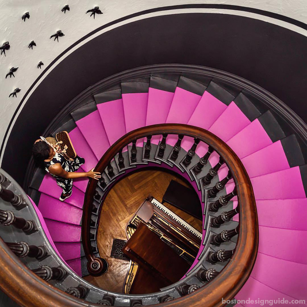
Anu Shah and Laura Custodie of Cutting Edge Homes, Inc. who commandeered the grand foyer, selected a fuchsia from a stained glass window at the stair’s midpoint, and saturated the ceiling with the dramatic hue. They then ran the tone down the back side of the stair clear to the floor in lieu of millwork or a carpet runner. The modern shade was meant to evoke the hues of a “pre-dawn sky” and give the historic architecture a fresh new spin.
Hammond Design
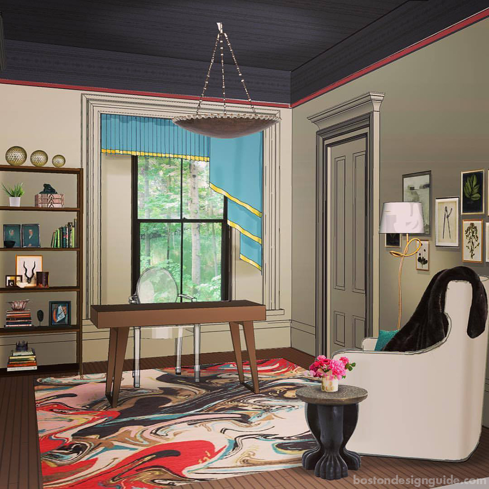
In the “Bold and Fierce” women’s office, inspired by comic book heroine Wonder Woman, Melissa Hammond and Meg Bennett of Hammond Design not only papered the ceiling in Osborne & Little Falcon wallpaper, they extended the treatment down the walls to meet a red chair rail that separates the textured, raven-colored wall covering from the metallic taupe of the room’s perimeter.
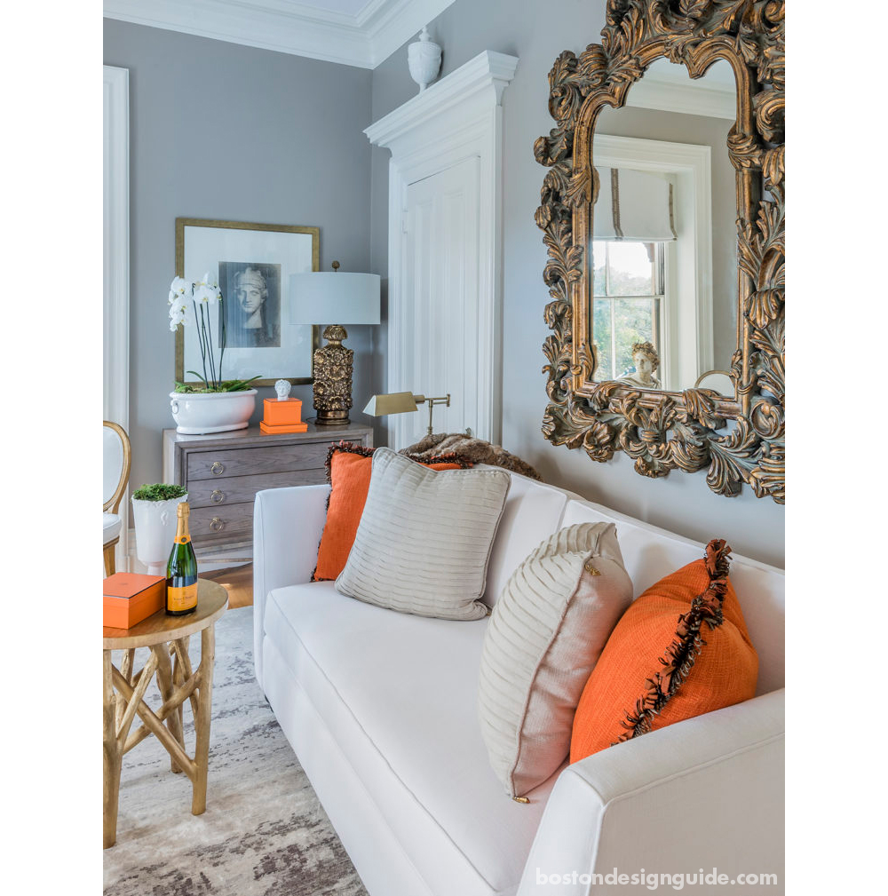
Boehm Graham Interior Design; photography by Elaine Frederick
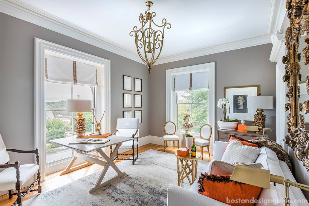
Doors and door casings were also used creatively. In the Toasting Room, a BDG favorite of clean, white furnishings, gilded accents and pops of Hermès orange, mother-and-daughter design team Kacey Graham and Michaele Boehm of Boehm Graham Interior Design placed a pair of alabaster urns atop exceptionally wide door casings that double as pedestals.
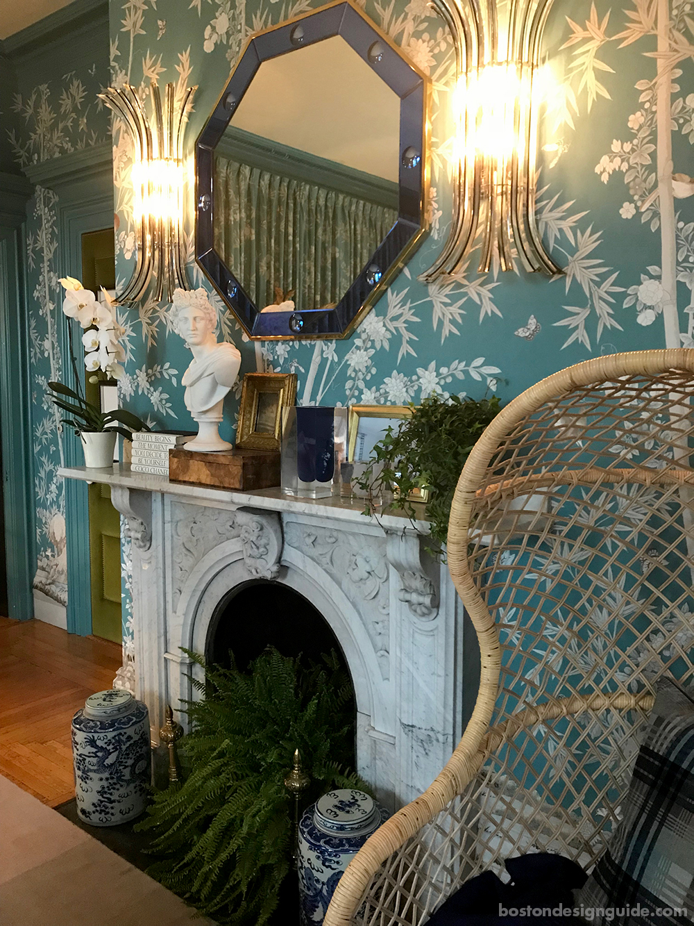
Robin Gannon Interiors & Home
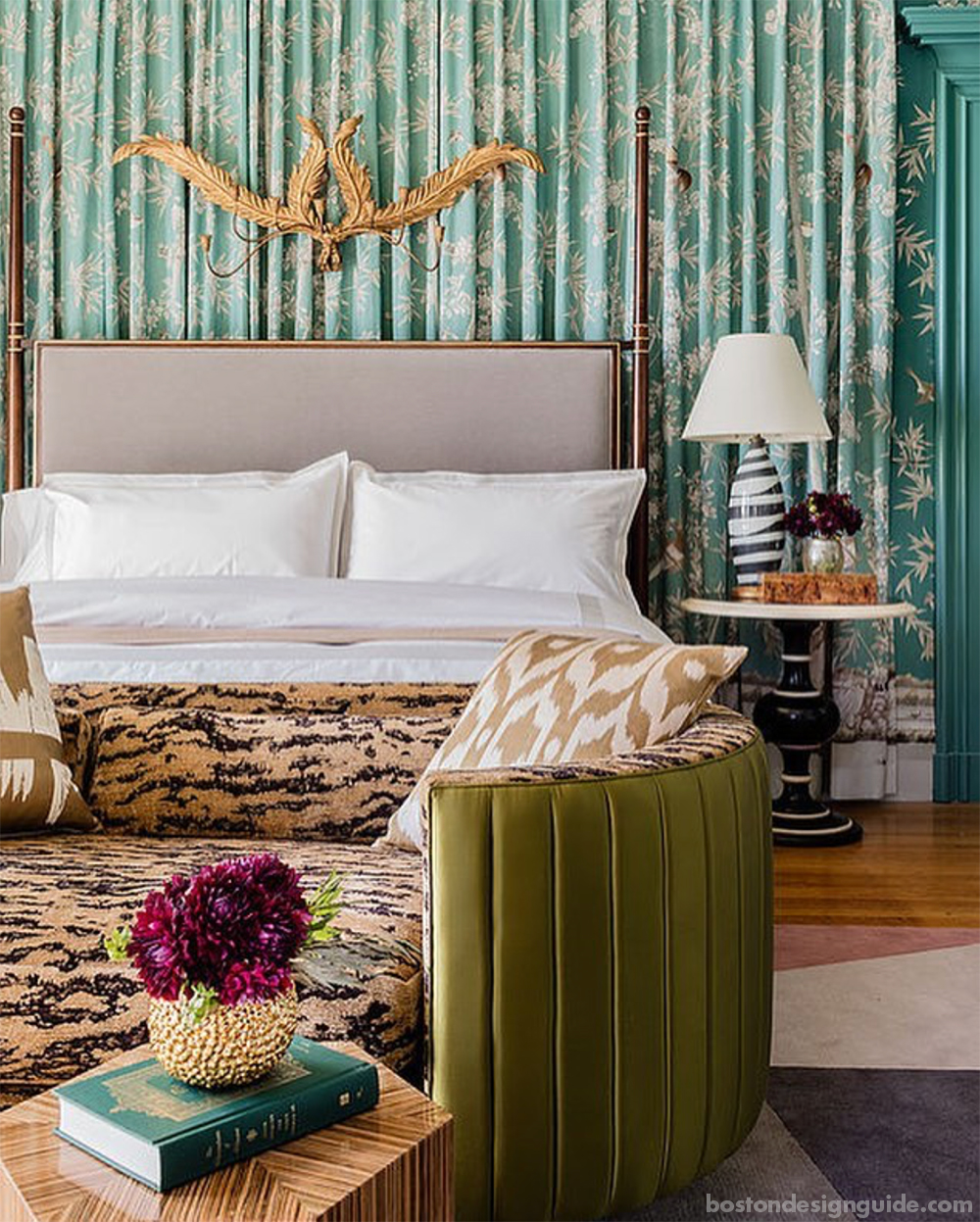
In the master bedroom, a padded door swathed in velvet made a luxe and lasting statement. We fancied the softness of the moss-hued fabric, the foil of the nail head detail and the fact that interior designer Robin Gannon affixed intaglio art to the surface, for yet another layer. She also fronted peacock blue draperies by the headboard with a golden sculpture and hung artwork from the moldings.
#2 MIX TIME PERIODS TO CREATE A TIMELESS LOOK
Gannon also suggested including elements from a wide range of eras and time periods to achieve a timeless design. We saw this technique in action in many of the Show House’s spaces, but, for Gannon’s part, it meant pairing chinoiserie wallpaper (which has long been en vogue) with bamboo chairs, classic marble and Art Deco accents, including Italian Murano glass wall sconces. How do you know what works together? “You can’t explain it so much as you can feel it,” she says.
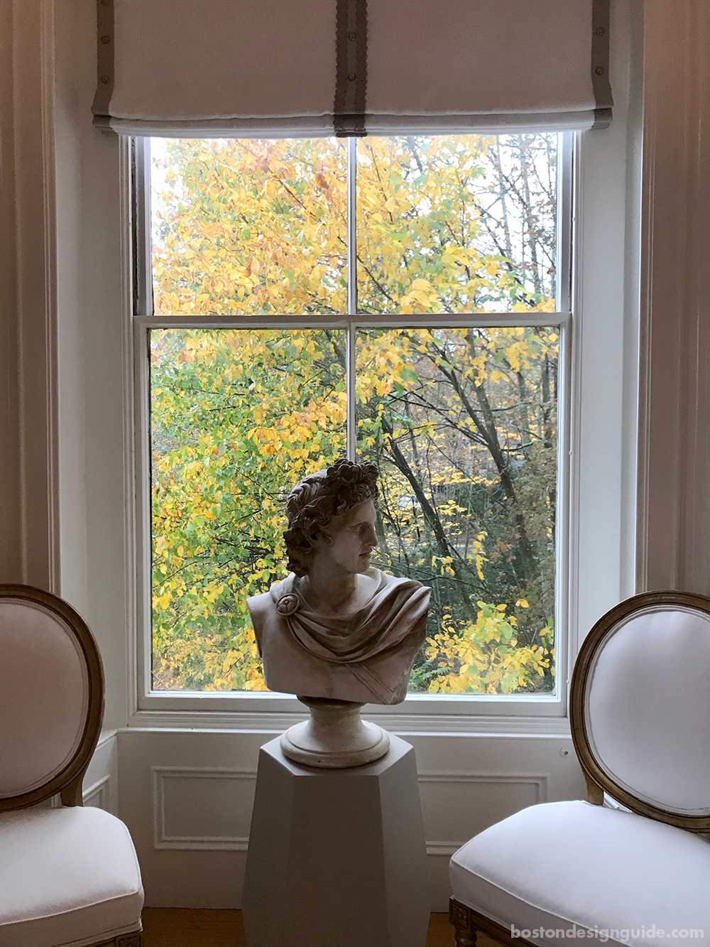
Boehm Graham Interior Design
Back in that Toasting Room, (we can’t stay away!) Boehm Graham Interior Design incorporated neo-classical sculpture as well as artwork in their flawlessly curated space. Kacey Graham often weaves in time-tested accents to her spaces, particularly when working with historic homes. Doing so lets the viewer see “these pieces in a fresh new way,” she explains. Here, she flanks a bust with bright white round back chairs and crowns the vignette with an embellished Roman shade (naturally!).
#3 LET IN THE LIGHT
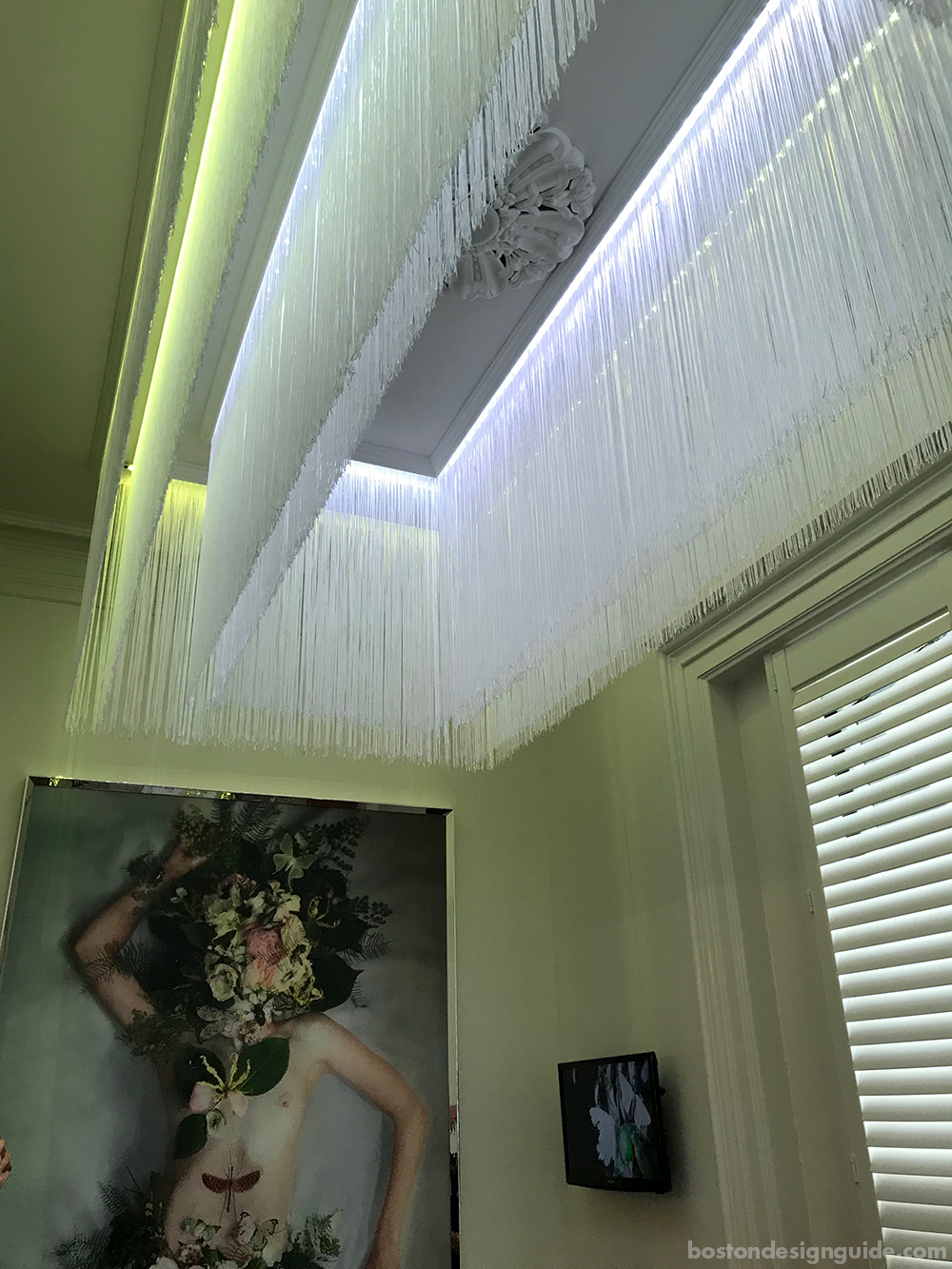
We overheard Graham say that, often, the very first question she asks a client when she enters their home is: Where is the light? Well, that’s one question we didn’t have to ask at the Show House. Light treatments and fixtures were key to many of the designs we saw, but perhaps nowhere as dramatically as in “Disco in the Garden of Good & Evil” by principal in Stephanie Rossi of Spazio Rosso.
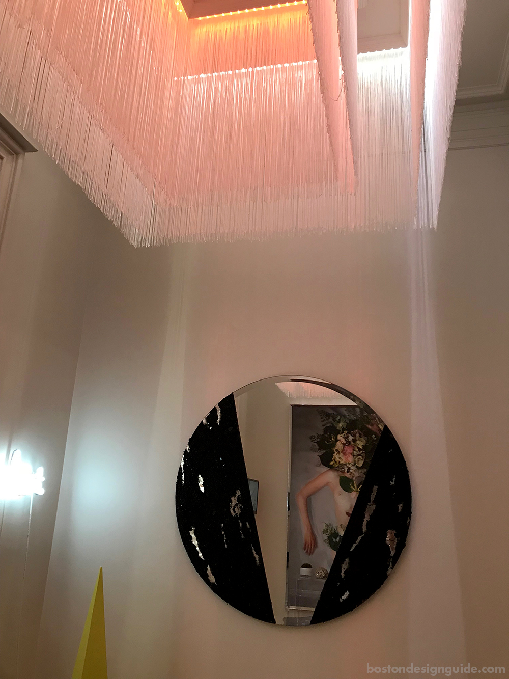
Spazio Rosso
As a video featuring artist Nick Cave’s recent installation at MASS MoCA played on a continual loop opposite neon wall art scripted with the word “dirt,” a fringed and feminine chandelier changed hues above an upholstered bench. The diminutive space was created to be an “enclave for contemplation,” mentioned Rossi, and visually challenge those who enter.
Vivian Robins Design
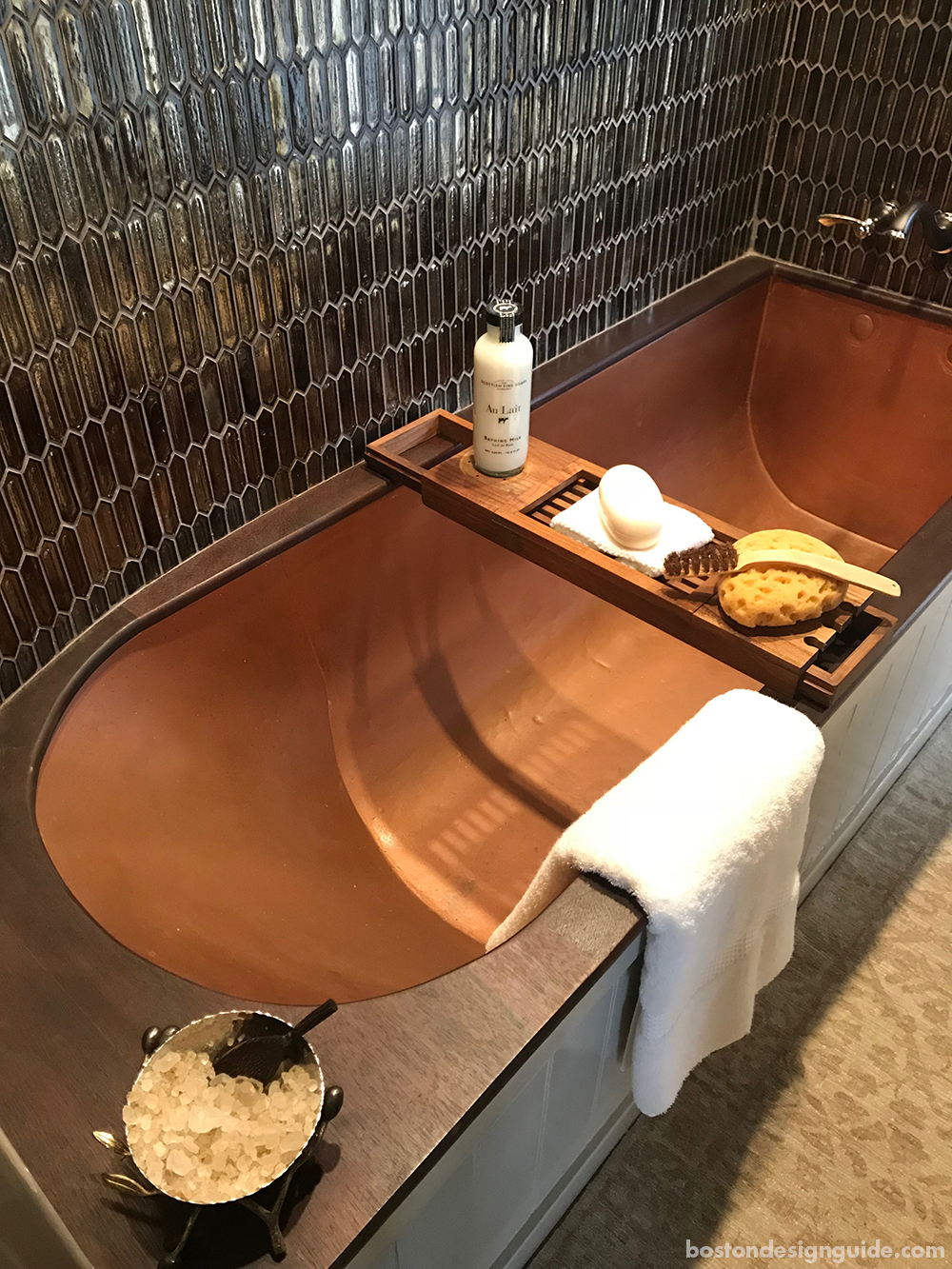
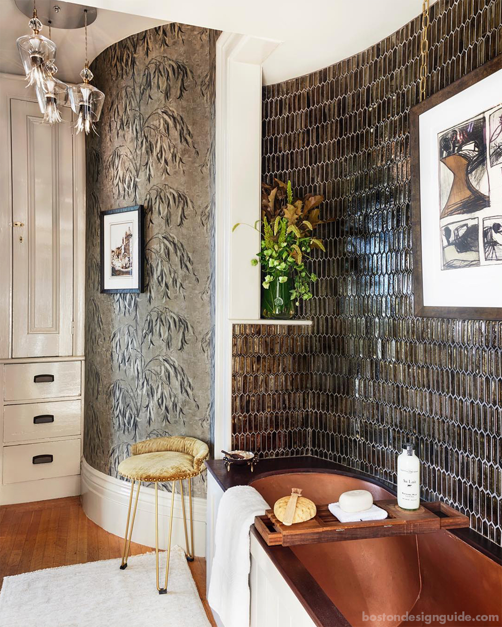
Designers also made good use of the natural light that streamed in from the many oversized windows of the Winslow Flagg Homer home. Vivian Robins of Vivian Robins Design explains that historic architecture often capitalized on the natural light and vantage of stately picture windows, so she followed suit. For the gentleman’s bath, which features a window with views of Boston in the distance, she purposefully selected a tile that glimmers with tortoise shell tones. It’s brilliant alongside the copper tub, with a look that changes depending on how the sunshine hits it.
#4 PLAY ARCHITECTURE TO YOUR ADVANTAGE
Vivian Robins Design
Throughout the Show House, interior designers were clearly influenced by the architecture of Bracketed Italianate-French Second Empire home. Though a gentleman’s bath at one time, Robins played up the curves of her space with a mix of complementary tile and wallpaper. The softness of the tone and pattern of the wall covering amplified the room’s graceful arc.
Mally Skok Design; photography by @sabrinacolequinn
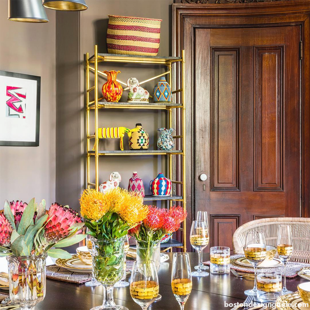
Mally Skok of Mally Skok Design was thrilled to breathe new life into the Oval Dining Room, in large part due to its magnificent shape and architecture. Grand floor-to-ceiling windows provided the perfect opportunity to feature the South African designer’s new “Botanica” line of hand screened fabrics and wall coverings. Skok lightened the formality of the space and its existing Victorian furnishings with “witty” updates, a current light fixture and global finds.
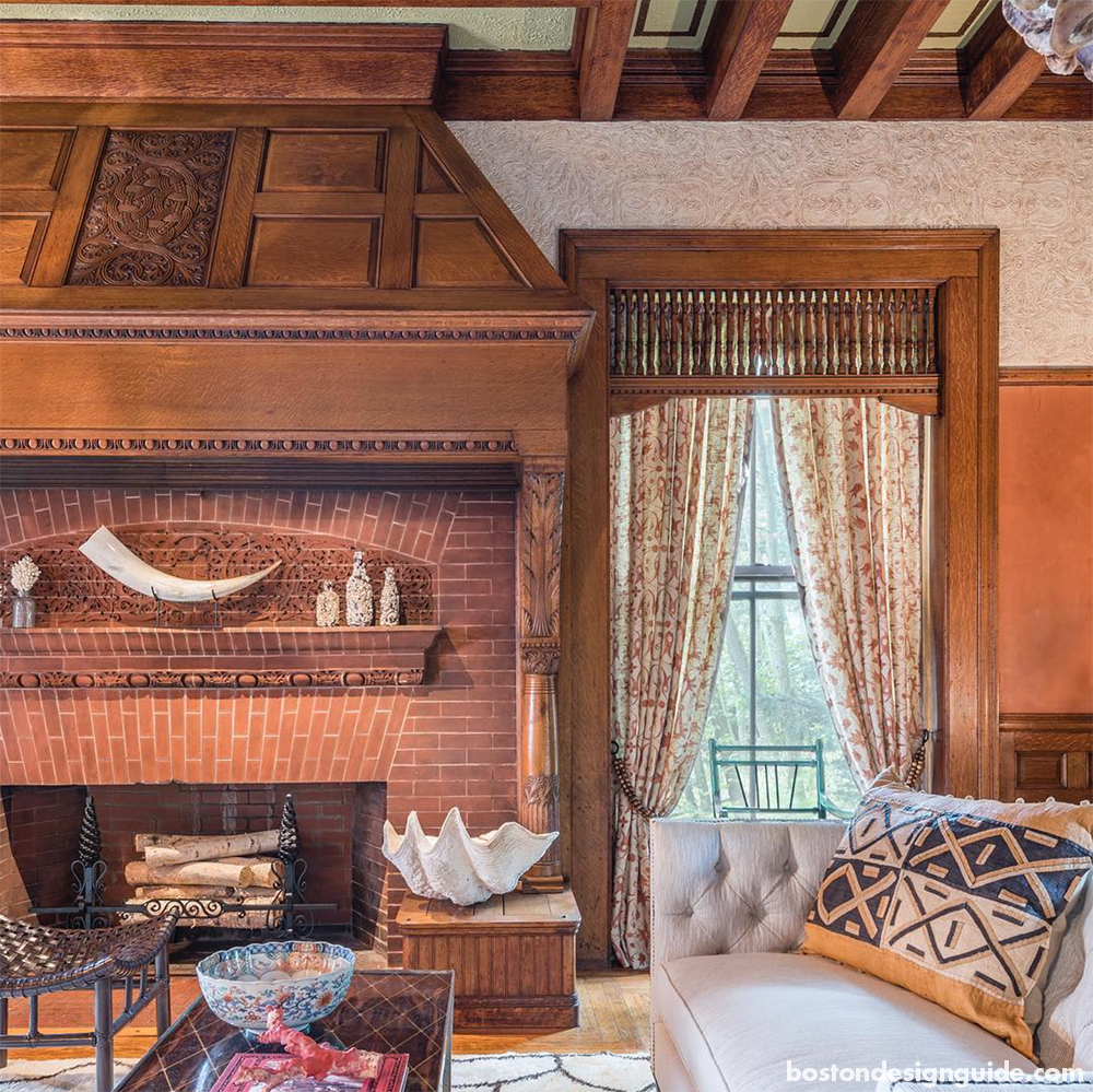
Theo & Isabella Design Group; photography by Elaine Frederick
Susan Schaub and D. Scott Bell of Theo & Isabella Design Group installed a wildly inventive “Wunderkammer” or “Cabinet of Curiosities” this year (stay tuned for an upcoming blog on the subject!). The ceiling and walls in the space were central to the room’s magnificent design and warmth. The principals painted and glazed the lincrusta (i.e. the two-dimensional top area of the wall) and used burnished Venetian plaster for a “reflective quality,” explains D. Scott Bell. Overhead, they painted the ceiling and designed a stencil for the fields between a procession of wood beams.
#5 GO BOLD
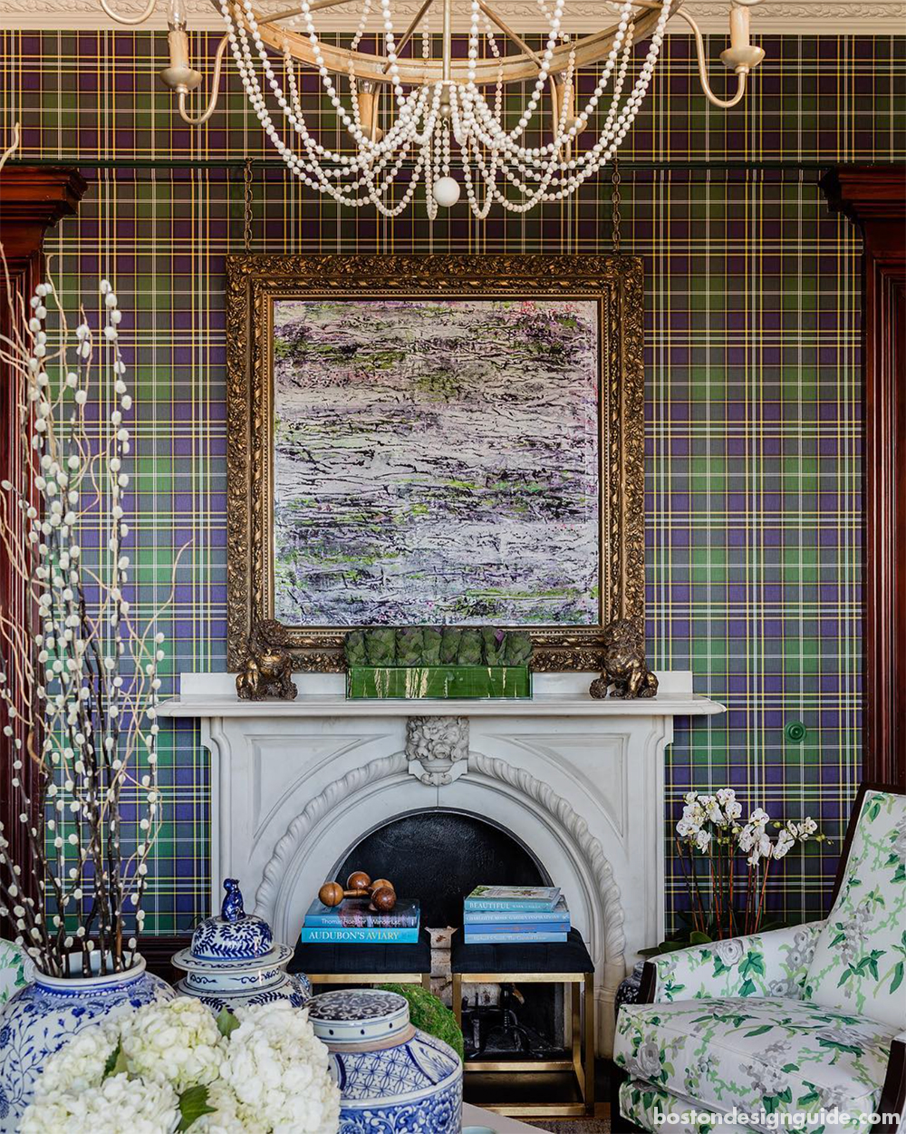
Elizabeth Home Décor & Design
When designing the parlor, Elizabeth Benedict of Elizabeth Home Décor & Design looked to the provenance of the William Flagg Homer House, and discovered that Winslow Homer was inspired by the rural landscape of the home’s surroundings. With this in mind, she selected “the greens of the pasture and lilac glow of sunsets” for her color palette, creating a lush space teeming with elegance. A deep, plaid wallpaper serves as the backdrop for impressionist paintings, floral upholstery and urns, a chandelier dripping with pearls, volumes of books bound in blue and natural elements like branches of white birch customized by Artefact Home|Garden.
The Junior League of Boston Show House is on view until November 5, at the William Flagg Homer House at the Belmont Woman's Club, 661 Pleasant St., Belmont, MA. For more information, visit jlboston.org
Opening image: Boehm Graham Interior Design; photography by Elaine Frederick


Add new comment