June 13, 2022 | Admin
When the owners of this Chatham home saw a neighbor’s place down the street, they wasted no time asking for the name of their designer, hoping for a similar look. The designer, however, told them that each client gets a unique design. “We are mindful that each project takes on its own unique design elements respecting the client’s lifestyle,” says Jocelyn Chiappone, owner of Digs Design Company.
The designer joined father and son duo, Ted Spencer and Matt Spencer of Spencer & Company, to create a forever home for the empty nester couple. “It started out as an expansion and remodel project. During demolition we encountered unforeseen issues with the foundation, so the team decided to start fresh with a new foundation,” Matt says. “We were able to use the original plans for the expansion, and worked directly with the clients to adapt things when necessary.”
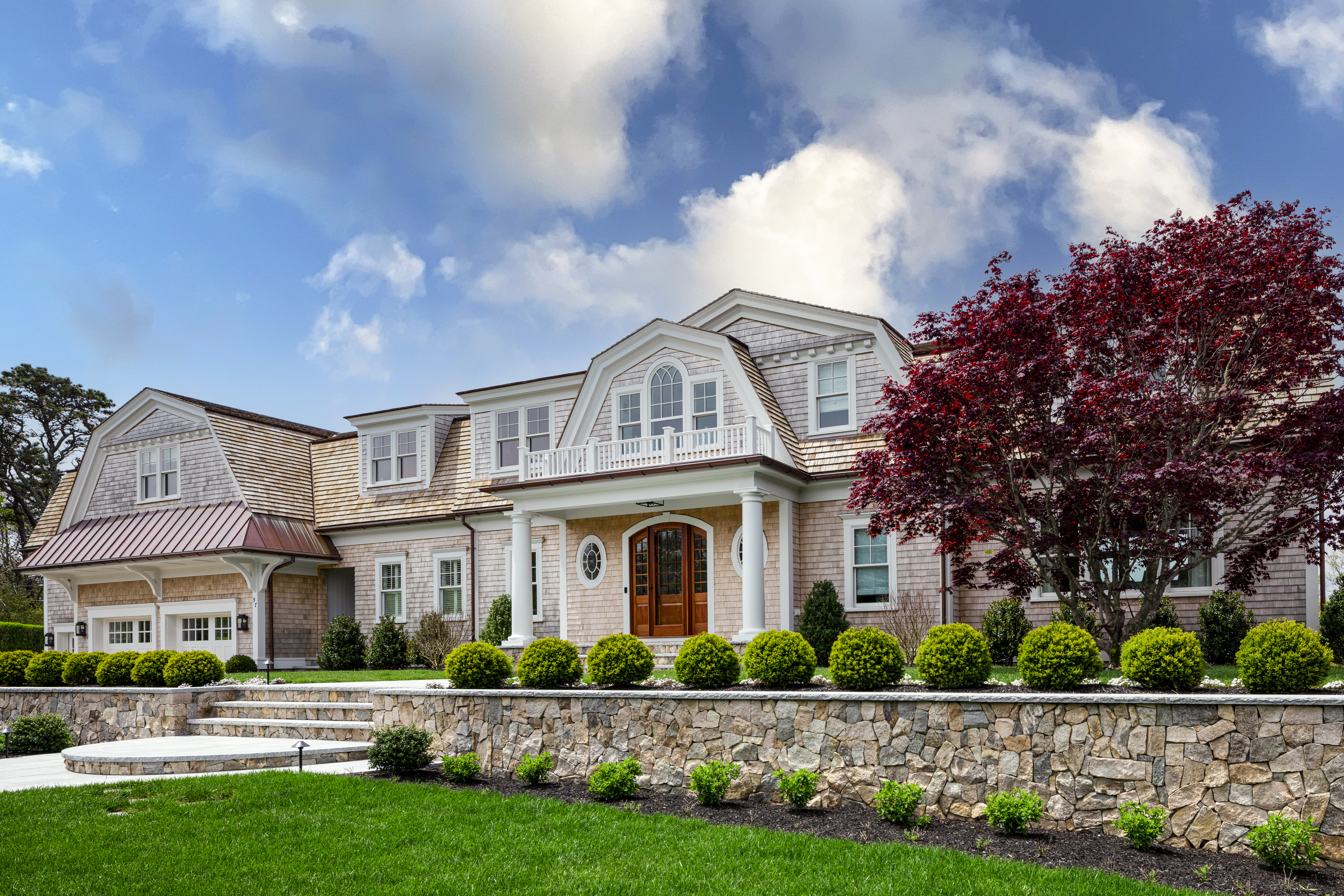
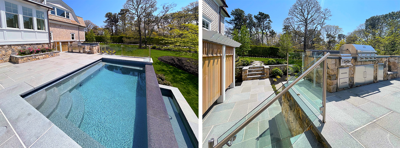
On the exterior, Thomas Mulcahy of Mulcahy Design Group reinforced the formal front façade with linear plantings of boxwoods and hydrangeas along retaining walls built from New England fieldstone. Out back, a series of terraces connect the deck off the first floor of the house to the main pool terrace, where glass rails & the infinity edge pool maximizes the view. “We came up with effective design solutions to complement the architecture & harmonize with the natural landscape,” Mulcahy says.
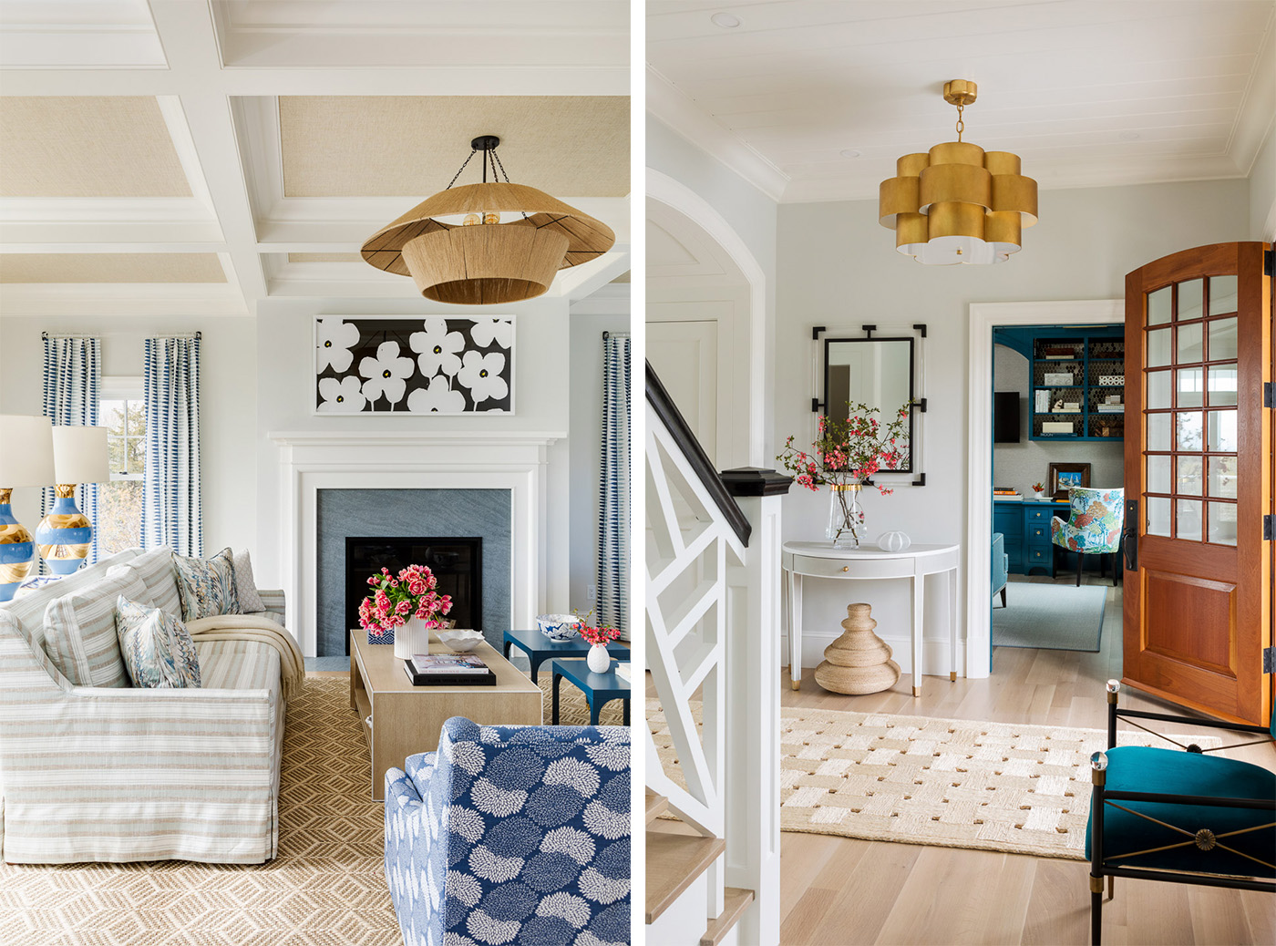
Chiappone incorporated compelling architectural details throughout the interior of the classic shingled home. A gracious stair with a Chippendale-style fretwork balustrade, for instance, is the focal point of the entry and second-story landing. “The gain is dramatic,” Matt says. “It really changes the whole house.” Still, nothing is overdone. “The design is streamlined, but there’s a sense of excitement,” Chiappone asserts.
Color and pattern play major roles in elevating the design. Rather than lean into a quintessential blue and white Cape Cod palette with nods to nautical motifs, Chiappone opts for a layered scheme that is both sophisticated and strategic. While the entry is light and airy, the adjacent office is rich and cozy thanks to deep teal built-ins and chinoiserie-style upholstery on the chairs. “This colorful and cozy space is the perfect “away” room for work and TV watching,” Chiappone says.
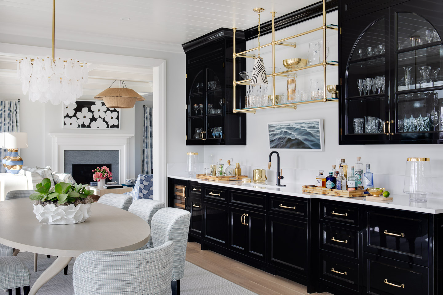
The high gloss black bar in the dining room picks up on that cabinetry style, complete with arched glass-front upper cabinets that frame an attention-grabbing polished brass and glass shelf. “Rather than repeating a large wall of white cabinetry we chose high gloss black with brass accents,” Chiappone says. “It is a great wow moment when entertaining.”
Rather than lean into a quintessential blue and white Cape Cod palette with nods to nautical motifs, Chiappone opts for a layered scheme that is both sophisticated and strategic.
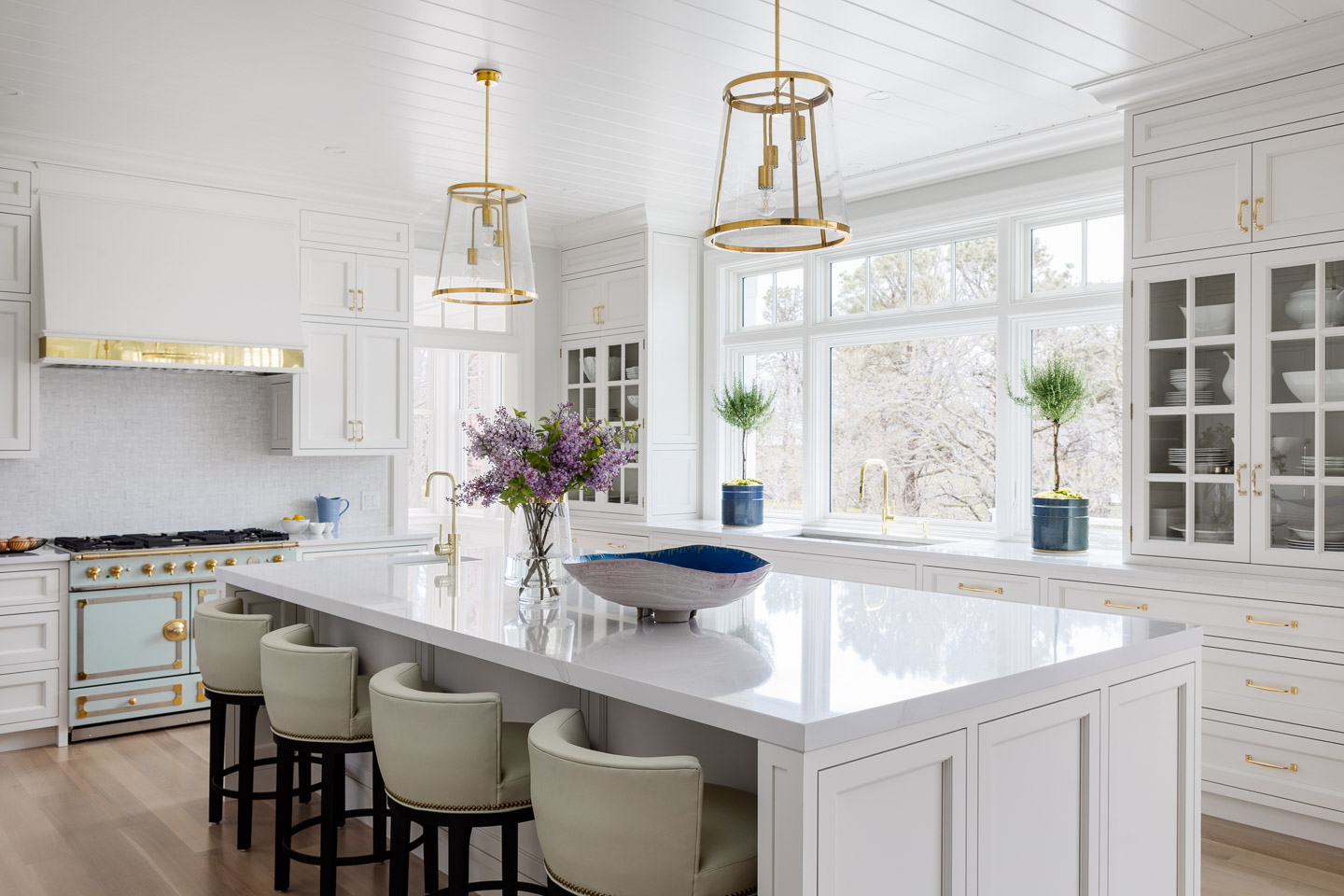
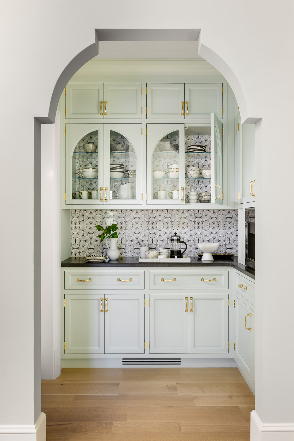
Polished brass accents inject glamour into the timeless white kitchen. The centerpiece is the La Cornue range, which Chiappone encouraged the clients to order in celadon. The cosmopolitan hue informed the celadon coffee bar tucked beyond a Moorish arch; another of the designer’s architectural flourishes. “We created a plywood template the width of the door frame that the Sheetrock is then built around,” Matt says in regards to the construction process. Jutras Woodworking crafted the cabinetry in both spaces, based on Chiappone’s design.
The open concept plan flows beautifully. Mod black and white artwork by Liz Roache pulls the eye into the living room. Here, barely-there blues blossom into deeper, clearer shades of purple-blue with touches of celedon on the prints tie into the kitchen, and sandy wood tones and natural fibers reinforce the coastal locale. Chiappone mixes soft stripes and classic trellis patterns with a playful floral and a pared down,
almost painterly embroidered drapes. “I don’t rely on go-to styles,” the designer says. “Fabrics are like fashion; I can’t wait for new collections to come out.”
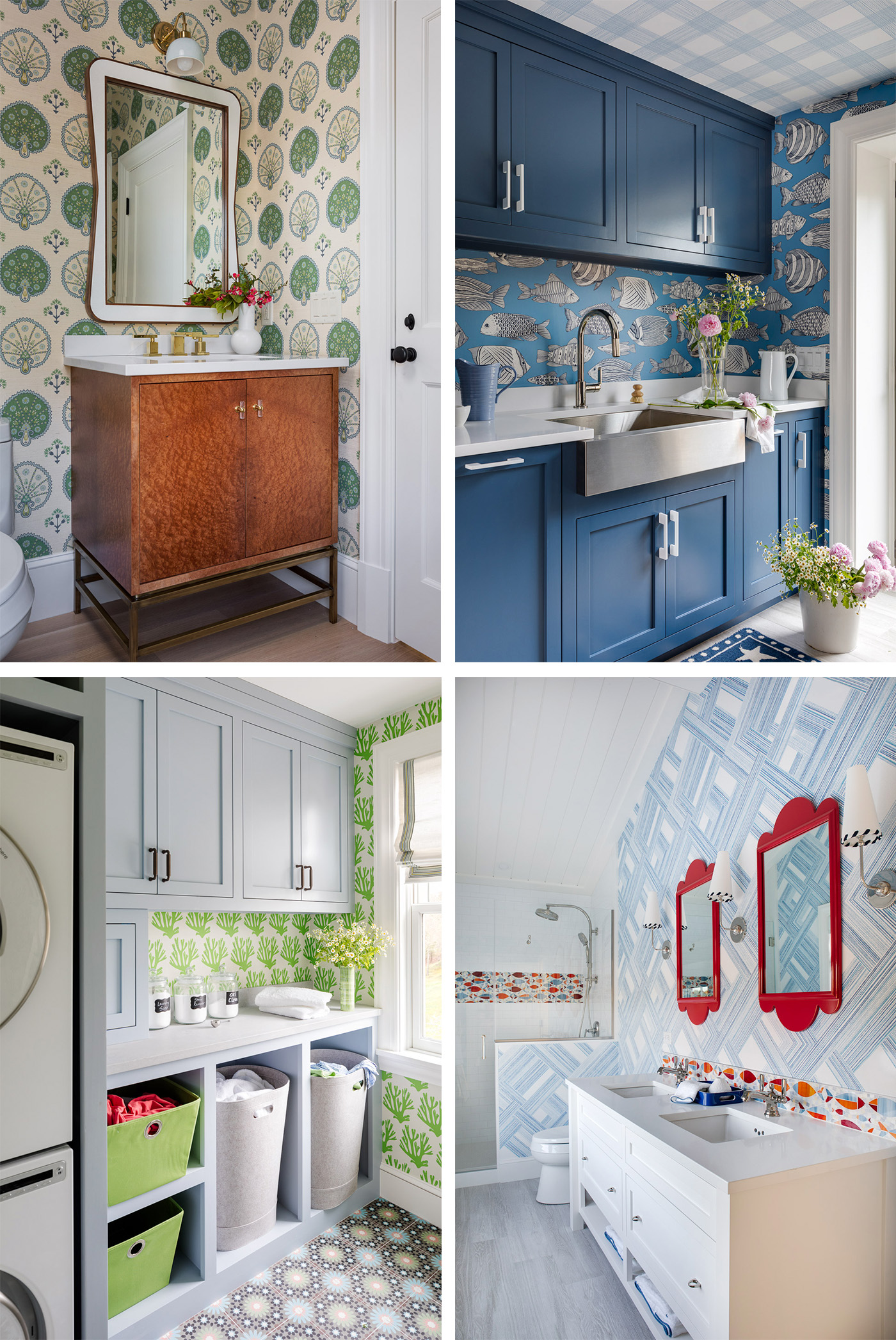
Chiappone delves deeper into color and pattern in the home’s private spaces. “Each bath tells its own story,” she says. The powder room on the main level is elegant, featuring a burlwood vanity and sisal wallpaper. The one in the basement, meanwhile, channels throwback-y camp vibes with orange life preserver wallpaper and a vintage rattan mirror. Upstairs, a bold guest bath plays with red, white, and blue, showcasing a school of fish in the shower and an oversize pattern on the walls. “These pops of color appeal to the younger generations who visit,” Chiappone explains. “Laundry rooms are the new powder rooms!”
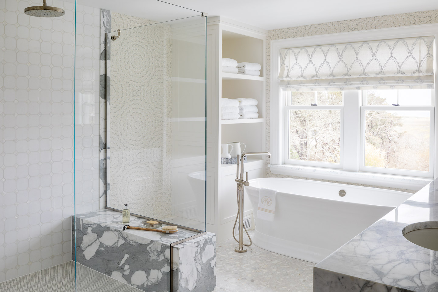
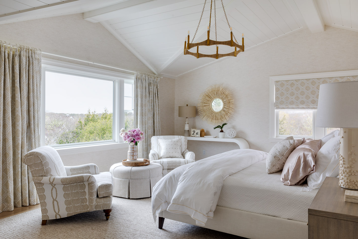
The primary suite, however, is absolutely serene. For this bath, Chiappone curated a mix of modern and classic materials, including a terrazzo floor and a Calacatta marble countertop. The nuanced, monochromatic palette continues in the bedroom, from the chunky, fisherman sweater-like rug to the V-groove-lined cathedral ceiling. Layers of tone-on-tone prints and textural, organic accessories enhance the sense of calm. “After the hustle and bustle of a busy day, they can walk in and sigh a big ah,” Chiappone says. “Then, in the morning, they can wake up, look out at the water, and pinch themselves.”
Architecture: Karen B. Kempton Architecture
Construction: Spencer & Company
Interior Design: Digs Design Company
Landscape Design: Mulcahy Design Group
Construction: Spencer & Company
Interior Design: Digs Design Company
Landscape Design: Mulcahy Design Group
Landscape: North Chatham Landscaping
Millwork: Jutras Woodworking
Stone and Tile: Ricciardi Marble & Granite, Inc.
Garage Doors: Designer Garage Doors
Writer: Marni Elyse Katz
Stylist: Karin Lidbeck Brent
Photography: Greg Premru,


Add new comment