February 21, 2017 | carly stewart

According to the PANTONE Color Institute, the 10 colors of spring 2017 express a variety of hues that surround us in nature with a mixture of colors from earthiness to those that are bright and vivid. See how to use these colors in your homes with this essential color guide for this coming spring season.
1
Primrose Yellow – PANTONE 13-0755
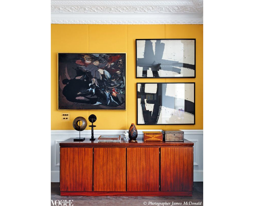
Image via Vogue
Incorporate instant warmth to your home with a joyful and bright yellow shade that brings as much happiness as a day filled with sunshine.
2
Pale Dogwood – PANTONE 13-1404
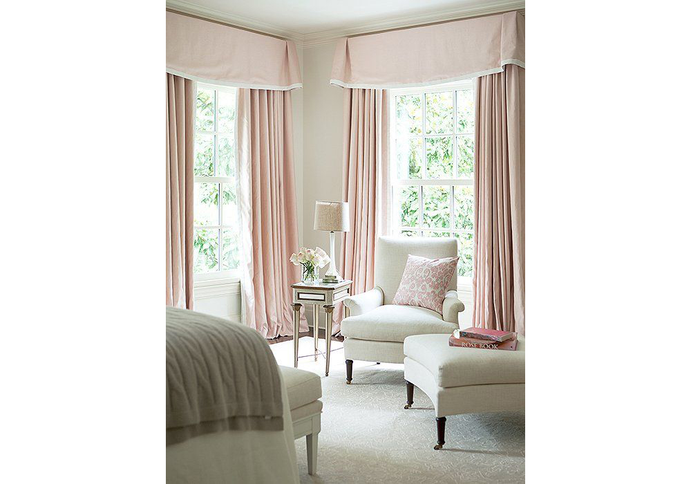
The subtle pinks are all the rage this season. You can’t go wrong when bringing a sense of innocence and purity to your design.
3
Hazelnut – PANTONE 14-1315
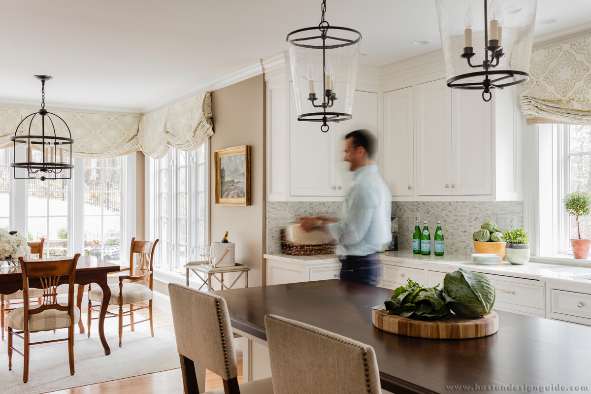
Interior Design by Theo & Isabella Design Group; Kitchen by Architectural Kitchens
Hazelnut represents the most neutral color of the spring 2017 grouping. This warm tone easily compliments the colors of the seasons with a natural earthiness.
[Spring 2017 Colors Spotted: Primrose Yellow, Greenery]
4
Island Paradise – 14-4620
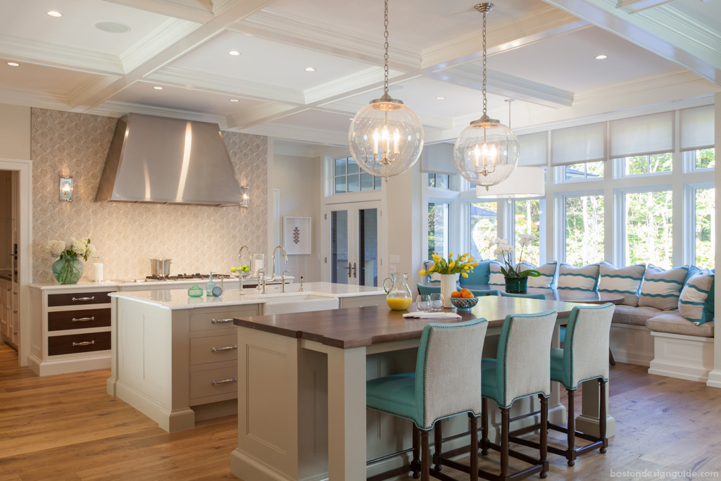
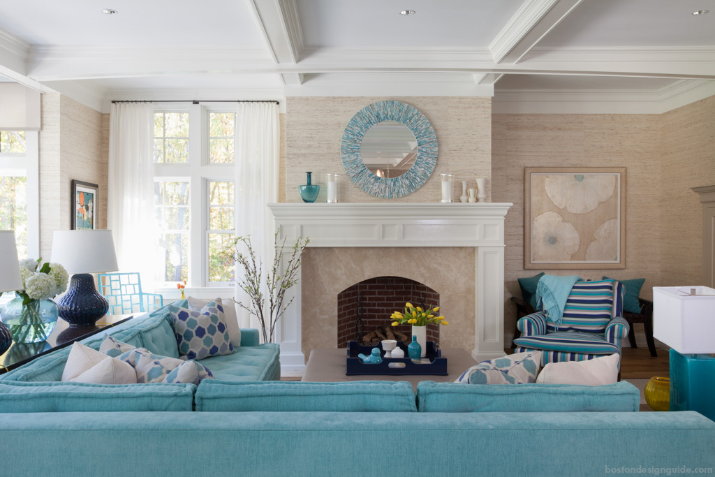
Interior Design by Plum Interiors
Island Paradise is a refreshing blue green that automatically reminisces on our favorite tropical getaways. Touches of this color in your design generate a calming great escape consciousness.
[Spring 2017 Colors Spotted: Primrose Yellow, Greenery, Lapis Blue]
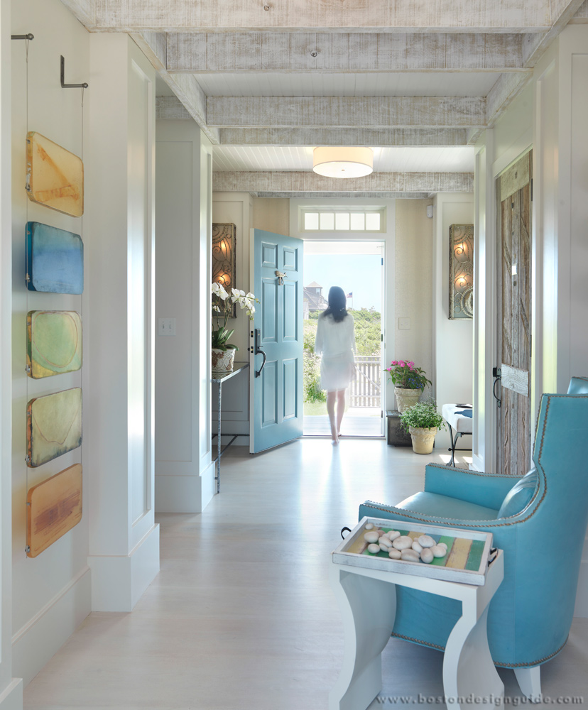
Interior Design by Donna Elle
5
Greenery – PANTONE 15-0343 [2017 Color of the Year]
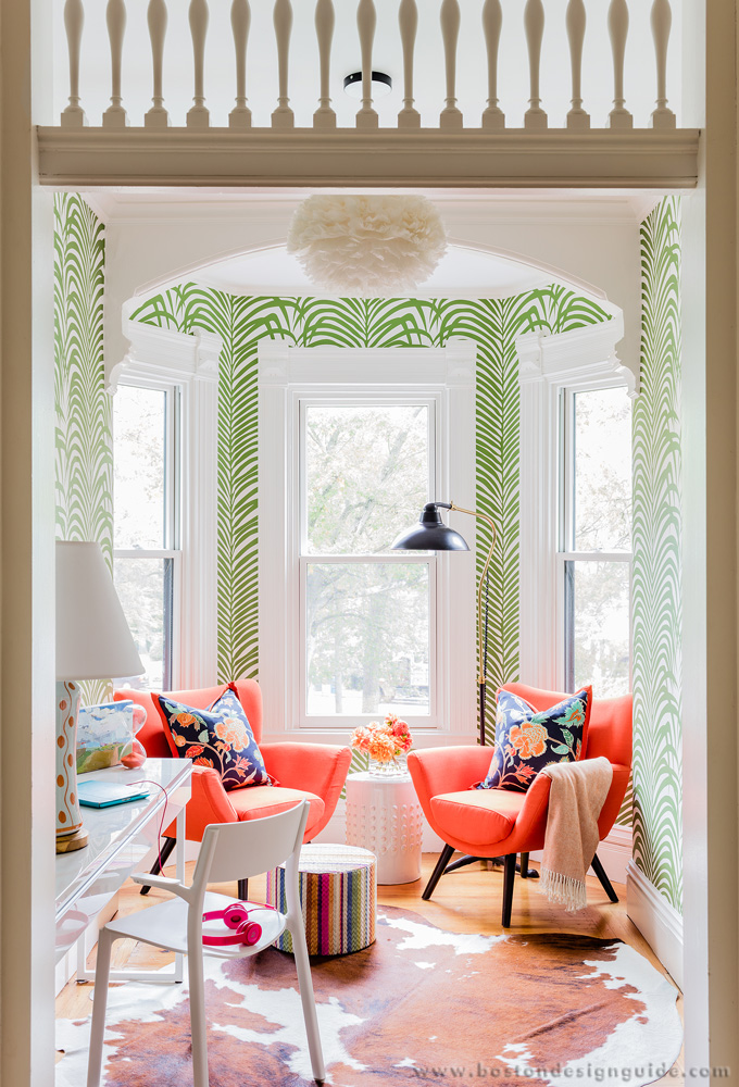
Interior Design by Elizabeth Home Décor & Design
Greenery provides a refreshing yellow-green burst of nature in your own home environment.
[Spring 2017 Colors Spotted: Flame, Pink Yarrow, Lapis Blue]
Also see: Home Trends Using PANTONE Color of the Year 2017, Greenery
6
Flame – PANTONE 17-1462
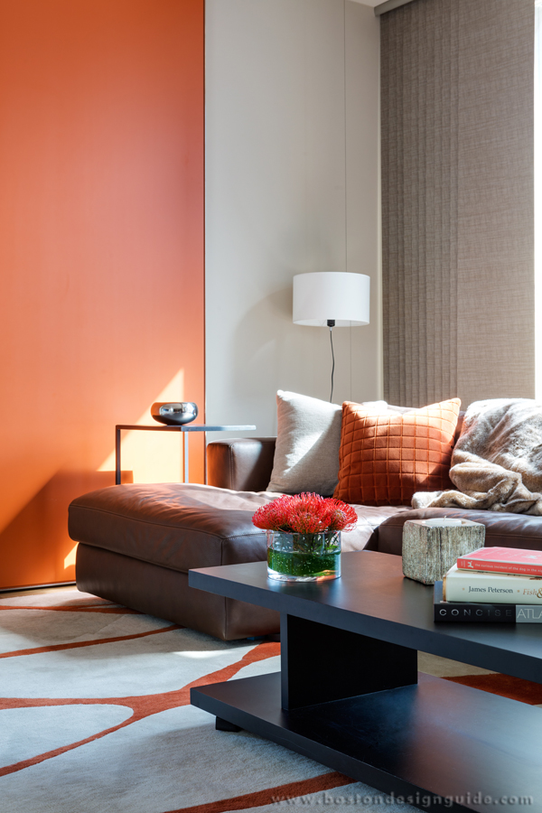
Interior Design by LDa Architecture & Design; Photography by Greg Premru
This red-based orange brings a bold, dramatic focus to your home that stands out in a fun way like no other.
7
Pink Yarrow – PANTONE 17-2034
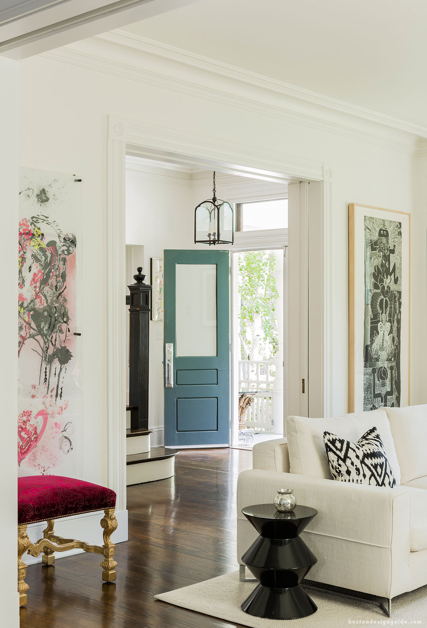
Interior Design by LDa Architecture & Interiors; Photography by Michael Lee
Pink Yarrow energizes spirits bringing bold attention to the room with its tropical and festive charm. A tasteful addition of Pink Yarrow livens this space like no other.
[Spring 2017 Colors Spotted: Niagara]
8
Niagara – PANTONE 17-4123
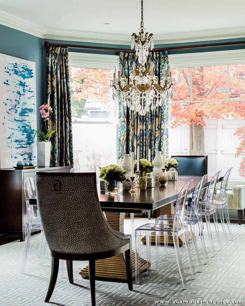
Interior Design by Elizabeth Home Décor & Design
Niagara easily captures the sense of ease and relaxation in any space. The color leads the PANTONE Fashion Color Report as the most prevalent color for the season. You simply can’t deny that this Niagara-filled dining room is utterly comforting and classic.
[Spring 2017 Colors Spotted: Primrose Yellow, Greenery, Lapis Blue]
9
Kale – PANTONE 18-0107
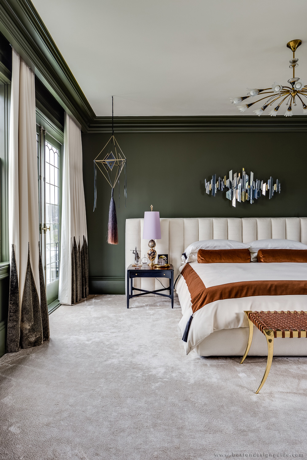
Wayland Home & Design – C2 Paint available (C2 934 – Posh; Designer: Will Wick Design)
Kale, like Greenery, evokes the foliage-based green and the great outdoors. This tone compliments the more vibrant colors in the spring palette while being able to perform as a perfect background for design composition among the other shades.
10
Lapis Blue – 19-4045
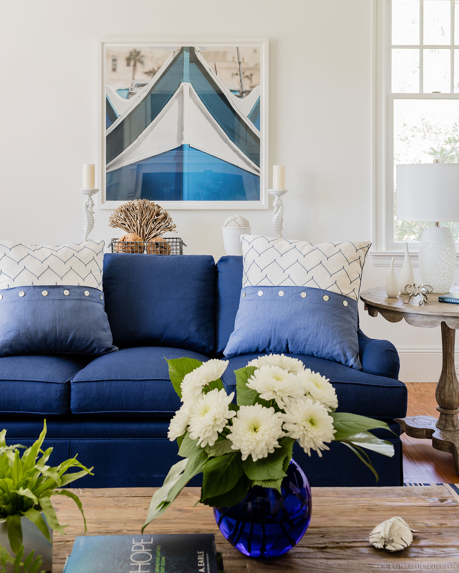
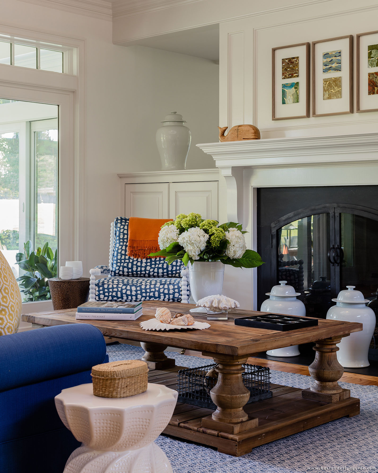 Interior Design by Wilson Kelsey Design
Lapis Blue brings a strong, intense energy to a bright, open room. This space above compliments other tones in the spring palette for a friendly, yet radiant invitation.
[Spring 2017 Colors Spotted: Primrose Yellow, Greenery, Flame]
How many Spring 2017 PANTONE colors can you incorporate?
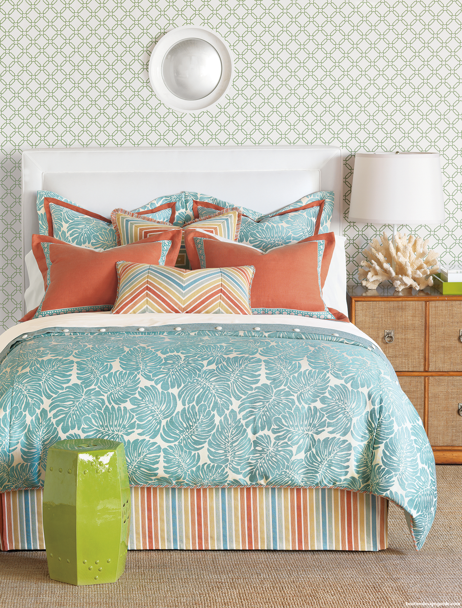
Bedding available at The Cottage


Add new comment